Last night we had a beautiful sunset. The sky was baby blue, the clouds were pink and the horizon was golden. I couldn’t resist. So I grabbed my Canon PowerShot G11 and walked over to the neighbor’s front yard where the view is just a bit better. I composed what I thought was an interesting image and snapped a few.
This morning I uploaded them and got to wondering about color saturation in Adobe Photoshop Lightroom. I have a technique I’ve used for years to enhance colors but there are a couple of other techniques I thought I’d like to understand better. The three Lightroom controls are:
- Saturation
- Vibrance
- HSL (the control I use the most)
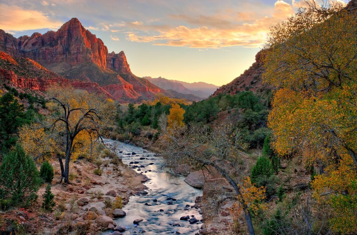
So, for starters, here’s the original unadjusted image.
 As you can see, the colors are really quite nice. But my recollection of the sunset was that they were a little more saturated, more intense.
Saturation
The first control I tried was Saturation. I set the value at a modest +25% with these results.
 The pinks and blues are nice but the yellows are too garish. What’s going on here?
The Saturation control saturates all the colors an equal amount. You can increase or decrease the saturation but it’s all or nothing. Every color is affected the same.
I also decreased the saturation by –25% with these results.
 The image appears much less interesting. Just as when the saturation was increased, decreasing the saturation affected yellows the strongest with the blues and pinks not quite as much.
If you set saturation to –100% you get a grayscale image.
 That’s generally not the reason why you would photograph a sunset but grayscale works really well in a lot of situations. The only thing, there are much more powerful ways to create grayscale images than with Saturation.
Vibrance
Another Lightroom control for affecting color saturation is Vibrance. This is a very sophisticated in the way it works. It does two things.
- Increases saturation of the least saturated colors
- Does not over saturate skin tones
The saturation produced by Vibrance can be very subtle. Here’s the sunset with +25% vibrance.
 You’ll notice that the pinks and blues are not any more saturated than the original. However, the yellows are just a bit more saturated. The effect achieved is much more pleasing than with the Saturation control.
You can also use Vibrance to decrease saturation. Here is the same sunset with –25% vibrance.
 The difference between –25% vibrance and –25% saturation is very subtle. The more saturated pinks and blues are desaturated about the same amount. The less saturated yellow is desaturated a little less with Vibrance than with Saturation.
If you set Vibrance to –100% you get this result.
 It’s interesting because there is still come color although it is all very pale.
HSL
The HSL control is the one I turn to most often. HSL stands for Hue, Saturation and Luminance. It gives you the ability to selectively control each of these three properties of color on eight different colors – Red, Orange, Yellow, Green, Aqua (think Cyan), Blue, Purple and Magenta.
I adjusted only the Saturation property and only for Red (+40%), Orange (+21%) and Yellow (+4). Here are the results.
 For my money this is the most satisfactory of the three results. The yellow is more saturated but not overdone and the pink clouds are more like what I recall. It really does capture more faithfully what I was feeling.
I like the HSL control best because it allows you to individually selectively adjust all three color properties for individual colors. I find myself using them all regularly. Maybe I’ll dive into HSL in a future post.
To see more of my photographs click here.
Join us for a fantastic photographic experience.
(4205)
Thank you very much for this helpful article. I was playing with colors yesterday for the first time in Lightroom, and found myself wondering about the difference between saturation and vibrance. But, as you say, the HSL functionality gives you the most options.
Ralph, This was a very interesting and helpful article. Thanks.