“Why don’t my prints look the same as the image on my monitor?” This is a frequent question in my workshops. It’s not the fault of the printer as is often suspected. My response is always, “It’s a color management issue.”
This is fourth in a series of articles that are shedding light on the complex subject of Color Management. So far we’ve covered Color Space in Color Management Made Simple – Color Space, the importance of profiling your monitor in Color Management Made Simple – From Camera to Computer and printing basics in Color Management Made Simple – From Computer to Print. These three articles give us a pretty complete picture of color management. But there’s still one very important concept to discuss – Gamut Errors.
In the Color Space article we introduced the color spaces that are commonly used when we work on our photographs – proPhoto RGB (the most complete), AdobeRGB and sRGB (the most limited). Each of these color spaces was compared to a box of Crayons with proPhoto RGB being represented by the 92 count box, AdobeRGB by the 64 count box and sRGB by the 48 count box.  In the Computer to Print article we talked about the different types of print paper and inks and how each has its own unique color properties. That is to say, each paper / ink combination has its own color space. And the size of the color space (number and colors of Crayons) varies from one combination to the next. The size of the print’s color space depends on the type of paper. Glossy papers are at one end with the largest color spaces and matte papers are at the other. Luster papers are very close to the color spaces of glossy papers.
The color of the paper itself also affects its color space. Some papers are pure white and to achieve this they very often contain chemical brighteners. These papers will have a larger color space. Papers without brighteners may still appear white but they won’t have as large of a color space. And some papers are not even white but have a pale yellow cast. Not only will this affect the color but it also reduces the color space.
Now comes the big question. What happens when the colors in your photograph cannot be reproduced in the paper’s color space? Or stated another way, what happens when there aren’t as many Crayons in your paper / ink’s color space as there are in your photograph’s color space? Well, it’s not a problem if you only use Crayons in your photograph’s color space that are also in the paper / ink color space. But that’s no good. You may want to print the same photograph on a different paper with a larger color space.
When you have colors in your photograph that cannot be reproduced in your paper / ink color space you have Gamut Errors. Boy these can be annoying. And they can be puzzling too. You may have areas of your photograph that don’t have any apparent highlight clipping (they’re not pure white) but they still don’t have any detail. This is because colors outside the paper / ink color space are printed at the outer limits of that color space. For example, if you have a really intense blue Crayon in your photograph’s color space but a less intense blue in your paper / ink color space, the image will be printed with the less intense blue. And not only the photographs intense blues but also the its less intense blues.
Remember the CMM (Color Matching Module)? That’s the software on your computer that basically translates colors in your photograph’s color space to the same colors (but a different set of RGB numbers) in your paper / ink color space. When the colors in your print fall outside of the paper / ink color space the CMM is responsible for dealing with that. You can specify how you want it to handle this by specifying the Rendering Intent. And that’s what rendering intent does – tells the CMM how to render colors that fall outside the color space of the medium you’re printing on. Therefore, rendering intent is part of the print dialog.
There are four rendering intents, two of which we use in photography. Here are the four but I’m only talk about the two we use – Saturation, Absolute Colorimetric, Relative Colorimetric and Perceptual. It’s the last two – Relative Colorimetric and Perceptual – that we use.
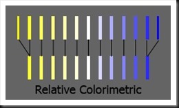
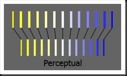
We’ll do Relative Colorimetric first because this is what was described in the example of the blue colors above. The blue that was out of gamut was translated to the nearest blue at the edge of the paper / ink color space. None of the colors that are in gamut are changed. Which is the way relative colorimetric works – colors in gamut are not touched (other than the translation of their RGB numbers from one color space to the other). But colors that are out of gamut are translated to the nearest color at the edge of the color space. Theoretically, relative colorimetric preserves the color at the expense of saturation. As a practical matter, I find that relative colorimetric produces images with sharper contrast and often a little darker than the alternative, Perceptual.  With perceptual the colors that are out of gamut are mapped back to the color space just like relative colorimetric. The difference is that the colors within the color space are also altered, they all get moved closer to the center of the color space. I think of it as being very similar to what I used to do as a kid with a rubber band. I’d stretch it out and write my name on it with a ball point pen. Then let the rubber band return back to it’s regular size and all the letters would get very narrow scrunched together. It was cool. Perceptual preserves saturation but may result in some color and tonality changes. And my experience is that the image tonalities are softened.
  I routinely use both rendering intents and it would be hard to say which one I use the most. I like relative colorimetric for it’s more dramatic look due to the contrast. But often times the shadows become blocked so I switch to perceptual which does a better job of preserving shadow detail or when I want a softer look. It can be a nightmare to keep track of which rendering intent I use. So once I find the rendering intent that I like, I change the file name by appending the rendering intent to the end. The file name may end up looking like big_sur_pfeiffer_beach_130804_rrpm_rc.tiff for a photograph that works best with relative colorimetric (rc) rendering intent printed on Red River Polar Matte (rrpm) paper. See File Naming Strategies for more details. I find that I routinely print two, three, four or even more proofs, tweaking this and that including rendering intent until I finally get the results I’m looking for.
Let’s put it all together. First, calibrate your monitor. Next, use a large color space for your images in post processing such as proPhoto RGB or AdobeRGB. Do not use sRGB for your photos. Finally, when you print use the CMM of the print program, not the operating system, specify the ICC profile for your paper / ink combination, disable color management in the printer and select the rendering intent that gives you the best results.
Do you have experiences and thoughts on color management? We’d like to hear from you; add your comments. And if you know someone who might find these articles useful, please feel free to share it with them, Like us on Facebook, repost it on your website or blog.
Join me on an upcoming workshop. Click here for more details.
To see more of my photographs click here.
(6074)
