It may not be obvious at first but a photograph’s border is a critical element of a successful composition. All too often we get so focused on the subject that the borders get ignored. Because it’s so important I’m writing a second post on the subject. To read the first post you can click on this link – Mastering Composition – Border Patrol.
For this post take a look at this photograph.
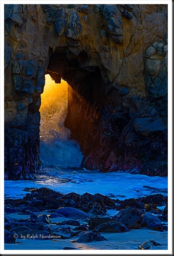
The photograph is of the famous tunnel at Pfeiffer Beach in Big Sur, California. In wintertime, as you can see, not only do the waves come crashing through but the setting sun turns the water to liquid gold. It’s easy to get so absorbed by the spectacle that important elements of the composition get ignored. Can you see what I missed here?
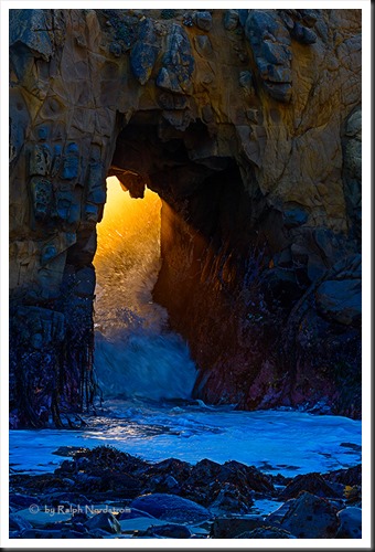
When checking the borders, the top and side borders are fine. But the bottom border has a problem. The rocks are very interesting but the patch of sand in front of them is calling for attention. But we don’t want to do anything to distract the viewer’s attention from the magic that is happening in the tunnel. The solution is to crop out the sand and place the field of rocks on the bottom border. The result is striking.
Now the bottom border is uniform without being boring. The viewer’s eye goes immediately to the glowing golden light and from there explores the wonderful power and textures of the rest of the image – including the bottom border.
It’s worth saying a word or two about a visual foundation. Some images (not all) are strengthened when the bottom border has a visual anchor or foundation. This is one such image. The dark tonalities of the rocks provides a solid base, especially when contrasted with the brighter surf just above it. We perceive dark tonalities as possessing a visual weight which, when placed at the bottom of the frame, impart a stability to the image. One can think of a visual center of gravity just like we think of a physical center of gravity. In the physical world placing a heavy weight near the top of an object raises the center of gravity and makes it unstable and easily tipped over. Placing the weight at the bottom of the object lowers the center of gravity and stabilizes it.
The same holds true in the visual realm. Dark areas have the same effect on the visual center of gravity. At this point you’re probably observing that the borders of the image above are all dark. And I think you will agree that it works. But in the first image placing the light sand at the bottom, besides attracting the viewer’s eye, also disrupted the visual center of gravity. By eliminating it now all the action is concentrated in the center of the image (and there’s plenty of action!).
I might also point out a couple more things about this photograph. First is the placement of the tunnel. Not surprisingly, it’s on the left 1/3rd line. Simply moving it off the center of the image creates visual tension which adds interest. The wave itself also has a curved shape that turns into the center of the frame. The curve of the wave and the placement of the tunnel complement each other to create drama.
The color palette of the image also adds to the drama. By making the surf in the foreground a cool color, the blazing gold of the tunnel becomes even more powerful. Blue and yellow are contrasting colors; that is, opposite each other on the color wheel. And including them both in the image attracts the viewer’s eye, especially when they are in close proximity to each other.
But these considerations are the same in both photographs. Both are identical except for the bottom border. And a simple tweak there produced a much stronger image.
As always we enjoy hearing from you so please don’t be shy. Speak up and share your experiences with us. We invite you to leave a comment.
Also, please feel free to share this post with your friends, on Facebook, Twitter, Google+ or wherever your social media wanderings take you.
Join me on an upcoming workshop. Click here for more details.
To see more of my photographs click here.
(2305)


