I have a good friend who is a very fine photographer who hates Photoshop. Not me. I love it and will spend days and weeks on a single image. But my friend hates Photoshop and wants to get done with it as quickly as possible.
So I showed him a simple two-step approach to Photoshop that gets you a long ways toward a great looking photograph. And I’d like to share it with you now.
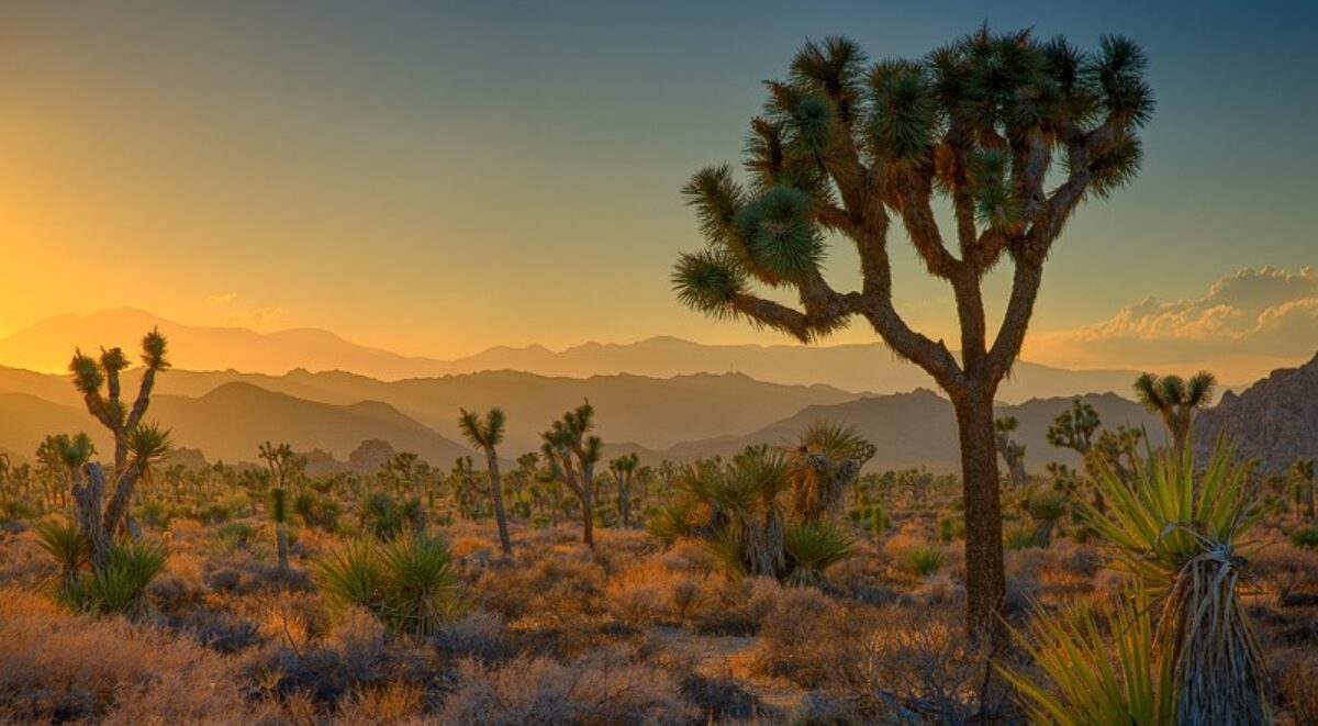
Let’s start with a nondescript image. You may recognize Manley Beacon at Zabriskie Point in Death Valley, California.
It’s a very low contrast image, one that doesn’t command a lot of attention. Contrast is one of the most psychologically powerful controls you have to work with when preparing a photograph. Contrast adds interest and draws the eye of the viewer.
Related to contrast is Black Point. What is that? It’s that area of the image that will print as the blackest black your printer, ink and paper are capable of producing. Most photographs can benefit a great deal from a black point. It provides the tonal foundation for the entire image. Now the area that is black has no detail, something we generally try to avoid. So you don’t want large areas of the image toally black, just a few little specks here and there.
The opposite of black point is White Point. Many images, especially black and white, benefit from a white point. My experience, however, is that color images often do not benefit from a white point. In fact, a white point often detracts from the image, making it look washed out. So most of the time you won’t want to set a white point.
So how do you set a black point and white point in Photoshop? The simplest and most convenient adjustment to use is Levels.

It displays a histogram of your image and immediately below it are three sliders. The slider to the left, the black one, sets the black point. The one to the right, the white one, sets the white point. The middle one sets the mid-tones.
So, let’s set the black point. While holding down the ALT key, click on the black slider and slide it to the right. The image will go blank and as you you slide blacks will start to appear. Adjust the slider until you have just a couple of specks of black and release the ALT key.
You can repeat the same process with the white slider although, as we said above, setting a pure white point in a color image may not be very desirable. Just play around with it until it looks right.
One last thing to do is slide the mid-tone slider left or right until the overall contrast and tonality looks good to you.
So when we do that to our image, how does it look?
Better already, I’d say. You’ll notice besides the image having greater snap, the colors are a lot more saturated. That happens when you adjust tonality. In general, if you darken an area you will also saturate the colors. This leads to the second step.
In the second step we use the Hue/Saturation adjustment. With this we can fine tune the colors and give the image a bit more sparkle.

The Hue/Saturation has three sliders – Hue, Saturation and Lightness. And very important, the drop down at the top allows you to select six colors – Red, Yellow, Green, Cyan, Blue and Magenta. You can adjust each one separately. Master adjusts all colors at once but I would never recommend that.
To use Hue/Saturation, look a color you want to adjust. In our image, we can brighten up the subject a bit by saturating the yellow. Also, the sun light falling on the Panamint Mountains across the valley can be subdued a bit by adjusting the red. Finally, the blue shadows on the mountains and valley can also be subdued a bit.
You have three controls. The one I go to first is Saturation. Sometimes you increase saturation; sometimes you decrease it. Hue will shift the color a bit. For example, if you’re working with yellow you can make it a little more orange or more green with the Hue control. The Lightness control is very subtle. I don’t use it very often but sometimes it comes in handy.
So after applying a little red, yellow and blue saturation, how does our photograph look now?
So there we have it. Not bad for maybe ten or fifteen minutes of work. Compared to what we started from it turned out quite nice.
Levels and Hue/Saturation are two tools in our toolkit, two words in our creative vocabulary that add dramatically to our ability to express ourselves through our art.
You can see more of my work on my website – RalphNordstromPhotography.com
(1063)
Thanks for posting this, as I’m sure it will be useful to many people out there. The more you know and prepare yourself, the better off you’ll be.
Hi Ralph,
Thank you very much for this excellent two-step method to enhance photographs. I understand that these two steps are a mimimum and that a lot more actions or steps can be applied but it is a good start.
Hopefully more steps will follow….
Johan