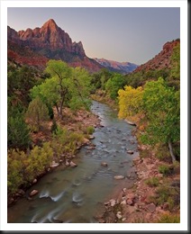
I was working on a photograph last night that turned out rather well. It was taken during a recent photography workshop in Zion National Park in Utah. I took the group to the famous bridge to photograph the Virgin River and the Watchman Tower at sunset. It’s a must photograph. It seems every photographer in Zion with a tripod is there. But we also returned for sunrise and had the bridge to ourselves.
There is a time of day when exposure becomes very tricky. This is during twilight when the sun is a little below the horizon so the earth is dark but the sky is very bright. You end up with what I call the “Grand Canyon” histogram – there’s a huge spike at the shadow end and a similar spike at the highlight end with a large gap in between. This is a challenging situation that, if you master, can provide some spectacular images. In this blog I’d like to walk you through the process.
The Captured Image
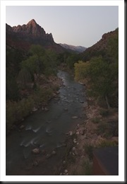
Let’s start with the image that was captured out there on the bridge.
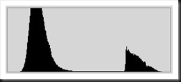
It doesn’t look like there’s much to work with here. The foreground is very dark and the sky is really bright. But it’s not washed out and that’s a good thing. In fact, the exposure was carefully set to two stops under so as not to wash out the sky. If the sky is clipped there’s nothing that can be done to recover it other than dropping in a sky from another photograph and I choose not to do that. A check of the histogram reveals a challenging but manageable situation.
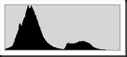
I call this the “Grand Canyon” histogram. There’s a huge spike toward the shadow (left) side and another spike towards the highlight (right) side with a large gap between them. The shadow spike would be the dark foreground. It occupies about three quarters of the image area so this spike is tall and wide. The highlight spike is the sky which occupies about one quarter of the image area so it is correspondingly smaller.
The key factors that make this a workable image are that the highlight shadow does not run all the way to the right side. If it did we would have highlight clipping that probably couldn’t be recovered. That would have been the end of the story right there. The other key factor is that the shadow spike sits well away from the left side so we don’t have any shadow clipping either. The biggest challenge with this image is to try to pull the two spikes closer together; in other words, move them both towards the center. We’ll start that process in Lightroom.
Raw Image Conversion – Lightroom
I use Lightroom for my raw image conversions. Many people refer to the raw images as the negative and raw image conversion as the development process. Lightroom (along with all the other quality raw image conversion programs out there) offers a wide array of functionality, so much so that many photographers only use Lightroom to process their images.
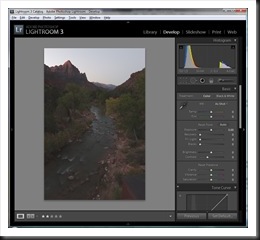
Here’s a screenshot of Lightroom for you to refer to when I talk about the controls.
The first thing I needed to do was crop the bridge out of the lower right hand corner. I figured a 4X5 crop would work well for this image instead of the 2×3 crop that is native to the camera’s sensor. So I created a virtual copy of the original and cropped the image. I really didn’t need to make a virtual copy as all of Lightroom’s adjustments are non-destructive. But I find it convenient if I end up in a place where I need to start over. I can just create another virtual copy and try it again. And I still have the original attempt to refer back to.
Next I needed to pull the highlight spike down towards the center. To do this I used the Recovery adjustment. It’s for recovering highlights. (I don’t have screen shots of every step or the process – sorry. Just follow what I’m saying and you’ll see the end results.) Next I tried to bring the shadow spike more towards the center with Fill Light. That got the two spikes closer together but I wasn’t satisfied with the results. They were still too far apart. So I went for the big gun – Exposure – and decreased it about ¾ of a stop. This shifted the whole histogram down and got the sky in a range that I liked. Then adding more Fill Light opened the shadows back up. A little Blacks to set a black point and the image was starting to look a lot better.
The histogram looks better too.
There’s still work to do but we’ve dealt with the most challenging problems in Lightroom. Time to move on to Photoshop.
Refining the Image in Photoshop
Now I’m really starting to think about how to make the image work. I prefer working on tonality before moving on to color. One of the first things I do is set a black point. This becomes the tonal anchor for the image. I prefer setting black points in Photoshop because I can use a Curve which has so much more flexibility and power than the Tonal Curve in Lightroom. At the same time I can make a global adjustment to the brightness. Another tonality thing I needed to do was brighten the foreground without brightening the sky. So I used another curve, masked out the sky with the paint brush and brightened the foreground.
Next came some color adjustments. There are two things you can adjust with color – hue and saturation. I thought the hues were right on so I made no adjustments to them (Lightroom is a better place to do this adjustment as you have Temperature and Tint which is a lot easier to use than Color Balance in Photoshop).
I thought the yellows could benefit from a little saturation so they got just a bit – not much. This brightened up the cottonwoods to bring out the vibrant green on the leaves before they don their autumn colors. I also thought the Watchman Tower could benefit from a little red saturation so I masked out the rest of the image and bumped the red just a bit. I wanted to emphasize the glow that the bright eastern sky was casting on the top of the Watchman.
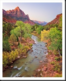
The image was starting to look pretty good on my monitor now. It was time to see what it looked like on paper. But before we go there, here’s what we have so far.
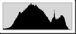
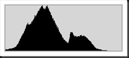
And here’s the histogram.
You can see it’s a far cry from what we started with.
Printing – the Final Step
It looks like I’m getting close to what I’m after – a warm glow on the Watchman with the cottonwoods in the foreground displaying their lime green foliage, the beautiful color that touches the leaves just before they turn yellow. So I created a proof print. And was disappointed.
The image turned out really flat. It had no life, no light. I wasn’t sure what to do with it so I set it aside for a while. I finally realized that there were two problems – tonality and lack of contrasting colors. The foreground was a little too light but not all of it. The cottonwoods were fine but something else was wrong. It was the river bank. It was too bright. My first attempt to darken it was with Selective Color. It’s better for selectively darkening colors than Hue/Saturation. I darkened the red channel making sure to mask out the red cliffs in the background and it brought the river bank down nicely. But it wasn’t enough. So I added some saturation to the reds in the bank. I used Select | Color Range to create a mask with just the areas I wanted to saturate and then used Hue/Saturation to punch them a bit. This added some complementary colors to the greens of the trees and the blues in the sky. But it still wasn’t enough. So returning to Select | Color Range I selected a larger area of the bank and used Curves to darken it. Ah, that’s better.
Next I noticed some oversaturation on the Watchman. I wanted to capture the morning glow but had overdone it in a few places. Calling upon Select | Color Range once again I selected just those areas that were oversaturated. This created a mask that I was able to use in Hue/Saturation to desaturate them and correct the problem.
Finally a little Vibrance helped the blues in the sky and the little bit of the blue in the water. But it also oversaturated the blues in the cliffs in the far background. So I masked those out with the brush tool. This decreased the saturation giving them a feeling of being off in the distance.
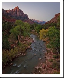
So a few changes and a few test proof later and we ended up with the final image.
 |
 |
 |
 |
Wow, what a difference. The point is that the original capture is a very workable image because we don’t have any highlight or shadow clipping. The trick was to deal with the Grand Canyon histogram by pulling the two extreme spikes back together. If the original capture had been exposed one stop higher it would not have worked. There would have been too much highlight clipping to get a decent sky in the final image. It’s easier to pull detail out of the shadows than it is to recover blown highlights.
Some people might object because they’re worried about noise in the shadows. But with today’s sensors noise is not near the problem it was even just three years ago. And we have lots of great tools for dealing with noise. My question is, “Do you want to walk away from the shot because you’re worried there might be noise, or do you want to take a chance and get the shot?”
Others may say that the final image doesn’t reflect reality. Well, no it doesn’t but neither does the original capture. The original reflects what the camera saw which isn’t what we were seeing as we stood on the bridge that beautiful morning. The final image is closer to what we physically saw. But it is more than that. It hopefully communicates the joy and excitement I felt as I stood there at the dawn of a new day in one of the most breathtaking places on earth.
So that’s the process. Let me hear from you. I’d like to know what you think and your experiences.
Join me on a photography workshop.
To see more of my work click here.
Thank you for reading this post.
(1803)

Ralph,
I enjoyed this post. i have decided to take the plunge and learn to use photoshop. To date all my post processing has been in Aperture which I am generally happy with. However I see that I can go a lot further with the process with Photoshop. I am taking a short course at our local community college on Photoshop. Do you have a reference book about using Photoshop that you would recommend.
Thanks,
Larry Lindell
Not really. I bought Scott Kelbey’s book but haven’t looked at it enough to recommend it. That being said, however, Scott’s book are pretty much the standard as far as Adobe is concerned.
Thank you, Ralph. I appreciate the walk-through on your work with this photo. Beautiful.
The subject is timely, and I remember when I first saw your photos about 3 years ago in Palm Springs that I DID ask if you enhanced them in any way; I wanted assurance that it was ok!
You said that you only brought out the beauty that was already there – very true. Thanks again, Deborah C.
Thanks Deborah.