When I first got my Epson 4800 printer I was tackling so many learning curves all at once that I really didn’t spend any time experimenting with papers. I was learning the virtually unlimited possibilities with Photoshop, getting used to the vast field of color management, Lightroom came along and that presented a new learning curve, HDR with PhotoMatix, LightZone, Photokit Sharpener, Imaginomics Noiseware Pro and more. Plus I was focusing on composition, light, post processing, soft proofing, etc.
It’s no wonder that paper was not high on my list of things that needed my complete focus and attention. I settled on Epson Enhanced Matte, a paper that gave me the effect I was looking for; that is, photographs that looked like paintings. And given the number of artist’s proofs I had to print before I got a print that I was satisfied with, it didn’t hurt that it was a fairly inexpensive paper.
Epson Enhanced Matte is a really nice paper for what I wanted to do. And I’ve never looked back at the decision to go with matte. I briefly tried some glossy and luster papers and didn’t like what they did for my photographs. So I was happy to stay with a matte surface.
But I didn’t realize when I started that the low D Max would be a challenge or that there would also be some color gamut difficulties, especially in the yellow-browns. These made working with some images rather formidable. It took a while but I finally started understanding what was going on and anticipating and pretty much avoiding these problems. Then…
Enter Red River Papers
Then a little over a year ago I wanted to print our Christmas cards and my brother told me about Red River papers. They have a 7X10″ size that’s scored in the center that makes a perfect 5X7″ card. Red River has a huge selection of papers so I got their sampler and gave them all a test. The paper that stood out way above all the others was their polar matte. When doing side-by-side comparisons I was blown away. There was more shadow detail than I had ever seen on a matte paper. And the images glowed. It was an exciting moment. So I switched from Epson Enhanced Matte to Red River Polar Matte and have been very happy.
Another benefit of RR Polar Matte is the large selection of paper sizes. Most of my images have an aspect ratio of 2X3, the same aspect ratio of our sensors. And 90% of the images I print are composed for this aspect ratio. But more and more I’m visualizing compositions in the field that work best with a 4X5 aspect ratio. With Epson I was limited to a paper that was roughly 11X16 unless I wanted to go to 17″ roll paper. Bear with me for a moment as we go through the math. My normal print size for a 2X3 aspect ratio image is 10X15. This fits nicely into a 16X20 frame. To keep the same image length for a 4X5 aspect ration image, a 12X15 print was required. But my Epson paper was only 11″ wide. So I ended up making the image smaller – 10X12.5. The problem with this image size is that it is more suitable for an 11X14 frame than a 16X20. But RR has a paper that is 13X19, just the perfect size for my 4X5 images in the larger frame. I’m definitely pleased with the impact these 4X5 images make. I can see why large format photographers love this format. This will certainly have an effect on the way I compose images in the field.
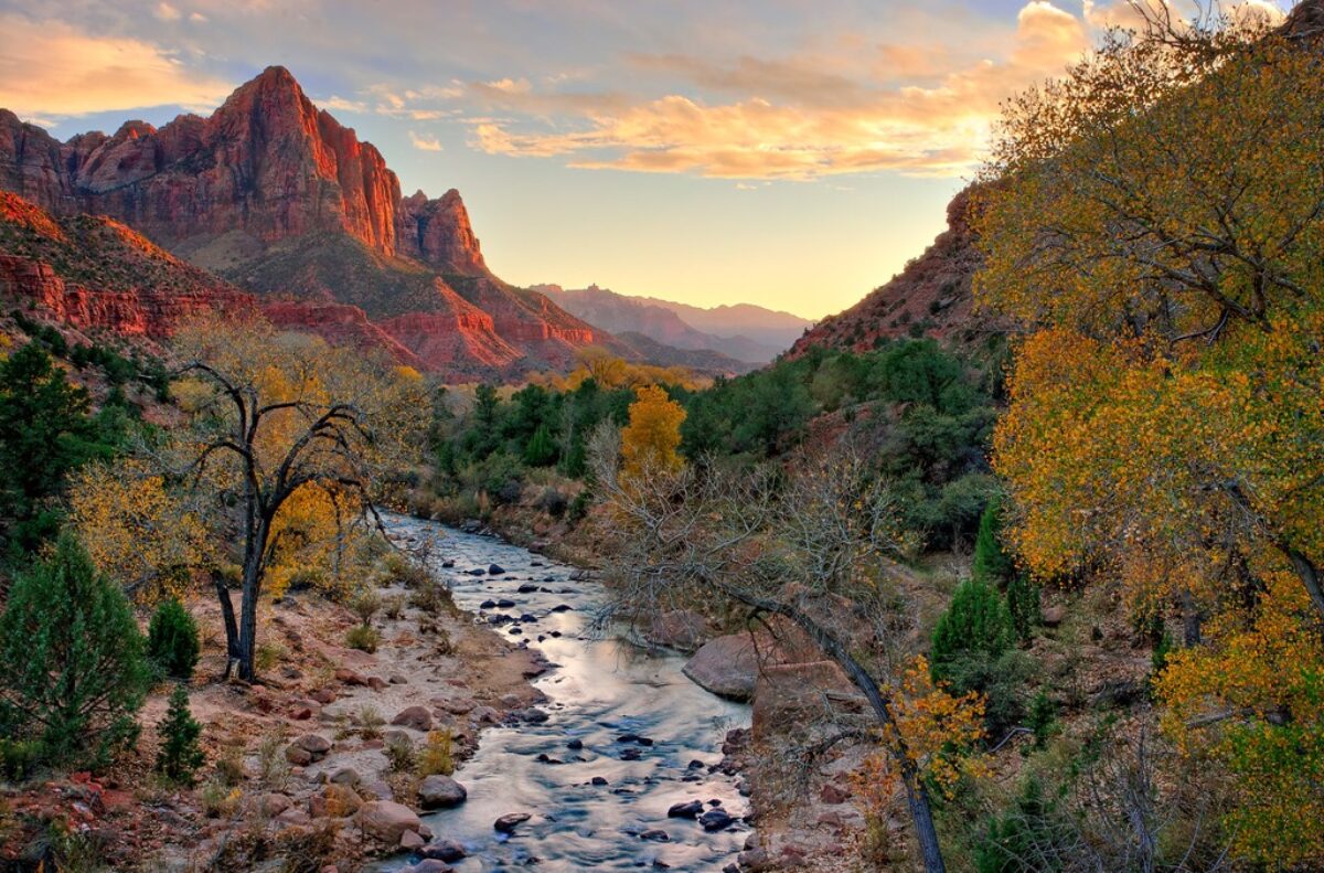
So now that I’m comfortable with all the variables that were demanding my attention early on (Photoshop, Lightroom, et al.) I can start exploring different papers. I’ve heard some wonderful things about Red River Linen. So I bought a box and gave it a try. I used one of my most glowing images for the test – Bristlecone Moon. Here are my first impressions.
The texture is just wonderful. The surface has a linen grain that is very sophisticated. The paper is not quite as white as Polar Matter (which is the hallmark of the latter). The color gradations are very, very nice. There is a transition from blues to purples in the sky. Both papers produce a smooth, very pleasing, almost magical gradation.
The overall image is softer than with Polar Matte. The colors are not quite as saturated and some of the fine detail like the grain of the wood is a little softer. The dynamic range is not as great but still more than adequate. The color rendering between the two papers is exactly the same (I’m using Image Print phatte black profiles). These are all things you would expect from a linen surface.
However, I think this is exactly what I’m looking for with my larger prints. My images are pretty intense, pretty dramatic. That works well for smaller sizes. However, sometimes I feel they’re a bit overpowering in larger sizes. I’ve tried to soften them just a bit but that requires a print file for the larger sizes that doesn’t come directly from the master file. And you introduce more variables that can result in slight differences in colors and saturation. With Linen, the softness can be achieved through the paper. And the good news is the print file is created directly from the master file with no changes whatsoever.
So I’ll continue to use Polar Matte for my note cards, 8X10 and 11X14 prints. The 16X20 prints may go either way but will probably tend more toward Polar Matte. But when it comes to larger images I’m using Linen from now on.
(1341)