What I’d like to do is keep a journal of the steps I go through and the decisions I make when creating the Zion Canyon print. It was shot on 11/24/2007 near the Great White Thrown turnout. I was there the day before closer to sunset and realized this shot needed to be taken about an hour earlier. So I came back at 4:15 the following day. The shot required both stitching (vertical panorama shots) and HDR (three exposures bracketed at +/- 1 stop) for a total of six shots.
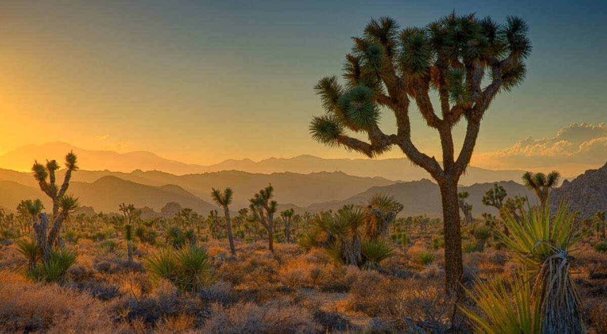
The image was shot down by the Virgin River although it’s not in the picture. The foreground is a meadow in the shade with two cottonwood trees. The middle ground is a Navajo sandstone cliff jutting in from the right, also in the shade. The background is a tall cliff, also Navajo sandstone, that is still catching some sunlight. The sky is cloudless and blue.
Here then are the steps I’m going through to take these six shots from RAW to a finished print. It will probably not be completed today. Sorry I can’t show the before and after of each step. That would be interesting.
Step 1 – DXO.
I just got DXO and was eager to try it out. So I processed the raw images in DXO using pretty much the default processing and output the files as DNG’s. I was very impressed with the results from the default selections. DXO applies corrections based on the camera and lens you use, and the aperture and focal length of the lens. It has a database of correction factors that remove the distortions created from the lens such as sharpness, chromatic aberration, vignetting and the like. It also has some very sophisticated algorithms that optimize the tonality and color of the files. The before and after images that DXO displays showed a very significant amount of detail recovery in the shadows as well as some very effective sharpening. This is getting off to a very good start.
Step 2 – Lightroom.
I next used LR to export the DNGs as TIFFs. But before doing that I need to make sure that all six images have the same white balance. The upper image in the panorama has a higher temp than the lower – 4750/+2 vs 4200/+4. I’m going to go with the higher temp because the preview of the lower images in LR has a cyan cast. So I’m changing all the white balance numbers to 4750/+2.
There’s still some shadow clipping in the overexposed images. I’m decreasing Blacks to 0 and increasing Fill Light to 10. There’s still a little clipping in the shadows but it’s only in the yellow channel. I’ll make the same changes for all six images. The rationale here is to apply the same corrections to each of the six images so that when we stitch them together a couple of steps from now there won’t be any color balance or tonality differences.
Finally, I’m exporting the DNG images as TIFFs.
Step 3 – PhotoMatix
I’m going to process the three photos that make up each of the two vertical panorama shots separately. The three TIFF files are identified and PhotoMatix generates the HDR 32 bit image. With 32 bit images it’s possible to capture the entire tonal range, no matter how great it is. As long as one of the images does not have shadow or highlight clipping the resulting 32 bit image won’t. I’m saving each of the HDR images for future reference if I need to redo the next step – tonal mapping.
Tonal mapping compresses the tonal range of the 32 bit images back into 16 bits. There are a number of controls but I’m not going to deviate very far from the defaults. The major thing I’m looking to avoid is highlight and shadow clipping. Both images are processed identically.
The bottom half of the pano looks very nice. The color cast that I saw in LR is not present. It’s still very sharp. I set the White Clip and Black Clip both to 0. All other controls are set to their default. Even the parts of the wall that are betting direct sunlight show detail. And the histogram of these parts shows no white clipping (although a little black clipping). I’d rather have a little black clipping than white. I’ll save this one as a 16 bit image and repeat the process for the upper half of the pano using exactly the same settings.
It’s getting exciting. What’s really neat about this is I’m not seeing any chromatic aberration in the silhouette of the tree branches against the blue sky. In the past before I used DXO there could be some rather annoying chromatic-aberration-caused halos.
Step 4 – Stitch the photos in PhotoShop
I now have two TIFF files that contained the images that were identically tonally mapped. I’m now going to open both them in CS2 (CS3 is on the way but CS2 will do). I’m selecting File | Automate | Photomerge and including both open files. Oh yes, Photomerge has to convert the files to 8 bit to merge them.
The merge is successful. The tonality and color balance is smooth and uniform throughout the entire merged image. The top and bottom images don’t align on the edges perfectly because I don’t have a pano head for my tripod. I manually changed the upward angle as best as I could but not surprisingly was a bit off. I’m going to switch on Advanced Blending although I don’t know what that does. But at this point it sounds good. I’ll accept the preview by clicking OK.
Well, the color is way off but that can be corrected. It’s too green in the shade. But the tonal range is excellent. However, checking the alignment at 100% magnification shows some problems in the trees on the left side of the image. Most of the branches align just fine but some do not. As one moves to the right the problem disappears. This comes from not having a pano head. Looks like I’ll be calling Really Right Stuff for their pano head if I’m going to get serious about this stuff. I’ll have to crop off the left side to eliminate the mismatches. I’ll do that toward the end of the process.
The image is pretty much square. I’m cropping it to make the edges straight. Now the dimensions are 8.4″ by 7.4″ @ 360 ppi or 3022 by 2657 pixels. There’s a bit of resolution to work with there. Not bad for a 6 MP sensor.
Step 5 – First Photoshop steps
I have a PS action I apply to every image at the start. I normally just run the action but since I’m using DXO this time I don’t know if I’ll need all the steps. So I’ll run through them manually.
But before I do these steps I better covert the image back to 16 bits.
The first step is to duplicate the Background layer and apply USM to the duplicated layer. But the background layer isn’t called Background, it’s called Photomerge. So I duplicate the layer, label it USM and apply the USM filter to it – 25 70 0. This is a great trick for adding life to the image. At these settings it doesn’t do any sharpening but adds brilliance to the image. These settings work just fine so I save them.
The next step is to do capture sharpening with the PhotoKit sharpener. I don’t know if it will be necessary as the image is already very sharp.
Well, it turns out the PhotoKit sharpener won’t run on this file so I’ll flatten it and try again.
Just as I suspected, the image is over sharpened, even with the Capture sharpen which us usually very subtle. So I’ll undo it and move on with the next steps.
The last two steps are to create two layer groups, one called Global Adjustments and the other called Local Adjustments. With that done it’s time to move on to the next steps.
Step 6 – Global Adjustments
From this point on the adjustments become pretty free form. I usually start with global adjustments followed by local adjustments but the order is really determined by the most obviously needed correction.
I think we need to start with the color cast in the shadows. Checking the RGB values for a black shadow, one can see there is a cyan cast. I think I’ll use a Level layer to adjust the shadow color cast to see how far I get. I use the Color Sampler tool to mark a shadow on the cottonwood tree that should be neutral black. The RGB values are 7, 14, 22. Next I create a Level layer and adjust the RGB levels to make it neutral – all three values are the same, 7 in this case.
Well, that’s much better. The adjustment took out some green (added magenta) and a lot of blue (added yellow). The Navajo sandstone cliffs glow even more.
I think the next thing I want to do is desaturate the blue. The sky is a little too loud and dominating. Sometimes I like to do saturation adjustments with Selective Color. It works very well this time. I adjusted the cyan and blue channels, lightening them both and adding yellow and a little cyan to the blue channel and adding yellow and red to the cyan channel. In addition to softening the sky a bit it also had a very favorable affect on the foreground.
Next I want to apply the Sudden Black technique to make some areas of the image go to total black. Using the Levels adjustment to determine that amount of black I need to add I came up with 12. I’ll use the Curves adjustment to actually apply the 12 points of black without affecting the tonality of the rest of the image. This is a very subtle adjustment indeed.
Before working on the yellow and red saturation of the walls I’ll work on their contrast, especially the big wall that’s catching the sun. I don’t want to change the tonality in the foreground, just on the big wall. So I’ll lock down the shadow range of the curve and the wall’s highlight areas and darken the shadows on the wall. It doesn’t take much of an adjustment, just a little darkening of the shadows and brightening of the highlights.
Next comes a little red and yellow saturation. I lightened the red just a little before saturating it, again, just a little. And I changed the hue of the yellow to make it less orange and more yellow and added just a touch of saturation. I’m trying to make it look like it’s catching some of the warm, setting sun – which it is. Actually, it looks better if I decrease the opacity of the saturation layer to about 50%.
Step 7 – Crop and print
There aren’t any local adjustments that jump out so it’s time to see what this image looks like on paper. I want to crop off the left side that had the alignment problems. But I’ll save the file first. This is my master file.
Well, there’s a nice vertical crop that is very strong. It includes just one cottonwood tree and crops out part of the middle ground cliff. It emphasizes the tree in the foreground against the big wall in the background. The tree is actually leading into the big wall.
But the foreground is too light. Return to the sudden black layer and darken the shadows more. The change affected the colors and saturation in the shadows so change the blending mode to Luminosity. Now the background wall is a little weak so return to the red and yellow saturation layer and increase the opacity to 67%.
Time for a print. Save the file under a different name and go through the print routine – flatten layers, re-size (this time to 6X9), up-sample to 360 ppi, and finally output sharpen. Flatten again and save.
Print using Image Print two ways – RC (relative colorimetric) 100 and P (perceptual) 100.
The RC100 print is out. Some parts of the cottonwood trunk could possibly benefit from some dodging. The composition is good. The sky looks good, not to dark and not too blue. The big wall looks great. However, the image is over-sharpened, at least in parts. I may need to go back and create a mask in the light contour layer and mask out some of the areas that are over sharpened. There are just a few places where the sharpening is too much. Otherwise, it’s a really cool photograph.
The P100 print is now out of the printer. As expected, it is a bit softer. I like the big wall in the RC100 print better. I think we’ll go with that one.
But that’s enough for session 1. I’ll put the two prints on the dining room table and check them in the morning to see if I still like them.
(482)