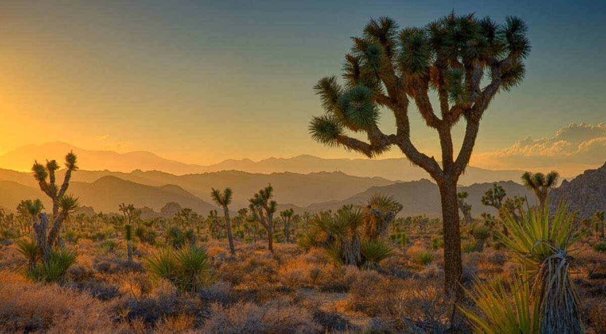
Well, as anticipated, I didn’t particularly like the print from last night. I seem to be having a problem with creating images that are way too cool in the shadows. So, how best to warm up the shadows?
Too blue
One can always try a warming filter. The #85 at 25 to 33% is actually pretty nice. The colors in the shadows are still a bit cool but look very natural. Next I tried the LBA at 33%. Finally, #81 at 33%. I created three layers so I could turn them on and off to see which effect I liked the best. The differences are very subtle. So I punched up the percent on all three to 50. the #81 is the warmest with more red but I think I’ll try something else.
Levels can be used to adjust colors. The nice thing about Levels is you can adjust the mid-tones without affecting the shadows or highlights and it’s the mid-tones I want to change. So I created a Levels layer and adjusted the red and blue channels. I increased red to remove cyan and decreased blue to add yellow. After playing around with it a little the effect on the foreground was very pleasing. I could also try to do the same thing with Curves – adjusting the red and blue channels but this is good. I’ll leave this like it is for now. I’m certain I won’t want to use the warming filters so I’ll delete those layers.
Distractions
Now there are a couple more things that need to be fixed. The wall immediately behind the tree is too bright. It’s pulling the eye away from the subject which is the wall above it in the sunlight. I need to darken it. It’s ruining the composition.
With the Magic Wand I’m gong to create a mask that select the tree. OK, that was a bit tricky but now it’s done. Now create a Curves layer and invert the selection. This will go in the Local Adjustments group. Pick a spot in the shadow part of the wall and pull down the tone. But this darkened the sky and sunlit part of the wall too much. So I’ll need to create a mask for that part also. But before I do I’ll duplicate the layer because I may want to work on the tree some.
With the layer duplicated I’ll paint a mask into the top of the image. Well the mask turned out to be pretty big. I may not have had to Magic Wand the tree but it didn’t hurt. I’d like to work on the tree a bit now. I’ll use the copy layer, invert the mask and lighten the tree. It works fine for the highlights on the tree but it has some very deep blacks. So I opened the Sudden Black curve layer and tried to open up the blacks just a little. Then I created a Dodge and Burn layer and dodged the blacks some more.
The tree is looking better now. By lightening it some it makes it one of the subjects, something I want it to be. It’s going to be interesting in that it is both light and dark, a silhouette, depending if it’s at the bottom or top of the image.
Repair the sky
It’s time to turn attention back to the sky. It looks rather gray. I went back to the original Selective Color in the Global Adjustments group and played with that but it had too great of an affect on the shadowy foreground. So I’ll create a Selective Color layer with a mask in the Local Adjustments layer and work on just the sky. It just took some lightening and adjusting the blue and cyan in the blue channel.
It’s getting late but I see one more global adjustment to make. The image is dark and contrasty. I’ll use a curves layer to lighten it up and soften the contrast a bit.
That’s enough for one night. I’ll print it and see how it looks in the morning.
(488)
