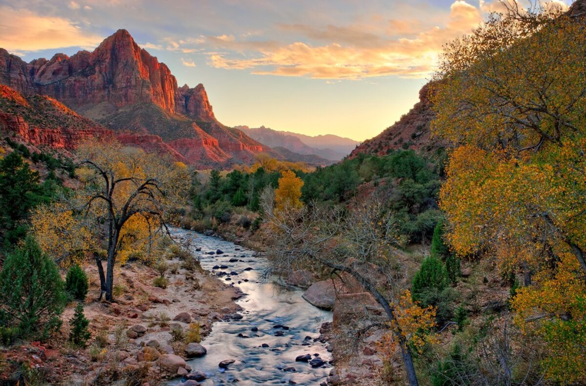
I love the time in the morning when the eastern sky just begins to show the first hint of the dawn. The world goes through an amazing transformation up until the sun peeks over the horizon and begins its march across the sky.
My camera and I are very active during that time but I have precious little to show for all the gigabytes of images we’ve captured. That’s not to say I haven’t tried really hard. But none have turned out to my satisfaction. They all seem so heavy-handed and certainly don’t capture the serenity of the moment.
Well, I had an idea today. It goes back to something I experimented with a couple of years ago and couldn’t get to work. The basic idea is to work in black and white first and later restore the color. The thought behind this is to get the tonalities right first without the distraction of color.
What I am about to describe is done in Lightroom and doesn’t use any of the local adjustment features of LR 2.
So, my first approach was to set the image to Grayscale in the Treatment area of the Basic control group in LR. I wasn’t after anything fancy here, just to get the image into BW. Next I adjusted tonality – black point, white point, contrast, etc. In this step I was after a good looking BW image. Next, back in the Treatment area I set the image back to color. What I found was the color image was WAY over saturated. Later I learned that was because I was working in RGB and not Lab. So I tried Lab but never really got the hang if it.
Then today I had an idea. I was working on an early morning photo from last month’s Grand Canyon trip and wasn’t happy with the way this one was turning out either. So I fired up LR again and selected the image I had been working on. Let me walk you through the process. It’s the same idea but executed in a much more controlled manner.
Here’s the starting image. Actually, due to the extreme dynamic range, this is an HDR image. But this was the starting point. There’s lots of atmosphere in this image. And a lot of blue. You would expect it to be cool because the main source of light is the blue sky. I like the sense of atmosphere but I’d like to moderate the blue, bring some warmth into the rocks and maybe a little more definition to the cliffs in the middle ground. 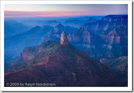 The first step is to render the image to black and white. But instead of using the Grayscale feature, I turned to the HSL control. You can render colors in gray scale by reducing their saturation. So I selected Saturation and set the slider for each color to zero. The result is a BW image.
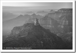 It looks good this way. There is still lots of atmosphere in the distant haze. But I’d like to try to get a little more contrast in the middle ground cliffs without loosing the hazy feeling. And I’d like to open up the dark area in the center and bottom a bit. A little playing around with the Basic controls yielded the following.
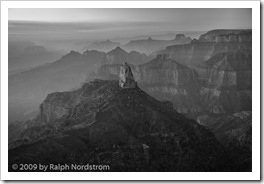 In this example the differences are pretty subtle but can be seen when you enlarge the two images.
The next step is to reintroduce color by increasing the saturation one color at a time. The nice thing about this process is that it turns out to be easier to add color than to try to take it away. You can always add a little of one color, them some of another and jump back and forth until you get close to the effect you want. So after a few minutes this is what emerged.
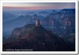 The image is still cool but it’s not the overwhelming blue of the original. The foreground has a lot more detail and is much more to my liking. The middle ground has a bit more definition because of the adjustments in the tonality we made in the last step and the reduced intensity of the blue.
But it’s still too blue. The image would be strengthened if there were some contrasting colors. It doesn’t have to slap you in the face; there just needs to be some soft oranges and yellows to complement the blues. This will add a lot of visual interest to the image. To do that I turned to Color Temperature. Increasing the color temperature (shifting the color balance to the yellow) produced this image.
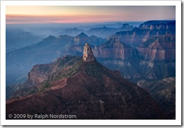 This change produced a very pleasant surprise. By adding yellow the spire in the center of he picture separated itself from the blue background and the image became much more three dimensional. The effect is subtle but very real.
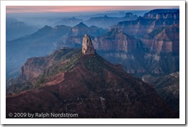
One final change is needed. The sky in the upper left hand corner is very close to being blown out and very distracting. I tried several things to darken it, desaturate it and the like. I considered waiting until I got the image into Photoshop to deal with it. But then I decided to crop it out. The sky isn’t needed to make this image work. It’s really the rows of receding ridges reaching above the blue haze that gives this image its impact. So out came the crop tool.
 This is much more pleasant than what I’ve been able to come up with over the past several weeks. I’ll sleep on this and return to it another day. I find that I get caught up in what I’m trying to do and when I see it a day or two later I often wonder what I was thinking. So there may be some more adjustments in Lightroom but it’s very close to being ready to import into Photoshop for the fine tuning.
To make the before and after comparison easier, here they are side-by-side.
 |
 |
We conduct photography workshops. Click here to check them out.
To see more of my work visit http://RalphNordstromPhotography.com
Finally, we invite you to join us on Facebook and become a fan.
(666)
