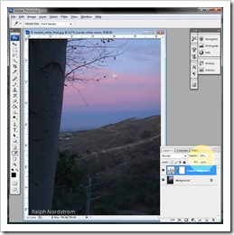
I got a Photoshop question from Lynne in Iowa, a dear friend for many years. She asked how you could adjust an area of an image to make it pure white. I gave her a quick email response that outlined a technique but the question really deserves a more detailed and complete answer. So, Lynne, this is for you and anyone else who encounters this situation in Photoshop.
In this Photoshop tutorial I am going to show you how to make this correction using an adjustment layer. This technique actually applies to two situations that are encountered quite often – getting neutral blacks and neutral whites.
Let’s take just a moment to describe what is meant by ‘neutral’ blacks or whites. On our computers, colors are represented by three numbers; e.g., 0,0,0 or 128,128,128 or 255,255,255. Each of these numbers tells how much red, green and blue are combined together to make a color. The first set – 0,0,0 – describes pure black – no color. The last set – 255,255,255 – describes pure white (that’s a little bit of a white lie but not important enough to launch off on to a tangent). The middle set would be a shade of neutral gray. Because each of the three numbers is the same, the resulting color is neutral; that is, no color cast A black with a hint of red might look like this – 5,0,0.
The reason for dipping into this brief technical discussion of computers and colors is because the three numbers that describe a color are at the heart of this technique. We will adjust the three colors in an area that is supposed to be a neutral shade of gray so that they are all the same.
Let’s use an example. This is an image I took from my back yard on a morning when the full moon was setting. There was a beautiful earth shadow and the moon is descending though some thin, pink clouds. We know the moon should be white and in fact it looks white. But we will first check to make sure and if not, adjust it to neutral white.
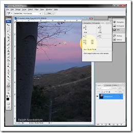
The first step is to determine the actual color of the moon. To do that we will select the Color Sampler Tool from the tool bar.
A click on the moon leaves a little target that gives us a sample of the color a that spot which is also recorded in the Info box.
The Info box tells us the color for sample #1 is 239,219,208. It’s actually a bit red because the red number is higher than both the green and blue numbers. Well, that’s not all that surprising because the moon is behind a pink cloud.
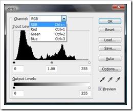
We’re going to use the Levels adjustment to make the moon neutral white. We start by adding a Levels adjustment layer and naming it “Levels White Moon.”
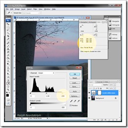
One feature of the Levels adjustment that often goes overlooked is the fact that we can also adjust the red, green and blue channels. And that’s what we’re going to do. Recall that the red channel had the highest number – 239. We will adjust the green and blue channels to bring their lower numbers up to red. We do that by selecting the green and blue channels one by one and sliding the white triangle slider down while watching the numbers in the Info box. Here, let’s try it. Select Green from the drop down and start sliding the white slider to the left.
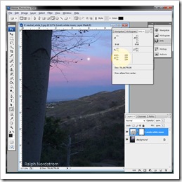
First, notice in the Info bar that for color sample point #1 there are two numbers – the original numbers on the left and the adjusted numbers on the right. The adjusted green number is now the same as the red – 239. In the Levels dialog the white slider has been reduced from 255 to 234. That was the amount of adjustment that was required to raise the green number to 239. We now repeat the process for the blue channel.
You can see by the three numbers in the Info box that our moon is now neutral white. The red cast has been completely removed.
We should probably point out that this technique is a global adjustment; that is, the color change is not limited to just the moon but affects the whole image. To make it a little easier to see, here are the before and after images side-by-side.
 |
 |
| Before | After |
The after image is a bit cooler than the before. You may decide that you really like something that is in between the two. Well, that’s easy enough to do.
In the Layers palate, each adjustment layer has an Opacity setting and by default it is set to 100%. This means the full effect of the adjustment is applied to the image. But if you would rather have some fraction of the adjustment applied, say 50%, you can change the Opacity setting.
As we stated at the start, this technique can also be used to set neutral blacks. You just use the Color Sampler Tool to mark a spot in the shadows. The rest is the same.
Let us know if you find this technique helpful. Or maybe you have a different way of getting neutral grays. If so, if you don’t mind sharing it, please do so.
To see more of my photographs click here.
Join me on an upcoming workshop.
(1358)


