Why study composition? Edward Weston said, and I paraphrase, that studying the laws of composition before taking a photograph is like studying the laws of gravity before going for a walk.
Well, sometimes I feel like a toddler when it comes to composition. And if you’ve been around a toddler as they’re learning to walk you know how diligently they study the laws of gravity and why they have such thick padding on their rumps. There’s a reason they’re called ‘toddlers.’
I’m always searching for new ways to present the principles of composition in my photography workshops. And I think I’ve come up with an approach that will get some of the people seeing the world differently, at least that’s the goal. I like to challenge my workshop attendees to stretch themselves and expand the way they see.
So my idea is this. Don’t teach the traditional topics of leading lines, rule of thirds and such. We’ve heard the rule of thirds so much so that camera manufacturers are adding tick-tack-toe lines to the LCS displays so we can have that reference in front of us when we shoot. There’s got to be a way to get the workshop attendees out of their usual way of seeing and challenge the way they look at a scene.
And I think I have it. In the photography workshops for 2011 I plan to begin by introducing the attendees to the elements of design. And for the first several shoots I’ll further challenge them to capture these elements in their photographs.
What are the design elements? Well there are several. I’ll give you a quick introduction.
Line
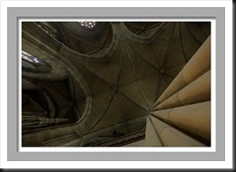
The first element is line with is basically one dimensional. We can have all sorts of lines in our photographs – horizontal, vertical, diagonal and curved. The orientation of the lines has a lot to do with setting the mood of the image. Here are a few examples.
 |
 |
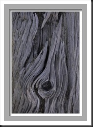
Some of my favorite images with a strong emphasis on lines are where the lines are, well, chaotic.
Shape
The second design element is shape which is two dimensions. Shapes are basically flat. Silhouettes come to mind.
Form
If line is one dimension and shape is two then form must be three. Yep, that’s exactly right. With form we see volume and mass.
Texture
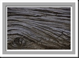
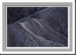
The next element commonly discussed in design texts is texture, the illusion that we can feel the surface. Usually but not always the illusion of texture is created when the light source grazes the surface of the object, accentuating its irregularities.
Pattern
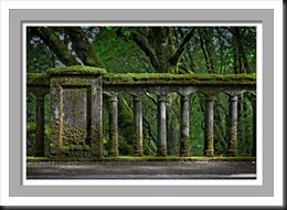
Patterns are the repetition of elements. Perfectly uniform patterns are unusual in nature (but they can be found). More often we see patterns in man made objects.
Color
The final design element that is frequently discussed is color. This also carries a strong emotional message. Colors can be bold or subtle.
Unity and Balance
I think there’s one more design element that is essential to a good design (and photograph). The elements of the composition must be unified and balanced. They must all work together in a way that complements and strengthens the message of the image.
So I’m hoping that introducing composition in this way will get the workshop attendees toddling on ice and that in so doing they will look at the world through different eyes. Don’t worry; we’ll cover composition from a more traditional perspective as well. But I’m thinking this is going to be a very interesting and effective approach.
Join me on an upcoming workshop. Click here for more details.
To see more of my photographs click here.
(1218)










Great introduction!
Thanks Andreas.