Not long ago I was in San Francisco for some photography. I was interested in photographing Fort Point because it would be a good opportunity to emphasize design elements and abstractions. Fort Point is part of the National Park system and situated at the mouth of the San Francisco Bay. Its intent was to protect the bay from attack. Construction was completed in 1861. It never fired a shot.
If you’re interested in learning more about the fort, here are a couple of interesting links.
https://en.wikipedia.org/wiki/Fort_Point,_San_Francisco
https://www.nps.gov/fopo/learn/historyculture/index.htm
These “Making a Photograph” articles generally take a single, successful photograph and walk through the process of its creation from the moment of inspiration in the field to the finished product. What that doesn’t show is the scores of rejects that ended up in my memory card, what I was trying to do with them and how and why it didn’t work. I think there’s as much to be learned from the rejects as there is from the keepers.
So in this post I want to ‘air my dirty laundry’ so to speak and share with you not only the keepers but the rejects. I also want to take you through the process of looking deeper into the rejects in an effort to learn from my mistakes.
So come along with me as I share my flubs and successes at Fort Point.
Before getting into the photographs, you might be interested in the camera gear I had. I was using my 24-105mm lens, my go-to lens. At f/4 it’s not particularly fast but the reach from a wide 24mm to a moderately long 105mm makes it very attractive. And I was shooting hand-held.
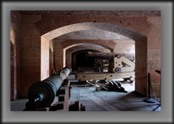
Upon entering the fort, I wandered around for a while, just taking it all in. Eventually something caught my eye. Here’s the first image I grabbed.
I was attracted to the cannons and cannon balls. After all, that’s what the fort is all about and here were a couple of examples. Gotta grab this one. I obviously didn’t put much thought into the composition. There are distractions on both edges. The subject matter is not at all clear and the light adds to the confusion. The composition is cluttered and chaotic. Isolate and simplify – definitely not at work here.
Sometimes a shoot starts out this way, rushing it and getting some pretty lousy results. I was searching for images rather than letting them come to me. That’s not an uncommon way to start, getting analytical and thinking too much rather than just letting it happen, especially if you’re not very familiar with the location. You feel an internal pressure to do something. The result – reject one.
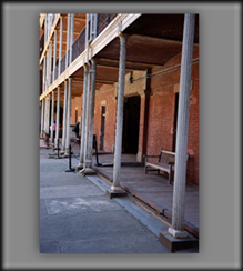
But it’s time to move on. Here’s the second image I saw.
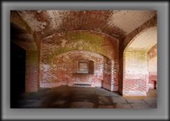
What caught my eye was the progression of pillars and the sense of depth they created. But again, I rushed it. The pillars are not vertical and the floor of the second story comes into the top of the frame at a very awkward spot. It’s just not in balance. Add to that the people at the end of the walk way. I wasn’t all that into the shot. Otherwise I would have waited for the people to move. I just saw it, grabbed it and moved on. It’s a snapshot – literally. Reject number two.
On to the next.
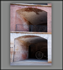
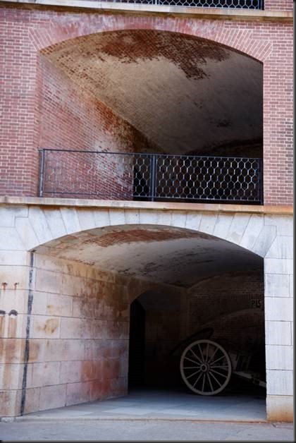
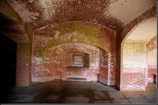
I’m starting to see patterns now. The cannon in the arch caught my attention and I wanted to show it in its environment. But there are a couple of challenges. First, the cannon is in deep shadow. If I was serious about capturing it I would have shot HDR. Secondly, the camera is pointing upwards creating parallax error; that is, the vertical lines converge as they move upwards. I consciously lined up the right side so it was vertical and let the left side tilt in. And the horizontals are sloping to the right. It probably would have been a little better if I had kept the horizontals were just that – horizontal – and let the verticals tilted in. But I didn’t have a clear sense of that this photograph was about and it shows.
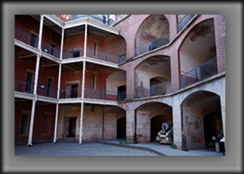
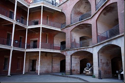
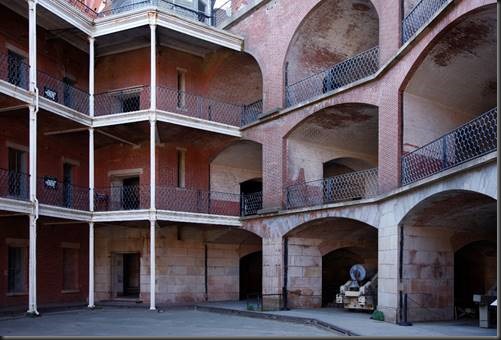
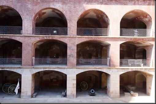
I decided I wanted to get a sense of the structure and the way it was laid out. So I shot at a wider angle, enough to capture all three stories and show the business end of the fort on the right compared to the supply and administrative end on the left. This is getting closer to telling the story but there’s a parallax problem in this image also. This, however, can be fixed in Photoshop and even Lightroom. I used the Perspective Crop tool in Photoshop and came up with this.
Much better. I didn’t think ahead though when I got the shot. Notice that on the right, the arches are not complete. I lost the right edge of the image to the crop. So when you encounter a situation like this in the field, it’s important to already be thinking about what you’ll do in the digital darkroom. Knowing that you want to correct the parallax error with one of the crop tools, you need to shoot a wider angle so that you will have room to crop and still preserve the important elements of the composition.
The photos are getting better.
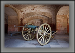
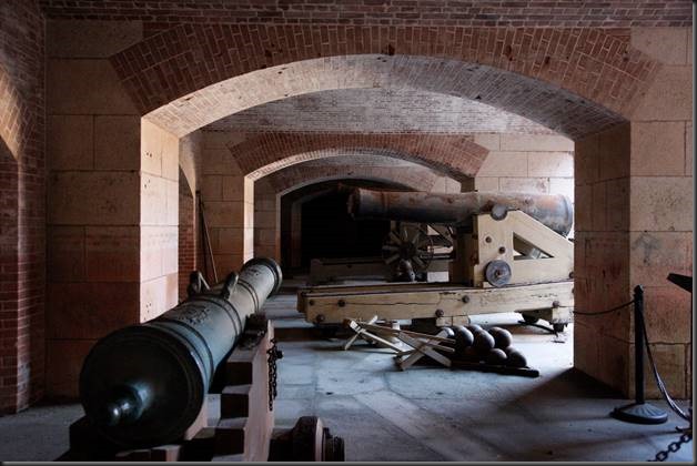
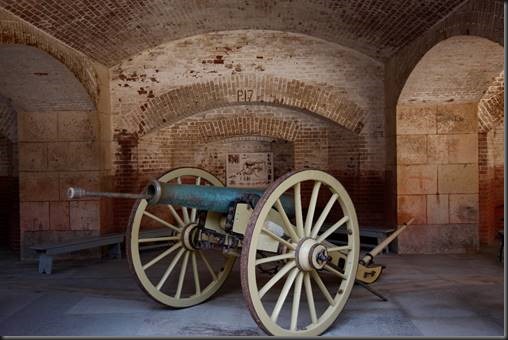
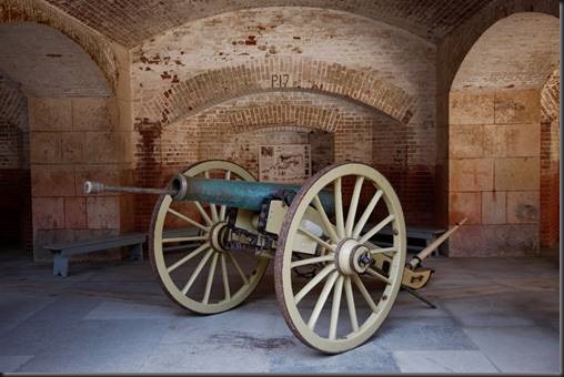
OK, I’m starting to get in the groove now. This image tells a bold story. The arches are symmetrical with the middle arch centered in the frame. Some might think that’s a bad thing to do because it makes for a static, lifeless image. Elements are supposed to be off-center, aren’t they? But to me, in this image the symmetry conveys strength, the sort of quality you want in a fort. Rule broken and to good effect. The angle of the cannon adds motion and energy to the image.
Oh, but look! I cut off the bottom of the wheel. Oops. Fortunately, I caught it before moving on.
That’s better. I got the wheel and the top of the central arch. Keeper!
Moving on.
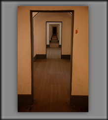
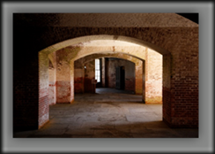
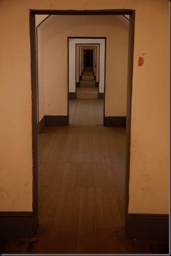
This is the officers’ quarters. And I’ll confess; I’m getting onto symmetry. Since all of these photographs are hand-held, my symmetry is just a wee bit off. Had I been using a tripod, it would have been perfect. You can see in the upper corners of the first door jamb that I’m a couple of inches too far to the right.
But I excuse myself for being just a bit off. There were a lot of people in the hallway, ducking in and out of the rooms. I had to wait at least 10 minutes for a split second where the hallway was empty. So when concentrating on the people and the symmetry at the same time I can give myself a break and live with the fact that it’s not perfect.
This one satisfies me! Again, this kind of symmetry is usually considered to be static and motionless and therefore undesirable. Rule broken again. However, the floor gives this image a lot of motion, rising from the bottom of the frame to the neighborhood of the upper one-third line. I’ll confess that I wasn’t aware of it at the time. But next time I get here, I will be. I’ll spend another 10 minutes or so waiting for an empty hall. But this time I’ll change the viewpoint and get down low so that the floor will not rise. Instead, the tops of the door jambs will create a descending line. That should be interesting.
And maybe I’ll have a tripod next time and I’ll nail the symmetry.
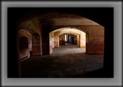
Back to patterns. This sort of has a chance but the light throws it out of balance. And it’s not strong enough to do HDR. It’s not going anywhere.
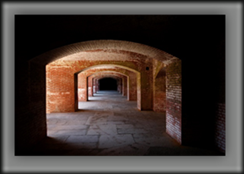
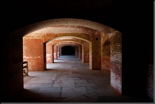
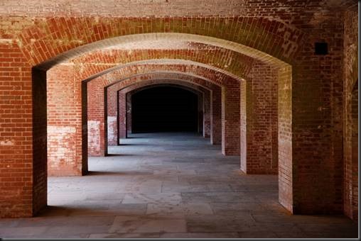
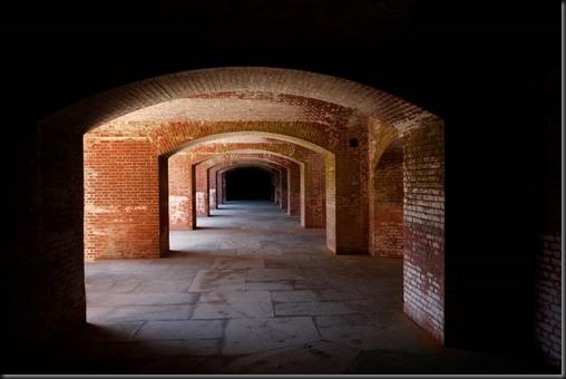
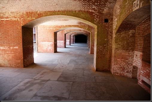
OK, another receding, symmetrical composition similar to the officers’ quarters. But this one has much more dramatic light. I like the way the receding arches are framed by darkness. It has a rather dramatic feel to it. The only problem is that structure on the left. It breaks the flow. My first reaction was to move forward to remove it from the image. That resulted in this photograph.
It solves the problem of the stray object and also creates an entirely different feel. No longer does it emerge from the darkness but is all in the light. Also, being closer to the first pillar makes it stronger and more dramatic in quite a different way. I really like the impact this image has.
My second though was to turn to use Content-Aware in Photoshop to remove the offending object in the original image.
Success! No distractions! Removing the distraction completes the vision I had in the first place.
But now I have another dilemma on my hands. I have two images of the same subject but which convey totally different feelings. So which one do I like the best. I’m not inclined to put two photographs of the same subject in my portfolio but I have a very hard time choosing which I like the best. Time will tell. I may have to break the rule I have for what goes into my portfolio.
One of the manipulations I allow myself in the post processing is to remove distracting elements from a photograph. What I don’t do is add elements. That’s a line I choose not to cross. Others may choose to cross it and that’s OK. It’s an artist’s prerogative to draw their own lines (pun accidental).
After all this symmetry, I finally found a place where there the symmetry is broken by the arches angling off in the distance. Ah, more motion, more visual tension. But I thought that maybe I needed more foreground so I moved back. And that didn’t work.
In moving back, I noticed the arch on the left and included it in the composition. But now that I look at it I have to ask myself, ‘What does it add to the photograph?’ And the answer is, ‘Nothing!’ So the first image is much simpler and lacks the distraction and confusion of the second. So that’s the one I’ll go with.
When I was photographing the long corridor a couple of images back, it occurred to me that if I moved to one side it might break the symmetry and add diagonal lines which would make it more dynamic. So I hustled back and got this one.
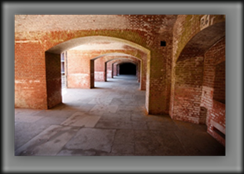
Again, I wasn’t taking my time. The gap between the first and second arches lets the viewer’s eye out into the courtyard. And the arch on the right edge is also a distraction. Now, in hindsight, had I reversed the composition and moved do the left and a little forward, it might have turned out more interesting. It might have even ended up as a keeper. I’ve done that in other situations and it’s worked out well. It’s worth remembering that taking a compositional idea and playing with it is always a good idea. Bracket the composition I like to say.
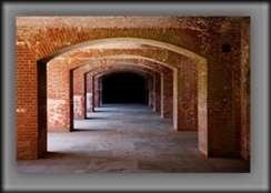
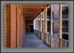
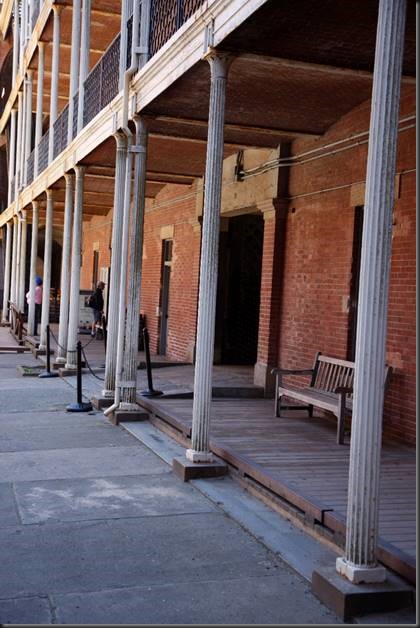
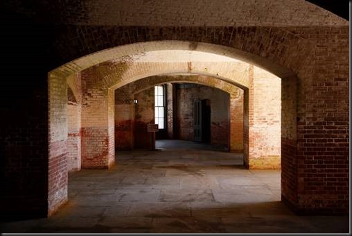
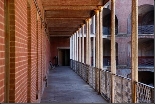
OK, I’m not giving up on the receding pillars and the 3-dimensional perspective that they create. This is on the second level and is way better than the first. The camera is level so there’s no parallax error. The wall on the left and pillars on the right both enter the frame in a balanced, harmonious manner. This image has diagonal lines, texture and patterns, it has unity, balance and visual tension. I’m happy with it. Keeper.
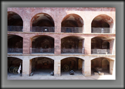
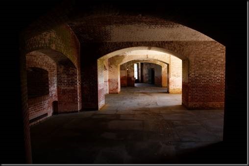
So I started with some lousy images and need to end with one. It was getting close to time to leave. The pattern drew my attention and I through I would get something very simple. I tried to line up perpendicular to the central column which is a good thing. But the light wasn’t working for me. The harsh highlights on the right ruin the idea. If I had moved two pillars to the left I could have avoided the light problem. Better yet, instead of lining up on the pillar I could have lined up on the middle of the center arch. That would have given me three arches, an odd number. Yea, it’s a rule but it would have worked well here. I should have at least tried it.
But it was getting to be time to go and I was in a rush.
So how did the day turn out? Lt’s look first at the rejects.
 |
 |
 |
 |
 |
 |
 |
 |
Well, it happens.
But the time spent in Fort Point actually produced six very nice photographs – well five if you take into consideration that two of them have the same subject. And I still can’t decide which one I like the best.l They both have something going for them.
 |
 |
 |
 |
 |
 |
There are a couple of takeaways from these keepers. Isolate and simplify is the first that comes to mind. Be clear about your subject, whether it’s a specific thing like the cannon or a design principle like pattern or symmetry or perspective.
Eliminate distractions, elements that do not belong. I call this Unity. Every element in the composition supports the image. None distract. None are freeloaders either – elements that don’t distract but add nothing to the image. In my book, it’s ok to remove distracting elements with the tools we have in our digital darkroom. But that’s a decision each of has to make for ourselves.
Another thought is to know the rules of composition so you can break them when it benefits the image.
It’s also worth taking a critical look at your rejects, I’ve learned a few things that hopefully I can bring with me into the field the next time I go out.
I hope that sharing some of my unsuccessful images with you and discussing what went wrong and in some cases what I could have done to make them stronger, that you will get some ideas on how you can improve your photography in the field.
I think one of the biggest things is to not rush it. Slow down. Allow yourself to feel the image. I would probably have walked away from some of these if I had done that. Others would have turned out better and possibly even made it into the list of keepers. It’s hard to slow down and get quiet, especially when there’s a lot of commotion around you or you’re feeling rushed. But it’s worth taking the time to find that quiet, in-rushed place within you. We all have it. It’s just a matter of learning how to find it and go there.
Come join us on this or any of our exciting photography workshops.
(138)

Nice post, Ralph. I think symmetry in architecture, especially historic architecture, is very important. I appreciate your results with hand-held photography. I’d encourage you on one of your travels to a city with an impressive church or cathedral to spend some time working on symmetry in a large space such as that. I have found that closely studying all corners of the frame in a cathedral can be very revealing when you try to line up columns or ceiling detail such as a dome. It forces you to find the exact center point of your scene (even if you’re shooting significantly upward). It also fixes a ton of things that would otherwise be complicated in post. I have found that the camera work really slows down, but the post-production work speeds up and is much more rewarding.
Excellent advice Steve. Thanks for sharing.