A Desert Scene
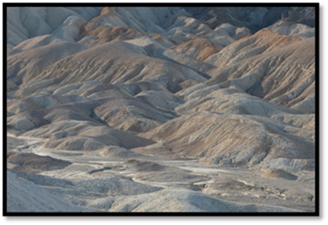
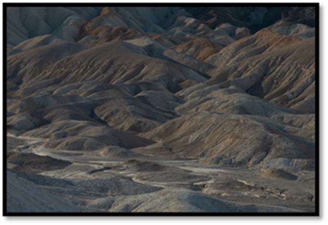
This image was taken in 20 Mule Team Canyon in Death Valley National Park. I was particularly excited about this when I saw it in the field. I was fascinated by the meandering dry stream bead that worked its way across the scene. The ever-present salt in Death Valley stood out white against the soft warm colors of the badlands behind it.
But there were several additional things that excited me. The badlands behind the stream bed also fascinated me and made the experience even richer. It is a concentration of diagonal lines, textures and forms. And the light, while the sun is fairly high in the morning sky, still crosses the badlands at an angle that accentuates its shadows. I intentionally 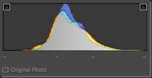 overexposed the image 2/3 of a stop to be sure to capture shadow detail and that’s why it looks washed out.
The histogram shows no particular challenges. There is no highlight or shadow clipping. You can see from the thin tail that moves towards the right edge, which was caused by the white salt, doesn’t quite touch it. If I had increased the exposure even a third of a stop more, there would have had highlight clipping on the salt.
Tonality Adjustments
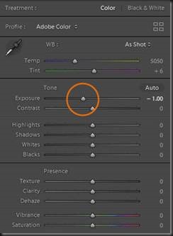 I like to start with tonality adjustments. In fact, most of the effort that goes into enhancing an image is with tonality adjustments. And most of these adjustments are made in Lightroom’s Basic group.
Where to start? This image is a bit washed out because it was slightly overexposed, so we start with an Exposure adjustment. Sliding the slider to the left moves the histogram to the left and darkens the midtones. We can monitor the adjustment by watching the histogram.
The next thing that is crying out to be done is to brighten the image. This can be done with the Whites adjustment. Increasing it will stretch 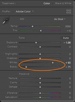 the histogram towards the right edge. After w
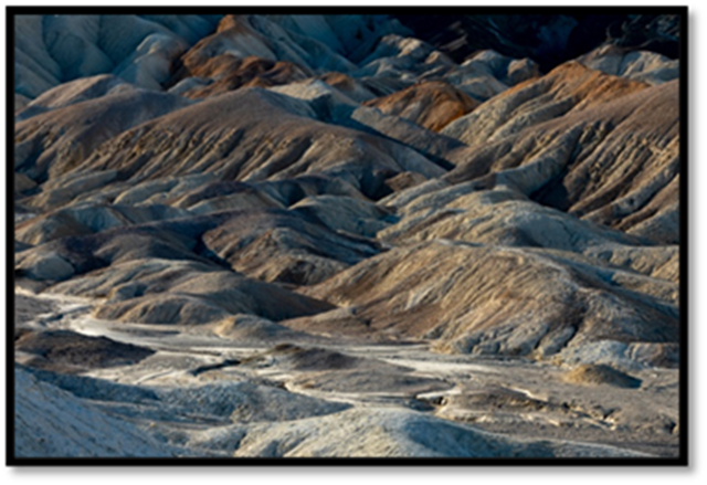 e do that, we can set a black point with the Blacks adjustment. Now we are using the full dynamic range of the medium.
The results are dramatic. Remember, the reason for taking this photograph is the dry stream bed and these adjustments have given it more visual weight. But they have brought even more out of the image. The textures and lines in the badlands have gained a lot of excitement and drama. And they are now also clamoring for attention. Maybe this photograph will go in a different direction. We shall have to see.
A few more tonality adjustments were made. Shadows was increased to open up a smidgen of detail in the shadows. And Highlights was decreased to bring out more detail in the salt. The changes were subtle. The last tonality adjustment was to add come Clarity. This adjustment increases the contrast of the midtones.
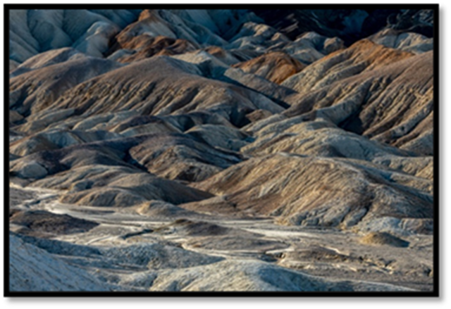
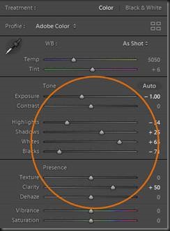 With these final tonality adjustments, the character of the image is beginning to become evident.
What has been revealed so far is the wonderful texture which we have already seen but there’s also a warmth to the badlands. For me, it’s beginning to feel like the warmth of the den in a Craftsman style home. Exposed wooden beams span the ceiling with wooden panels on the walls. A fire in the fireplace makes it all the more inviting. In fact, maybe what is what this photograph is about – a feeling of warmth. But it’s not there yet so let’s press ahead.
Hue Adjustments
There are no Hue adjustments that stand out. There is no overall color cast nor are there individual hues that need to be corrected. And that is often the case. So, we’ll move on to Saturation.
Saturation Adjustments
An application of Vibrance brings out both the warm oranges and yellows and the cool blues and cyans but the effect is subtle. If I want to create 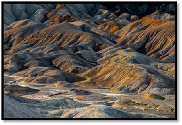
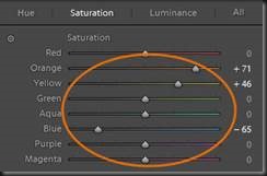 my warm, cozy den feeling the image itself will need to be more than subtle warm and cozy. The HSL group has the adjustments to do this.
HSL has the Targeted Adjustment Tool that lets you click on the image and move the mouse up or down to increase or decrease the saturation. But I chose not to use this because some of the elements in the image are more orange and some are more yellow. So, I adjusted these yellow and orange hues manually.
Also, I thought that the badlands that were predominately yellow didn’t contribute to the direction I was taking the image. So, again in HSL, I switched to the Hue screen and adjusted the Yellow slider to make the color ever-so-slightly warmer.
Freeform Adjustments
The image is starting to take shape. Now I can look at the entire image more critically. What I see is two distractions that take away from what I want the image to express. At the bottom of the frame is a bright area that has a fair amount of visual weight. And the chaotic jumble of the badlands at the top of the frame is also distracting. I want to emphasize the diagonal lines and textures in the foreground. The chaos in the background contributes nothing.
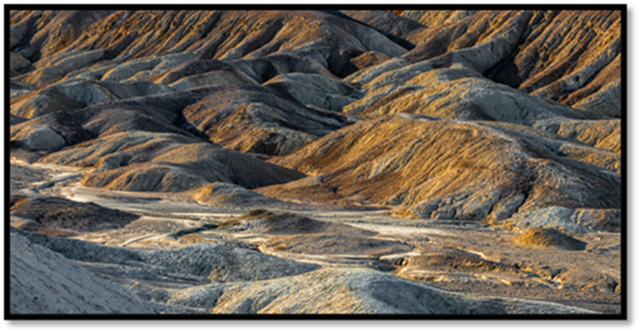 I can take care of the background issue by cropping it out. But the foreground must stay because I want to place the dry stream bed on the bottom 1/3rd line. No, I haven’t given up on that yet.
That’s better. Except for the bottom edge, the image is now balanced and has cohesion. All the elements are working together. The diagonal lines are all sweeping together giving the image an uplifting energy. And the dry stream bed is in a position that gives it more visual weight although it still does not jump out.
And the cozy Craftsman den feeling is not quite there either. A den is a rather darker, cooler place. So, if I make just one more Exposure adjustment, I can probably get what I’m after.
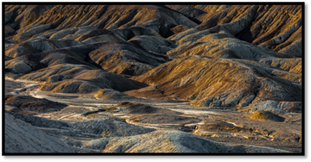 And look what that did to the dry steam bed. By darkening its surroundings, now it is more prominent. It has become a key element in the photograph again.
But there’s still that distraction at the bottom of the screen. The viewer’s eye has to get past it to get into the image. To deal with it we need to darken it with a local adjustment.
Normally I do local adjustments in Photoshop because of tools like 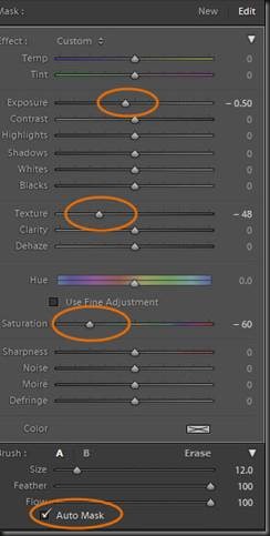 Curves and the more powerful masking capabilities. But Lightroom has the Adjustment Brush so we will use that for this example.
One of the really cool features of the Adjustment Brush is the Auto Mask capabilities. With it you can more precisely paint the area you want to adjust. Lightroom notes the tonality and color of the area where you start and confines the mask to that combination. If you paint into an area that has a different tonality and/or color, Lightroom adds that to what it is looking for.
Once the mask was created on the distracting area, I decreased exposure to darken it and thus lessen its visual weight. But its blue hue was still distracting so I decreased saturation to turn it into a neutral gray. There were a few bright specks, so I decreased Texture to try to deal with those.
You can see that you have a lot of controls with the Adjustment Brush and Adobe continues to expand its capabilities. For those of you that prefer to use only Lightroom, the Adjustment Brush will give you the greatest flexibility. There are to Gradient tools, Rectangular and Circular, that also can create local adjustments. But in this situation, the Adjustment Brush outperforms them.
What did we end up with? Does the final image emphasize the dry stream bed? Does it have a Craftsman style cozy, welcoming den feeling to it? Take a look.
The End Result
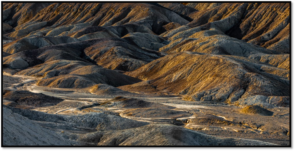
The dry stream bed meandering through the image now jumps out, just like I had hoped. It is a key part of the image and adds a gracefulness that contrasts beautifully with all the energy that surrounds it. The warm, inviting hues create the feeling of comfort that I sensed.
The right elements have the most visual weight – the dry stream bed and the brighter feature on the opposite bank. There is visual tension in the lines, both curving and ascending. There is also balance and harmony as everything feels just right. And there is plenty for the eye to explore as it wanders over the badlands.
This is a far cry from what I saw as I stood there on an outcrop looking down on this scene. And yet, I had a strong feeling about it. The sinuous dry stream bed of white salt was so compelling. I couldn’t say that this is what I envisioned when I pressed the shutter, but I can say with certainty that I saw a great potential in it. I couldn’t wait to work on this one. It didn’t come quickly or easily. But, by coming back to it time after time it began to reveal itself. And now, it is one of my favorites.
Come explore the mysteries in nature. Broaden your technical and creative skills. Unleash the artist within you. Join me on an exciting photography workshop.
(143)
