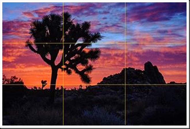
The Rule of Thirds is a compositional principle that is widely used. And for good reason because, well, it works. At least, it works in a lot of situations.
What is the Rule of Thirds? You superimpose a tic-tac-toe grid on your image, two vertical lines equally spaced and two horizontal lines equally spaced. Then you place the key elements of your image on or near those lines, or at one of their intersections. They don’t have to be exactly on the lines or intersections, just near them. This is art, not engineering, so it’s important that it feels right. But the Rule of Thirds gives us positions that are visually very strong and command the viewer’s attention. That’s why you want to use this principle for the key elements of your composition, the elements you want to draw the viewer’s eye to.
One should be cautious in overusing the Rule of Thirds. It should not be applied mechanically and certainly not universally. It does not apply to all compositions. After all, aren’t our ‘Rules’ of composition made to be broken? But on the other hand, sometimes a composition gets just a little bit stronger when you move the key element just a tiny bit to place it closer to or right on a 1/3rd line.
The fact is it works so well in so many situations that the camera manufacturers give us the ability to display the grid on our camera’s LCD screens and viewfinders. Also, software publishers like Adobe display the grid when we use the crop tool. This is true of Elements, Lightroom and Photoshop. And these aids can be very helpful in achieving strong compositions.
Why does the Rule of Thirds work so well? To answer that let’s talk about Visual Tension.
All physical objects have a center of gravity. The earth has a center of gravity. It’s the very center of the planet. If we should miraculously find ourselves at the center of the earth there would be no gravitational pull. We would be floating; we would have no energy. And the only direction would be up. There would be no down. But since we walk on the surface of the earth, 3,963 thousand miles from its center, we are pulled toward the center by the force of gravity. Gravity is what keeps us from floating off into space. In fact, it’s what keeps our atmosphere from floating into space. It’s a very useful thing to have.
Psychological studies have shown that we humans perceive optical centers of gravity in images. They are not physical things but rather they happen in our minds. Nevertheless, they are real and universal perceptions. When you’re composing an image, if you place a key element on top of one of these centers of gravity it’s like placing the element at the center of the earth. It is static, un-moving, without energy, lifeless. (This can be exactly what you want if your goal is to create a tranquil image.) However, if you move the element away from the visual center of gravity our minds perceive tension. It’s out of place and we see it as being pulled toward the visual center of gravity. Now it has energy; it is dynamic and dramatic; it has motion. In other words, it creates visual tension.
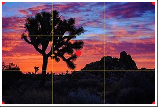
Where are these visual centers of gravity? One is at the very center of the image and the others are at each of the corners (where the orange dots are placed in the image below).
When a key element is placed on the center dot, the on the bull’s eye, it is static, it has no energy. And images that are static are not very interesting. Moving the element off the visual center of gravity produces tension, energy, motion and drama. They will engage the viewers and hold their interest, and the viewer will dwell on the image longer. That’s a good thing because it’s the mark of a successful photograph.
When a key element is placed near a corner visual centers of gravity the effect is a little different. The element is pulled towards the corner and the viewer’s eye will go right along with it. It becomes a place where the viewer can escape from the frame and is gone. This points out another quality of a successful image, namely, that the composition holds the viewer captive within the frame with no easy way for the eye to escape. But placing a key element near a corner provides a gateway they can pass through and are gone. (See Mastering Composition – Border Patrol).
You can see from the example above that the Rule of Thirds lines are well away from the center and the corners of the frame and thus create visual tension while still holding the viewer’s eye, interest and attention. There are certainly other ways of creating visual tension and the Rule of Thirds is just one of them. But in the right situation it works very well. So make sure the tic-tac-toe grid is displayed on your LCD screen or in your viewfinder and take the Rule of Thirds into consideration when you’re composing your next image. It does not always work but when it does you will find that it breathes life and energy into your photographs.
If you find this article helpful, please share it with your friends on Facebook, Twitter or even on your blog.
We always look forward to your comments so please share your experience with us.
We do photography workshops. Come on out and join us. Click here to check us out.
You can also check out our photography. Click here.
(2867)


