There’s a simple compositional technique you can apply to quickly improve the quality of your pictures. It’s fun and easy and works in so many situations. It’s called the “Rule of Thirds,” and it goes a little something like this.
Take the picture frame, what you see when you look through your camera’s view finder or on the LCD screen. Divide it into nine equal parts; that is to say, draw two equally spaced horizontal lines and two equally spaced vertical lines. Well, you don’t actually draw them but just imagine them. The idea is to place elements along these lines, at their intersections or within the areas they define.
This technique gives images a certain dynamic quality. The images do not feel static but have an interesting and pleasing tension. If you play around with this a little I think you’ll find your photographs will have that extra little something to them. In fact, this is such a natural thing to do you may well be doing it already without even being aware of it.
Let’s look at a few examples. We’ll begin with horizons. If there’s a horizon in your image rarely would you want to place it in the center. Of course there are exceptions but generally speaking you’d want to place the horizon on either the top or bottom one third line. Placing it on the top line would emphasize the foreground. Placing it on the bottom line would emphasize the sky. Here’s an example of the former.

This is the famous Racetrack Playa in Death Valley National Park where rocks skid around when on one is looking. The subject is not just the rocks but the fascinating tracks they leave so more image real estate is given to them.
When you have a glorious sky (sorry I don’t have an image to illustrate) you will want to try setting the horizon on or near the bottom one third line.
 Here’s an example of placing the subject on one of the one third lines. This is beautiful Latourell Falls in Oregon’s Columbia River Gorge. The waterfall not only is placed in the left one third line but stops at about the bottom one third. This makes it possible for the stream to form both a diagonal and leading line that draws the eye to the waterfall. There are also other diagonal lines in the image the strengthen the pull to the falls.
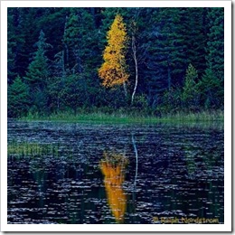
The next example also places the subject on the one third line, this time the right one. But this time the horizon or rather the shore line is in the middle of the image. You’ll often do that with reflections because in this case you want the symmetry.
 Moose Pond in northern Minnesota is where this photograph was taken. There is a lot going on between the reeds in the pond and the forest across the way to provide a lot of balance, depth and interest. But the focal point is clearly the autumn tree and its reflection. If the tree had been centered it would work nearly as well.
 This just isn’t the same, is it. It’s not completely dead but it lacks the drama of the original image.
The next example illustrates how the areas can be filled rather than placing subjects on the lines. This is Split Rock Lighthouse in Minnesota (did you know that Minnesota has more lighthouses than any other state?).
 Notice Split Rock itself with its beautiful lighthouse. It occupies the middle left thirds area. This is balanced by the cliff on the right with its pines occupying the right third of the image. You can see literally thousands of images of Split Rock Lighthouse on the internet but I’ve only seen one or two other that employed this composition. It’s very compact and satisfying, giving a feeling of strength and security to the lighthouse.
Let’s finish this with an image that is very symmetrical while at the same time employing the rule of thirds. This is an image of the tufa at Mono Lake east of the Sierra Nevada mountains in California.
 This morning the eastern sky was like nothing I’d ever seen before. The intensity was just amazing. I recall saying to myself out loud, “This is about the color.”
Now, this composition didn’t manifest itself to me while in the field. It was afterwards in the digital darkroom that I saw the potential for a symmetrical composition, something you don’t see very often. But to make it work I placed the horizontal plane of symmetry on the upper one third line. This accomplished two things. First, it neutralized the static qualities of the vertical symmetry and second, it made it possible to show the magical progression from blue to orange in the water.
Camera makers are just now starting to realize the importance of the rule of thirds. In the past, you could buy a focus screen that had lines for your view finder but it was divided by three lines horizontal and vertical, not two. So it divided the viewing area into fourth, not thirds. But now my Canon 1Ds Mark III has the option of displaying the one third lines on the LCD panel. I find this to be incredibly helpful when I’m composing an image with Live View. And I was also really happy to see my new Canon G11 point and shoot with the same capability. I can’t tell you how often I check the alignment of the image against those line. Well, actually, I can. I look at them for virtually every shot. That’s not to say that I always apply the rule of thirds. I don’t. But now whether I apply the rule of thirds or not, it is a conscious decision.
So, give it a try. If you camera is capable of displaying the one third lines, turn them on if you haven’t already. If not, think of the scene as though the lines were there. Give it a try. Put things on the lines, at the intersections or in the areas. Go overboard. Go crazy. You’ll soon have a more conscious feel for using one of the most effective compositional techniques. And you’re going to like the way your pictures look.
As always, here’s wishing you good light.
Join me on an upcoming workshop.
To see more of my photographs click here.
Become a fan on Facebook and follow along.
(1832)


A clear and concise explanation of the rule of 3rds. Though it is a simple concept it is well worth pointing out and discussing in detail. Good photographic examples as well. Thanks/ R