For a followup post read
http://ralphnordstromphotography.com/wordpress/articles/how-to-articles/expose-revisited/
The light meters in our digital cameras don’t always give us the best exposure. That’s not to say that they give us the wrong exposure. But the ‘correct’ exposure doesn’t necessarily produce the best image file as far as post processing is concerned, especially if we’re shooting RAW.
If you expose an image at the exposure selected by your light meter and check the histogram, chances are it’s skewed a little to the left, toward the shadows. This is especially apparent in low contrast scenes. The image might look great on the camera’s LCD and in Lightroom. But a slightly overexposed image will capture more information and is therefore better to work with later – given of course that it’s not so overexposed that you have highlight clipping. An ideal histogram is one that is just to the right of center. This technique is called ‘Expose to the Right,’ and is practiced by many of digital photographers.
During a recent photography workshop I led a discussion on exposure and advocated the ‘expose to the right’ technique. Later, one of the attendees said she didn’t like it because the images looked horrible in Lightroom. And indeed they do. They look washed out. So a recommendation to expose to the right needs to be followed up with a discussion on how to process these images. It’s only fair.
Let’s use one of the shots I took during the workshop and take it through the entire process to show what can be pulled from an image that is exposed to the right. I’ll use an image captured at Zabriskie Point about 20 minutes before sunrise.
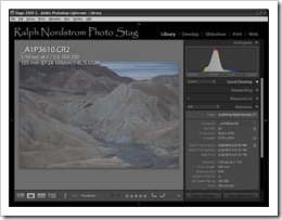
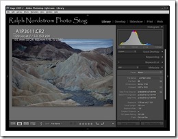
First, let’s look at the image that was captured at the exposure recommended by the camera’s light meter.
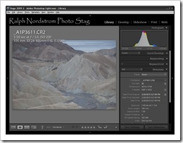
This is admittedly a very flat scene and so is not going to be very interesting. You can clearly see that it’s very muddy and the histogram is indeed to the left of center. he next image was overexposed by one stop.
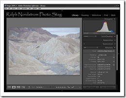
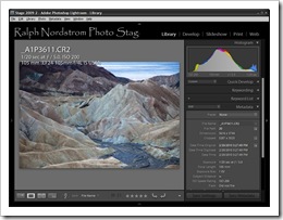
Now the image looks washed out. But it’s no longer muddy and the histogram is to the right of center with no highlight clipping. So this is a great file to work with. Here’s the +1 image by itself.
The first thing to do is adjust the exposure in Lightroom. We’ll take out the 1 stop of overexposure by setting the Exposure adjustment to –1.
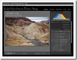
The overall tonality of the image is better and the histogram is back near the center or just a little to the left of center. Now that’s OK because we already captured the additional information in the RAW file. But the image is still very flat. So the next step is to set the black point.
The black point can be set with the Blacks adjustment. In this case it was set to +10. You want to set it just high enough so that you start to get shadow clipping in a very small area of the image. Too much shadow clipping will make the image too dark but a little will give it a solid tonal foundation. Notice that the left end of the histogram has stretched out to the point where it’s just touching the left side. But the main part of the histogram has shifted to the left only slightly.
The process we’ve started here is to add contrast to this flat image. Contrast is going to make it a lot more interesting. We’ve got good shadows in the image now so the next step is to brighten it.
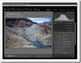 Brighten the Image with Curves
We can use the Tone Curve adjustment to brighten the image. I increased the Lights slider to about 90. This affects the brighter areas of the image without noticeably lightening the dark areas. The image is a lot more interesting, now that we’ve added contrast. Also the histogram now fills pretty much the entire range from shadows on the left to highlights on the right.
The dark area in the upper left corner was just a little too dark for my taste so I added a little fill light.
So far, the only adjustments we’ve made affect luminosity. We haven‘t done anything with color yet. But before turning our attention to color let’s take a look at what we’ve accomplished so far. Here’s a before and after comparison.
 Before Before |
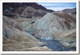 After After |
In the after image we can already see some of the marvelous textures and forms that make Zabriskie Point such a wonderful place to photograph. The soft light of dawn is perfect for bringing these out. The image has a fantastic glow, a far cry from the harsh light and shadows of mid day and a totally different mood from what it will be in a few short minutes when the sun first strikes it.
With the luminance nicely established we can move on to the next major step – adjusting the hue (color).
Now, dawn light is inherently blue because the only source of illumination is the blue sky. This makes everything in the scene take on a blue cast. We can go with the blue which will give the image a cool feeling or we can adjust the color temperature and warm it up a bit. We’re going to do the latter.
Warming up the image by adjusting Color Temperature and Tint brings out the characteristic browns and tans of Zabriskie Point. And we’ve preserved the beautiful soft light while giving the image a warm feeling.
The change in this histogram is not as dramatic as when we were adjusting luminance. We just see the three channels (red, green and blue) starting to spread out.
But Zabriskie Point is not all browns and tans. There are some very subtle greens in the formations. We can bring them out by adding some selective saturation. This is done by saturating individual colors.
In this step I added a little blue saturation to the salt pan. This helps to emphasize the whiteness of the salt. Next I found some green areas in the mud stone and increased their saturation quite a bit. Can you see them? Finally, I also added a little saturation to the yellows and oranges. It doesn’t take a lot of saturation to bring out the subtleties in the color.
The final adjustment was to use the Punch preset. This adds +50 Clarity and +25 Vibrance. Clarity is pure magic in the way it brings out more detail in the image. And Vibrance is a different kind of magic in the way it adds a bit more saturation to the less saturated colors. When pared together the image glows. Here’s the final image side by side with the one we started with.
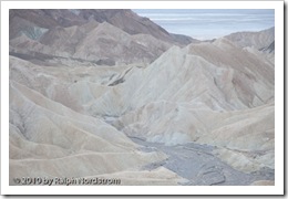 +1 EV RAW Capture +1 EV RAW Capture |
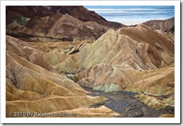 Final Image Final Image |
To recap the steps we went through, we began by adjusting luminance. First we corrected the one stop overexposure introduced by the ‘Expose to the Right’ technique. Next we set a black point. Then we adjusted the highlights which had the effect of introducing contrast. The second major step was to adjust hue and the final step was to adjust saturation.
This is a good sequence of steps to follow when working with an image and one that I would recommend. That’s not to say that one would never deviate from this order but in most cases it works out very well.
So, the Expose to the Right technique can produce very striking photographs, especially when paired with low contrast scenes. That’s why the wonderful dawn light is one of my favorite lights to shoot in.
To see more of my photographs click here.
Join me on an upcoming workshop.
(7919)


Hi, and thank you for this helpful content. Am I right in assuming the black was actually set to minus 10 rather than plus 10?
Hi Andrew and thank you for your comment. When this article was written I was using an earlier version of Lightroom. That was before they made the Blacks adjustment both positive and negative. At that time a positive adjustment darkened the blacks. But you are right. With today’s Lightroom it would be a negative number.
Hi Ralph,
Thank you for a great article giving easy to understand step-by-step instructions for how to extract the details from a initially flat and dull RAW image.
What I would find very interesting is to see a comparison of the final image with the image that results from applying the same steps to the normal-exposed image in order to illustrate the extra details that may be captured by exposing to the right.
/Morten
Morten, thank you for your comments. I appreciate you taking the time to provide your feedback. I was thinking of writing a sequal to this post and will definitely publish the before and after images side by side.
Hi Ralph,
This is just another fantastic article. You should be come a sales rep or an evangelist for Adobe. The way you ewplain and ahow something is first-class.
I’m a PhotoShop and by extension a LightRoom-hater. Not because I hate the software but because I hate spending time behind the computer, I’d rather be shooting pictures in National Parks and the like.
Congratulations Ralph and please keep those articles, tips and hints coming.
Johan
Johan, thanks for your comment. I know very well your affection for Adobe. By the way, let’s start planning for next year.
Great post, Ralph! Good tips for people who aren’t sure where to start w processing their images in lightroom.
Thanks Velvet. It’s been a process that is very helpful for me.