There are a couple of things that make a great vacation photograph. Certainly photographing loved ones in exciting and exotic places is one of the most important. But there is something else that is very powerful and not that hard – Composition.
There are many facets to composition, far more than can be covered in a brief blog posting. But come along and I’ll share 10 simple compositional techniques with you that will enhance not only your photography on your vacation but throughout the year.
Fill the Frame
 One mistake that less experienced photographers often make is to not get close enough to their subjects. This results in the subject of the image being lost amidst its surroundings. In this photograph of wild irises near North Lake in the Eastern Sierra Nevada Mountains of California, the subject is the three irises and the rustic fence post. Getting in close was critical to making this image work.
This is particularly true when photographing people. All too often we don’t get close enough. (A funny thought, though, is this is generally not a problem for cell phone cameras. Many people hold the cell phone at arms length and take pictures of themselves and their friends.) One more tip when photographing people is to always pay attention to the background. It’s more than the pole sticking out of the person’s head syndrome. Finding the right background can make the photograph a lot more interesting and at the same time set off the people.
Isolate and Simplify
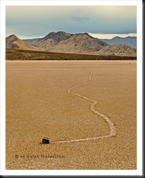 Many images benefit from isolating the subject and simplifying the surroundings as in the case of this wandering rock on Death Valley’s famous Racetrack Playa. With this principle you can create a whole style of photography that is simple, clean and refreshing. It’s harder than it looks (unless you’re on a playa with only one rock around). But with practice you can train your eye to pick out the simple and orderly from the chaos.
This is part of a broader idea. Eliminate all distracting elements from the image. This is an important principle whether you are photographing a very simple, isolated subject or you have a more complex composition. Every element in the image should work with every other element. The image would be diminished if one element is removed and diminished if one more element is added.
Rule of Thirds
The Rule of Thirds is one of the so called ‘Rules’ of composition. And while most visual artists will say there are no ‘rules’ of composition, this one is so useful that it approaches the status of a rule.
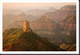 Imagine that there is a tic-tac-toe grid drawn on your image. The idea behind the Rule of Thirds is to place important objects on the horizontal or vertical lines of the grid or at their intersections. In this morning photograph of Point Imperial on the North Rim of the Grand Canyon National Park, Mount Hayden is placed on the left vertical 1/3rd line. The reason this works so well is that placing key elements on 1/3rd lines is very pleasing and at the same time creates visual tension which makes the image more interesting.
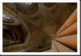 The Rule of Thirds can be used in many other ways as well. You can place the visual focal point of the image at the intersection of two of the lines as in this photograph of the interior of the Elizabethen Kirche in Basel, Switzerland. The lines converging on the lower right hand intersection produce a very powerful effect.
The eye is naturally drawn to these intersection points so placing an object on them naturally draws attention to it. A variation on this idea is to place the main subject on one intersection and a supporting subject on the opposite intersection. For example you may place a family member on the lower right hand corner intersection and the spire of a distant cathedral on the upper left hand corner intersection.
 Another effective use of the Rule of Thirds is to determine where you will place the horizon. In this image of Lake Superior I wanted to emphasize the way a body of water glows during twilight. So the emphasis here is the water and I placed the horizon on the upper 1/3rd line. If I had wanted to emphasize the sky I would have placed the horizon on the bottom 1/3rd line.
We’re very fortunate that the camera manufacturers recognize what an important role the Rule of Thirds plays and have given us the option of displaying the tic-tac-toe grid on our LCD screens. This is available on most point and shoot and DSLR cameras (with live view) and if your don’t have your camera set up to display it, check your camera manual and turn the feature on.
The Rule of Thirds is not a hard and fast rule. But it is a very powerful guideline. It works so well because our brains seem to be hard wired to be drawn to these lines and their intersections. I’m continually amazed when I’m composing an image how a good composition is made even better by adjusting the elements ever so slightly so they align with the 1/3rd lines.
Off Center
 Closely related to the Rule of Thirds is Off Center. In this technique the subject is placed slightly off center as opposed to being right in the center of the image. The bulls eye is a dead spot, lacking in energy and life. Moving the subject slightly off center as in this photograph of the sacred Spirit Little Cedar Tree on the North Shore of Lake Superior adds the right amount of tension (and interest).
It seems to work because our brains like to have things in their place and we tend to want things ordered and in the center. By placing the subject off center our brains try to ‘correct’ the image and that’s what makes it interesting – at least that’s probably one of the best theories.
Lines
Lines are very important to compositions. Lines lead the eye through the image; they create a mood.
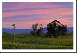 Let’s start with horizontal lines. This photograph of dawn in Napa Valley, California has horizontal or near horizontal lines in the vineyards and the sky. How does this make you feel? What sort of mood does it convey? Most people would say this image has a quiet, peaceful mood. Often times flat, horizontal lines will give the image a lifeless look. The fact that these lines are sloping just a little (along with the windmill and the trees) helps to keep the image interesting.
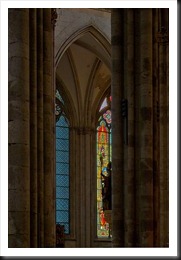 Vertical lines produce a completely different mood. Everything about a Gothic cathedral is vertical. The aim of the architecture is to draw our eyes to heaven and bathe all inside with heavenly light. In this photograph of the interior of the magnificent Kolner Dom in Cologne, Germany the vertical lines of the fluted columns accentuate this uplifting feeling. Other moods created by vertical lines are feelings of energy and strength.
Neither horizontal nor vertical lines impart a feeling of motion. Rather, they are solid and stable, immobile.
 Motion comes from diagonal lines. Even this abstract photographed near Jumbo Rock Campground in Joshua Tree National Park, California has motion.
Diagonal lines are unstable and that is what gives them such energy. Images that incorporate diagonal lines communicate that energy. If the diagonal lines start at the bottom of the frame and lead up into it we call them Leading Lines. This is a very powerful technique for adding depth to your landscape images. Look for diagonal lines to add tension and excitement to your photographs.
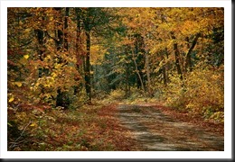 Curves are all around us. They are graceful and flowing. They add a feeling of elegance to an image. In this image of a dirt road in Northern Minnesota, the curve is not visible but implied. You know the road turns as it drops out of site. You don’t need to actually see the curve to know its there. Your mind fills it in. But the effect is still the same.
Oftentimes lines can be implied, not explicit. But they still have the same impact and still create the same moods.
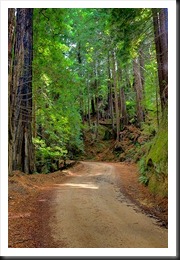 I think the most graceful of all lines is the S-curve. In this photograph of a redwood grove along the Big Sur Coast of California the road leads us into the image, making a very gentle S-curve. It complements the vertical lines of the redwoods and produces an invitation to enter this beautiful and stately forest.
You don’t come across S-curves very often and Tony Sweet, famous landscape photographer, advises us to shoot them whenever we find them in nature.
Textures
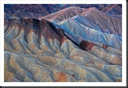 Textures are very interesting and exciting. Textures are the illusion of roughness. They are often created by tiny shadows on an object when light strikes its surface at a low angle. But you don’t always need this kind of light to see the texture; it’s just that it brings it out more.
So, rather than showing an image that has a texture like sand paper (which make stunning images indeed), I decided to give you an example of a soft texture. To me in this image of Zabriskie Point in Death Valley National Park, the qualities of the soft almost fuzzy texture complemented by the soft blue and brown hues evoke the feeling of a baby’s blanket.
Patterns
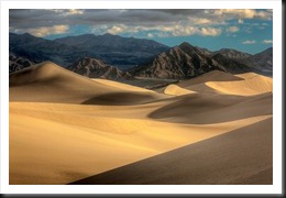 Patterns are very rare in nature. Well, let’s refine that statement. Regular patterns are very rare in nature. Regular patterns are generally found in man made structures. There are exceptions in nature however – the petals of a flower, the shell of a snail and so on. But in general nature is chaotic.
In this image of the Mesquite Flats Dunes in Death Valley National Park the peaks of the dunes create patterns albeit irregular patterns. Furthermore, the patterns in the dunes are repeated in the mountains in the background.
Framing
 Framing the subject is a technique that has been used so often it’s almost a cliché. You’ve seen the photograph of a building with a branch from a nearby tree filling part of the blank sky above. (Some real estate photographers have their assistant hold a branch if one is not handy.) But there are times when framing is the perfect technique. This photograph of the Red Cathedral in Colmar, France was begging to be framed. The archway with the lamp hanging from the ceiling framed a very interesting section of the side of the cathedral. All the elements came together to make a nice abstract image.
Orientation
Horizontal or vertical, the orientation does matter. We often fall into the habit of always shooting horizontal or always shooting vertical orientations. The best thing to do is to mix it up. In fact, I often shoot the same scene in both orientations. Sometimes I don’t know what will work out best until I’m back in the studio and have a chance to review the images more carefully. When you are shooting and things are happening quickly it’s good insurance to grab both shots and delete one later rather than wish you had taken the other orientation but didn’t.
Point of View
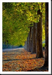 We see the world from eye height – our eye height. And that’s the way we expect the world to be. But if we do a simple thing like getting down on the ground or climbing on top of a picnic table (without stepping in the potato salad of course), the world changes and becomes fresh and new.
This photograph of a tree lined lane in Napa Valley, California illustrates the point. A more ‘standard’ composition would have been to shoot straight down the lane from eye level. And it’s a very beautiful, symmetrical, balanced image. But my moving to the side and dropping down to near ground level the image becomes entirely different. The low viewpoint emphasizes the feeling of depth.
This image also makes use of another compositional technique – perspective. There are three elements of perspective – vanishing point, converging lines and foreshortening. They all further strengthen the illusion of depth and three dimensionality.
A Challenge for You
Being a photographer is about expanding the way you see the world. And one very effective way of doing this is through exploring and trying out different compositional techniques. I believe that it’s perfectly OK to say, “I’m shooting this for its texture,” or whatever. I often have a technique in mind when I’m composing an image – “Oh, S-curve!”.
So the challenge for you is to pick one of these techniques that you don’t consciously use and go out and use it. Explore it. Get comfortable with it. Internalize it.
Then do it again with another technique.
It’s a marvelous experience. I know you will enjoy the journey.
We do photography workshops. Come on out and join us. Click here to check us out.
You can also check out our photography. Click here.
(6239)


Thank you Ralph for sharing these great tips! In high school, during the 70’s, I’d had a half a semester on the topic of “Lines,” which had really impressed me. It was the first time that I became aware of the psychology of photography. Since then I’d, at the conscience level, forgotten a lot. Thank you very much for bringing back memories and re-teaching me this valuable topic. I’ll be sure to share this with Rossy. We still have you on our mind for one of your fantastic workshops!
Martin, good to hear from you.
The more I explore composition the more I become aware of the connection between the composition and the overall emotion or psychology of the photograph. I’m to the point now where I study photographs after the fact, look af the compositional principles employed and see how they contribute to the overall message of the image.
Give my best to Rossy. Looking forward to seeing the two of you in the future.
I am just leaving London UK to spend a month in Yellowstone and Estes Park. Great timing for me to read your article about vacation photography – much to inspire and refresh my photography. Thank you.
Thanks you Phil. I’m happy you found the composition tips useful. Have a fantastic trip (hard not to on those beautiful locations). Wishing you great light. Oh, and if you wouldn’t mind, please share your photos when you return.