I think we all understand that serious landscape photography does not document nature but interprets it. A well-made landscape photograph captures the photographer’s response to what was experienced and is able to convey this response to the viewer.
The Professional Photographers Association has 12 criteria by which they judge their competitions. Granted, the PPA membership consists of very few fine art landscape photographers but still, the criteria of a great photograph are pretty much the same.
Here are the twelve criteria (the order is my own):
1. Impact
2. Composition
3. Center of Interest
4. Lighting
5. Color Balance
6. Technical Excellence
7. Story Telling
8. Creativity
9. Style
10. Presentation
11. Subject Matter
12. Technique
I mention these because there’s a lot that goes in to making a great photograph and these criteria provide a framework in knowing what to look for. But rather that exploring these criteria in words, let’s look at a few photographs. And let’s do it by looking at two examples of the same image – what it looked like when it came out of the camera and what it became when transformed in the digital darkroom.
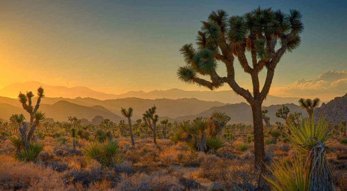
Image 1
The first image is a scene in the mountains of Southern California. I was wondering by myself along a remote trail. The sun was sinking lower and lower in the sky and I was thrilled climbing the trails and walking among the trees and rocks. I came upon this scene and it just felt right. I had to capture it.

The mid-afternoon light is actually quite nice. It’s not spectacular but it’s very pleasant and doesn’t pose any exposure challenges. The shadows make for interesting patterns on the forest floor. And I tried for a composition that captured the energy and harmony I was feeling while at the same time portraying the stately strength of the trees. And the center of interest is the rocks that form a sort of path that leads up to the trees on the right. The trail leads out of the frame on the right, inviting the viewer to explore what lies beyond.
It’s a very nice picture but now it’s time to make it even nicer. An effective way to add impact is to increase the contrast. (This will be a recurring theme.) The shadows can be darkened along with the midtones. Care is taken, however, to not lose detail in the shadows. You also have to be careful with the clouds. They have more detail that the RAW image doesn’t show, detail that can be coaxed out.
The other thing to play with is the color palette. We have a comfortable, cozy response to warm colors and choosing a color palette the brings out the warmth of the trunks and the duff on the forest floor adds a good feeling. Combine that with the blue sky that is carefully enhanced, and the image becomes very inviting.

When I look at this, I relive the joy I felt being alone in these beautiful mountains.
Image 2
This next image is from a trip with my brother to Artist’s Point in Grand Marais, MN on the North Shore of Lake Superior. There’s a good reason this is called ‘Artist’s Point’ as it inspires artists of all types. It was autumn and the sun had set. Gentle twilight was upon us.
It was a quiet, peaceful evening, infused with the glory and joy of autumn.

The light in the RAW file is soft, cool and low-key. Contrast is low, and colors are muted and of a blue hue. The billion-year-old lava in the foreground and the descending line of trees converge on the endless still waters of the largest of the Great Lakes. The motion that the shore generates is complemented by the stillness of the water and the quiet clouds above.
To make this image come to life and fully release the emotion that is just under the surface, a small amount of contrast is added to create what I like to refer to as ‘crispness.’ And one would be remiss if the warm autumn colors were not celebrated and set against the cool of the clouds and lake.

The overall effect is still of peace and tranquility and it also has a dash of life and a pinch of joy.
Image 3
The RAW files in the first two images were rather close to the final photograph. Not a lot of work was required to bring them to completion.
That was not the case with this next photograph. It was a location in Death Valley National Park that I had discovered quite by accident. I had skipped off the pave road that leads into Death Valley from the south in favor of a 45-mile dirt road. There were many intriguing stops along the way and as I neared its end, it crossed a fascinating, rugged salt pan before rejoining the paved road. It was in the afternoon that I first saw it and I knew I had to return for sunrise. I was on the road the next morning before 5:00 to be sure to get there in time. Oh boy, did it ever pay off!

This RAW image doesn’t look exciting at all. It looks flat and quite boring. The composition, however, is interesting. The clouds in the sky mirror the patterns, textures and lines in the salt pan below. And everything in the image draws the eye to the vanishing point right in the center where the salt, sky and two mountain ranges converge. There is a strong sense of depth and vastness.
I started with this image the way I started with the others. The first step was to increase the contrast in this image to utilized the full dynamic range of the medium. I created a few tiny specks of pure black, called ‘black points,’ and brought up the highlights so there were some small areas in the clouds that are nearly pure white. The clouds are very important, so I pulled out all their detail and set them against the blue, morning sky. Finally, I enhanced the warm color on the distant mountain range to provide some color contrast.

This image is so much better. The light on the salt pan in the foreground enhances the textures, patterns and lines. The photograph pulls the viewer in and says, ‘Isn’t this a truly remarkable and grand place?”
Image 4
The last image I want to share is a very special one from the Big Sur coast of California. Of all the spectacular views along this amazing 100 miles of coastline, this is one of my favorites.
I was by myself (seems to happen a lot) and photographing these two bridges, the natural one in the foreground and the iconic Stony Creek bridge in
the background. I was excited to photograph them in morning light, something I had never done before.
It was a morning that did not have a strong golden hour; some mornings are like that. There was a bit of haze that surrounded the bridge in the background. The dynamic range is quite large with very deep foreground shadows and the bright bridge in the background. Not much contrast needs to be added but the shadows are murky. That needs to be fixed.
I set up my camera, chose a vertical orientation and dialed in the composition. There is a strong connection between the two bridges, an implied line that ties the two together. I used a telephoto lens which compressed the space between them, giving both equal weight and importance.

It was important to open up the shadows so that the patterns and textures in the rock stood out. And the contrast needed a little tweaking to create that ‘crisp’ look. The sunlight on the middle ridge was brightened which help to achieve this.
Finally, the joy of golden hour was created by warming the entire image enough to make the haze warm without sacrificing the beautiful blue of the sea.

The result is very pleasing, a scene that invites you to just relax and indulge your senses. One can talk about the technical qualities of this image, how the light and composition and post-processing all come together. But in the end, it’s the feeling that one gets when looking at this that is important.
Summary
Maybe you’re thinking, “That’s beautiful but it’s not real.” I have a couple of responses to that. The first is how I respond to the question, “Do you manipulate your photographs?” My answer is always, “Yes, of course!” When making photographs like we’re talking about here, it’s important to be honest about it. Trying to deceive the viewer is, well, a lie. The viewer has the right to set their own criteria for enjoying a photograph and if it excludes ‘manipulated’ photographs, that’s fine. But they have a right to know.
The second response is related to a follow-up question to the “Do you manipulate your photographs?” question that never gets asked and that is ‘Why?” But I have an answer for that also. “Because my camera doesn’t know what I’m feeling.” The reality I’m trying to capture is the inner feelings I have.
And just as important, that’s the reality I’m trying to share. Because art is a shared experience between artist and viewer.
So, with that in mind, how are the qualities of an effective landscape photography achieved? It starts with a strong composition, a composition that ‘starts the ball rolling’ to capture the response the photographer wants to share. Fantastic light helps a great deal and when you have it your images soar. But, as you can see in the examples above, fantastic light can also be coaxed out in the digital darkroom. And, you want to begin the post-processing with a RAW file that does not have any exposure or sharpness issues.
When it comes to the digital darkroom, contrast is the first thing I attend to. It is a powerful element that creates impact. When you work on contrast, the image comes alive before your eyes. One way to think about it to make the best use of the full dynamic range of your medium. In addition to adding ‘crispness’ to your photographs, you want to make sure you don’t have blown highlights or murky shadows.
Next, you need to be aware of your color palette. Painters understand that the color palette has a powerful emotional impact on the viewers. Warm colors bring energy and come toward the viewer. Cool colors retreat from the viewer and bring quiet. We are smart to follow their wisdom in this area. Choosing to emphasize colors that are opposites (on the opposite sides of the color wheel) also enhances the image’s impact by adding color contrast.
Finally, we look at color saturation. A lot can be communicated by the intensity or purity of the colors. Strong, saturated colors convey one thing while soft, pastel colors convey quite another.
In the end, the photographs you make will result from the understanding of these tools gained through practice, trial and error, and applying your own judgement and taste to their use. Your photographs will reflect your reality and that’s the way it should be.
Join us on one of our exciting photography workshops.
(323)
The Camera provides a coloring book.
LIght Room provides the crayons.
Mix to provide ART. I mean what Ralph said more eloquently.
I like the way you said it Brad. Also eloquent.