Focus Stacking in Joshua Tree National Park

As part of the Desert Institute class I was teaching in Joshua Tree National Park, we did a sunset at the end of the second day at the trailhead parking log for Ryan Mountain.  Across the road one of the participants found a composition that I liked a lot, so we talked about the possibilities.  He ended up with a nice photograph and moved on.  I spent a little more time on it because I saw that there was a depth of field problem that needed to be resolved.

The foreground was about 20 feet from the camera and the background was a least a quarter of a mile away.  At a focal length of 190 mm there was no way I could get that depth of field even with an aperture of f/32.  So, as you can see below, I did two shots, one focused on the bush in the foreground and the second focused on the outcrops in the background.  The plan was to use focus stacking to get a sharp image throughout.

Photoshop does an excellent job of focus stacking.  To get it started, I selected the two files in Lightroom and clicked Open as Layers in Photoshop… from the Photo menu.

Lightroom converts the DNG files to Tiffs and loads them into Photoshop where they are stacked as two layers, one on top of the other.

In Photoshop, select both layers and in the Edit menu first click Auto-Align Layers… and then Auto-Blend Layers…. It’s that easy.

Continue reading “Focus Stacking in Joshua Tree National Park”

(156)

Why Lightroom?

A brief rundown on the strengths and weaknesses of Lightroom

I remember when I first tried to process RAW files back in 2002.  I had been shooting JPEG up to that point and heard about RAW files, so I thought I’d give it a try.  I used the only RAW conversion program available to me at the time – Camera RAW in Photoshop 7.1.  It didn’t go well.  I couldn’t figure it out, so I continued to shoot in JPEG. 

Then I heard about a product called RawShooter from a Danish company – Pixmantec.  It had just become available and it was free.  With nothing to lose I downloaded it and checked it out.  It was fantastic.  It was so easy to use.  When the company offered the paid version, RawShooter Premium, I was all in.

Then, on June 26, 2006, Adobe announced they had purchased the ‘technology assets’ of Pixmantec for incorporation into Lightroom which was in the third round of beta testing at the time.  Version 1 was shipped in February of 2007 and us Pixmantec customers were grandfathered in.  With RawShooter Premium no longer available and a free version of Lightroom 1, I switched to it and was pleased to see some of the functionality in RawShooter Premium that I especially liked appear in Lightroom 1 that hadn’t been in any of the beta versions. 

Michael Reichman of Luminous Landscape and Jeff Shewe in the Photoshop Hall of Fame put together a video training course which I grabbed up right away.  And my experience with Lightroom was off to an excellent start.

A Brief History

Lightroom was designed from the start for digital photographers.  The core functionality was to be RAW image conversion.  But digital photographers need a lot more than just that. They needed to be able to organize their image files, edit them, categorize them, tag them, export them, print them and more.  In short, professional digital photographers needed to be able to run all aspects of the creative side of their businesses using Lightroom.  It’s tempting to think of Lightroom as a tool to adjust and enhance our images but as you can see, it’s so much more.

The Heart of Lightroom – the Catalog

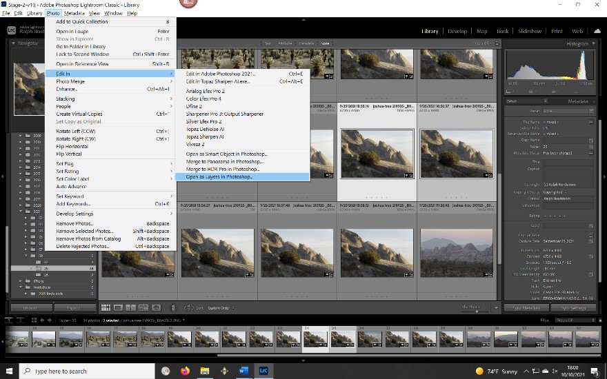
With the introduction of layers in Photoshop, the notion of non-destructive enhancements was introduced.  The idea is that the original image is priceless and if adjustments change it and they don’t work out, you’re in trouble.  You can’t start over again.  So, Photoshop introduced layers.  Virtually all of the adjustments you could apply to the original file could be applied in layers stacked one on top of the other.

To give the photographer the ability to make adjustments non-destructively, Lightroom took a different approach.  The developers created a catalog that is at the heart of Lightroom.  Understanding how the catalog works is key to getting the most out of Lightroom.

Simply put, the catalog keeps track of virtually everything about the image files.  First, it knows the location of the file – the hard drive it is on and the folder it is in.  When Lightroom creates a JPEG preview file that it uses when it displays the image on your monitor, the catalog knows the name of the preview file and where it is. If you use the star method of ranking files or you flag them or assign a color to them, all that data is kept in the catalog. 

And when you make adjustments such as Exposure or Contrast or Highlights or Saturation or any of the other available adjustments, every one of them are kept in the catalog as a simple list.  This gives you a full history of all of the adjustments.  If you decide to start over, since the original RAW file hasn’t been changed, you can keep the original list and create a new list.  This gives you the ability to try different approaches for an image.  And the original RAW file remains unchanged.

Continue reading “Why Lightroom?”

(124)

The Qualities of a Powerful Landscape Photograph

When working on a photograph and wondering where to start, it’s helpful to know what is possible.

I think we all understand that serious landscape photography does not document nature but interprets it.  A well-made landscape photograph captures the photographer’s response to what was experienced and is able to convey this response to the viewer.

The Professional Photographers Association has 12 criteria by which they judge their competitions.  Granted, the PPA membership consists of very few fine art landscape photographers but still, the criteria of a great photograph are pretty much the same.

Here are the twelve criteria (the order is my own):

1.    Impact

2.    Composition

3.    Center of Interest

4.    Lighting

5.    Color Balance

6.    Technical Excellence

7.    Story Telling

8.    Creativity

9.    Style

10.  Presentation

11.  Subject Matter

12.  Technique

I mention these because there’s a lot that goes in to making a great photograph and these criteria provide a framework in knowing what to look for.  But rather that exploring these criteria in words, let’s look at a few photographs.  And let’s do it by looking at two examples of the same image – what it looked like when it came out of the camera and what it became when transformed in the digital darkroom.

Image 1

The first image is a scene in the mountains of Southern California.  I was wondering by myself along a remote trail.  The sun was sinking lower and lower in the sky and I was thrilled climbing the trails and walking among the trees and rocks.  I came upon this scene and it just felt right.  I had to capture it.

San jacinto 180720 SM37804

The mid-afternoon light is actually quite nice.  It’s not spectacular but it’s very pleasant and doesn’t pose any exposure challenges. The shadows make for interesting patterns on the forest floor.  And I tried for a composition that captured the energy and harmony I was feeling while at the same time portraying the stately strength of the trees.  And the center of interest is the rocks that form a sort of path that leads up to the trees on the right.  The trail leads out of the frame on the right, inviting the viewer to explore what lies beyond.

It’s a very nice picture but now it’s time to make it even nicer.  An effective way to add impact is to increase the contrast.  (This will be a recurring theme.) The shadows can be darkened along with the midtones.  Care is taken, however, to not lose detail in the shadows.  You also have to be careful with the clouds.  They have more detail that the RAW image doesn’t show, detail that can be coaxed out.

Continue reading “The Qualities of a Powerful Landscape Photograph”

(193)

Making a Photograph – Sheep Pass Morning (2016)

The making of a photograph of monrning in Joshua Tree National Park.

When you get up early and leave at 4:30 in the morning for a sunrise shoot there are no guarantees. You pick a location that has potential and, by getting out so early, you up the potential for great light.  It might, and then it might not happen.  But you’re out there anyway.

When you arrive, the desert is still dark. You stand by your car, talking quietly with friends, sipping hot coffee and watching the emerging light on the eastern horizon. There is a sense of eagerness balanced with patience. Often, however, just being there is its own reward and coming home with a keeper is icing on the cake.

The earth brightens quickly this time of day and soon you grab your gear and head out into the desert. For me, just wandering and not looking for anything in particular is the best approach.

I prefer to let images come to me rather than hunting them down. When something I see stops me in my tracks, these turn out to be the best photographs. It’s not because I’m searching for leading lines or applying the rule of thirds or any other of the many ‘rules’ of composition. I don’t like to think when I’m photographing; I prefer to become quiet and simply experience. And when I’m in that state of mind I stop in my tracks because it just feels right. And the stop is usually followed closely by an utterance of surprise and joy – “Oh Wow!”.

Such was the case with “Sheep Pass Morning.” The morning shoot was winding down, meaning the sunrise had come and gone and the wonderful golden hour light was quickly fading. I wandered aimlessly and “Boom,” there it was. I was excited. This just felt right.  And yes, I did say, “Oh wow!”

I set up my camera and composed the shot. I was conscious of the cluster of rocks in the lower right corner and their relationship with the Joshua trees on the right edge. I was conscious of outcrop of rocks on the left, the mountain range in the background (Queen Mountain) and the clouds. All these elements were in my mind but mostly I was seeking balance and harmony. During that time, distant Queen mountain into shadow so I waited for the light to came back, cheering it along. Then the moment came and I tripped the shutter.

Continue reading “Making a Photograph – Sheep Pass Morning (2016)”

(142)

Creating Images with Impact – Black Point

Add Impact to your Images by setting a black point. Here’s the how and why.

In this series of blog posts were talking about how to create Images with Impact. You know what I’m talking about. These are those images that really grab our attention, that capture our imaginations. There’s something special about them and it doesn’t have to be a mystery how they are created. There are a few simple techniques that you can use in Lightroom and Photoshop to add impact to your images. Now if you don’t use Photoshop, you can still do everything were talking about in Lightroom.

In the first article we talked about utilizing the full dynamic range of your medium. This is something Ansel Adams taught in his books and classes that was an essential element of his stunning landscape photographs. As he developed his technique which became known as the Zone System, the primary goal was to use the full dynamic range of his medium which, in his case, was the black and white print.

So we talked about that technique first because it is the most appropriate place to start. I do want to add that in color photography or color prints not every print benefits from a white point but virtually all prints benefit from a black point – which is what we want to talk about in this article.

IMG_0012-2

What exactly is a black point? It is small portions of the print that are pure black. If you’re printing on paper than these are small portions that are the blackest black that the combination of paper and ink can achieve. As a side note, different combinations of paper and ink achieve different levels of blackness. But regardless of the combination you use, the blackest black that can be achieved is your black point.

You want to keep the black point areas very, very small because they have no detail. And generally speaking we like to see detail in our shadows, another guideline that I picked up from studying Ansel Adams. But you don’t want to eliminate black points, that is, in most cases. There are a few exceptions to this rule that I will talk about later.

Let’s take a look at the before and after images of our photograph. I shot this at the Huntington Library in South Pasadena a few weeks ago. It’s in their incredible cactus garden – endlessly fascinating.

Continue reading “Creating Images with Impact – Black Point”

(8327)

How to Photograph the Coastal Redwoods

The Coastal Redwoods of Northern California have a beauty that is inspiring. But capturing them in a photograph is much harder than it may seem. Come with me to explore ways to capture their grandeur.

California is blessed with two species of redwoods, the Giant Sequoia (Sequoia giganteum) of the Sierra Nevada Mountains and the Coastal Redwoods (Sequoia semperverins) along the California coast from the Oregon border to 150 miles south of San Francisco.  These awe-inspiring trees are both a joy and a challenge to photograph.  I recently spent a week in Crescent City in Northern California photographing the Coastal Redwoods and leading a photography workshop there.  I’d like to pass along some of the techniques we employed to capture photographs that do these majestic trees justice in breathtaking but often very difficult light.

Continue reading “How to Photograph the Coastal Redwoods”

(7366)

Mastering Exposure – Expose to the Right

Expose to the Right – put it to the test by creating and comparing actual images.

Over the years there has been a lot of interest in the concept of ‘Expose to the right.’  This is something that is commonly done in digital photography where you intentionally overexpose an image.  The idea is that in digital images there is more information to work with in the brighter tonalities than there is in the darker.  And this will give you more to work with in the darkroom (Lightroom and Photoshop) which will result in a better image.

I’ve written several posts on this topic and if the concept is new to you please read these.  I’m not going to go into the theory here; that is spelled out in these posts.

Lightroom Tutorial – Expose to the Right

Expose to the right – Revisited

Now, I understand the theory.  I’m a computer guy; I had better understand it.  But I’ve always wondered if the promise of a better image actually worked out in real life.  So I did a test during our recent workshop to Big Sur.

Continue reading “Mastering Exposure – Expose to the Right”

(2292)

Color Management Made Simple – From Computer to Print

Color Management can be a difficult topic. But we’re breaking it down for you. This is the third in a series of articles on the topic – from the Computer to the Print. For a full understanding, read all three.

Color Management is the science of getting the colors you want in your photographs – consistently.  And in my workshops I hear all too often that people are disappointed because the colors they get in their prints are not what they saw on their monitors.  They often go to a lot of work preparing an image and when they print it it’s as if all that work was a waste of time.

Color Management is indeed a science and can be very complicated and technical.  But getting the same colors on the print that you see on your monitor is essential if you are to have control over the creative process.  For that, color management is the key and in these series of articles I’m trying to break it down to make it more understandable and accessible for all of us.

plaskette_rock_setting_sun_110808

In the previous two articles I presented the concept of a color space and what happens behind the scenes when you move the image from the camera to your computer.  See Color Management Made Simple – Color Space and Color Management Made Simple – From Camera to Computer.  In this article I’ll be covering the all important aspect of getting your prints to look like what you see on your monitor; that is, from Computer to Print.

Continue reading “Color Management Made Simple – From Computer to Print”

(3282)

File Naming Strategies

Having an effective file naming convention may not be the most exciting thing but it can sure make your life a lot easier.

OK, so this isn’t a very sexy topic but having a strategy for naming your image files can save you a lot of grief down the road.  Let me run through what I’ve worked out over the years (and believe me, it’s taken several years to perfect this).

So it starts in Lightroom which gives you the option of renaming your files when you import them.  I’m following Scott Kelby’s recommendation here.  Let’s start with a file name as it is created in the camera.  It’s going to look something like this – _SM35116.CR2.  By the way, here’s the photograph that that goes with.

hidden_valley_130119

Hidden Valley (2013)

Continue reading “File Naming Strategies”

(2756)

Lightroom Tutorial – Workflow Made Easy

Simplify your Lightroom workflow with these easy steps.

Lightroom is a great tool. It’s quick and easy to use – once you get the hang of it. But sometimes mastering the workflow, the steps you go through to take a raw file to a ‘final’ image, can be a bit daunting.

Let me say up front that Lightroom is an important part of my workflow but it’s not the only part.  Every photograph I work on starts in Lightroom but is completed in Photoshop.  Nevertheless, Lightroom gets a photograph to about 80% of the final product.  I know many people who use Lightroom exclusively and Photoshop only in rare circumstances if at all.

So back to the workflow.  Can it really be made easy?  Yes it can.  There are four major steps (not counting import – see Lightroom Tutorial – Importing Photographs):

  1. Mechanical adjustments like dust spot removal and cropping
  2. Tonality adjustments
  3. Hue adjustments
  4. Saturation adjustments

Let’s skip the first step and start with the second.  The example will be in Lightroom 4.

Continue reading “Lightroom Tutorial – Workflow Made Easy”

(7129)