Color Management is a very complex topic. And it’s possible to get bogged down in a lot of technical details. But it’s extremely important, especially if you want to print your photographs. And it can be broken down into a few simple concepts.
On my workshops I often get asked questions about color management and the topic is huge and a bit technical to get into the details. So I thought I’d give an overview of the topic in a few blog posts. Who knows, maybe I’ll create a presentation that can be used during a workshop.
Color Space
Let’s start with color space which is the whole reason we need color management.
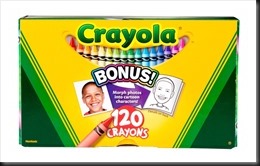
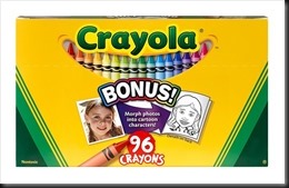
A color space is all the colors that can be rendered using a given technology. Think if it this way. You all enjoyed coloring with crayons when you were young. And I don’t know about you but I was always envious of my friends that had the big giant boxes of crayons with 120 different colors. They had every color under the sun.
We can think of the 120 crayon box as being the color space of the real world with every color under the sun.
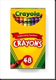
Now, you’re reading this blog on your computer monitor or tablet display. It’s using a color space that was defined specifically for the internet – sRGB. This stands for “standard Red Green Blue.” It was jointly developed back in 1996 by Hewlett-Packard and Microsoft. It’s a color space that is designed to work on any display device and is thus the lowest common denominator. It cannot display all the colors we see in nature. It is like the 48 crayon Crayola box.
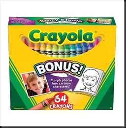
Two years later Adobe came along with their own color space definition, realizing that sRGB was not adequate for serious graphic design and photography. So they put forward AdobeRGB(1998). It was much better than sRGB and was more like having this 64 crayon box.
With AdobeRGB(1998) it was possible to render a far greater range of colors than were available in sRGB. And we were much happier. But as good as AdobeRGB(1998) is, someone always wants more. So along came an even larger color space – ProPhoto RGB. It was more like a 96 crayon box.
It still does not render all the colors in nature but it’s much better than sRGB and marginally better than AdobeRGB(1998).
Now, don’t take this comparison of Crayola boxes literally. I’m not suggesting that AdobeRGB(1998) has a color space that is half again as big as sRGB (that is, renders fifty percent as many colors). I’m just saying that it’s more. Actually, it’s quite a bit more.
These are just three color spaces that are in common use when we work on our photographs on our computers. But this isn’t all of them; not even close. There are hundreds if not thousands of color spaces as we’ll see later.
So with this in mind, what can we conclude. Well, let’s start with your camera. Each camera has its own range of colors its sensor can capture, its own color space. Differences in the various sensors from one model to the next will result in slightly different color spaces. When you capture RAW images all the colors the camera is capable of capturing are in the RAW file. In other words, there is no defined color space for RAW files; it’s just what the camera’s sensor can capture. But when you capture JPEG the camera’s processor will convert the RAW image from the sensor to JPEG format and you actually have a choice of color spaces. The default is sRGB. But you can change that to AdobeRGB(1998). Your camera has a menu option for that. Now, I don’t recommend shooting in JPEG but if you do, be sure to set your camera to use the AdobeRGB(1998) color space.
The other place where this affects us is when we convert our RAW files to another format such as TIFF or PSD in raw image conversion programs like Lightroom or Adobe Camera Raw. Again, you have a choice of the target color space and again, most programs default to sRGB. I recommend you change that to ProPhoto RGB. That’s the color space I prefer.
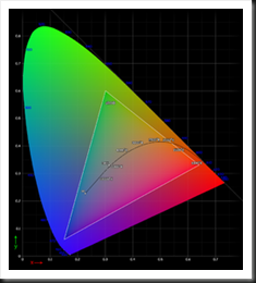
Want to see what a color space actually looks like? Here’s the sRGB color space.
There’s (a lot) more to this topic but this is a good place to stop so you can get back to whatever you need to get done today.
We always enjoy hearing from you so feel free to join the conversation and leave a comment. Also, we encourage you to share this with your photographer friends.
Join me on an upcoming workshop. Click here for more details.
To see more of my photographs click here.
(3684)
Mr. Contrarian here. Unlike the other commenters, I don’t think the crayon boxes are a good analogy. It’s not the number of colors available that separates one space from another. In fact, one color space has as many colors as another. A better analogy would be comparing different brands of crayons. Let’s consider a basic set with yellow, red, blue, and green. Sometimes, at kid-friendly restaurants, such 4-color crayon sets are available for kids to color with while the food is prepared. Usually, these are generic crayons with rather poor color rendition. I remember as a kid being frustrated that such crayons were not much good. In contrast, Crayola crayons, even in a set of these same 4 colors, were much more vibrant. With the generic crayons, all you could create was art with faded looking colors. With the Crayola crayons, the colors were much more rich. That is the type of difference reflected in different color spaces.
I would also criticize the picture of a color space. Color spaces are three dimensional. What you have shown here is a slice of a particular rendition of a color space, displayed in the coordinate system of another color space.
Victor, thank you for your thoughtful comment. The reason I chose boxes of crayons with more or fewer crayons is to demonstrate that some colors are just not available in certain color spaces. For example, sRGB cannot render nearly as many colors as ProPhoto RGB – hence gamut errors when converting from ProPhoto RGB to sRGB. Your illustration of cheap restaurant crayons compared to quality Crayola crayons refers primarily to color saturation and is also an illustration of the limited color gamut of the restaurant crayons and hence the smaller color space.
Thanks for adding to the conversation. I appreciate you taking the time to share your thoughts.
This is a great, clear and easy to grasp way to explain colour spaces. I am very familiar with the colour management process and found it an enjoyable read. Is it alright to put a link to this on my website? ( I am currently creating a new website and would love to include links to information that is easy to understand ) Thank you.
Hi Venus, it’s wonderful to hear from you. I trust all is well. You can definitely put the link on your website. And let me know when you get it up. I’d like to catch up on what you’re doing.
Hi Ralph, this is a great beginning to understanding Color Management. I love the crayon box analogy! What’s the next step(s)? What settings should we use on our cameras and in Photoshop? If we don’t do our own printing, seems like most print shops required that you convert to sRGB …..
Hi Maureen, it’s good to hear from you. The next step is to talk about from the camera to the computer and after that from the computer to the print. I’ll be sure to include labs on the print side. Thanks for the suggestion.
Although I know a little about colour spaces and why we should use particular spaces for particular jobs, I found your analogy using the crayon boxes as an example to be a good one, especially for those new to the idea. Good for visual learners like me, too.
Thanks Allison. It just came to me and it seemed a good way to illustrate color spaces.