Photographic Gear – the Camera Body

I’m taking you on a tour through my camera bag and the first stop was the bag itself.

Click here to read the article: Photographic Gear – A Tour of a Photographer’s Camera Bag

The next stop is the camera itself. Now, by this, I mean the camera body, not the body and lens. I’ll talk about lenses later.

Like so many of us, my camera got put aside for quite some years. I was very active in photography in the 1970s. I took frequent trips to Yosemite, camping and exploring with camera in hand. I even worked in a photography studio lab for several years, learning the intricacies of color film processing and printing. But then things changed and time for photography dissolved. Until my daughter was about to be born in 1994, that is.

I bought a Canon EOS ELAN with a Tamron 28-200mm lens and shot countless rolls of film, mostly of the new joy in our lives.

clip_image002[4]I resisted the digital movement for a long time, preferring 35mm film. But when I finally joined the movement around 2000, I purchased a digital point and shoot with a big zoom lens. It was a Canon PowerShot Pro90 IS that I cut my digital teeth on with all of its 2.6 megapixels.

I tried to apply what I had learned in the film world for both color slide and negative films to the digital world. I also tried to apply what I had learned in the color darkroom to Photoshop. It took a while to realize that very little of the knowledge and experience I had gained carried over into the digital world. This required a whole new way of thinking, both in the field and in the digital darkroom. For example, with color slides, you normally want to underexpose a little to saturate the colors more. With digital, you overexpose a little to get more detail in the shadows.

clip_image004[4]It was in September of 2004 that I made the jump to a digital SLR when I upgraded to the Canon 10D. With a little over 6 megapixels, I was a big step up from the PowerShot. This is the camera I was carrying around in the duffel bag I mentioned in the previous article.

I did a lot of shooting with the 10D. I was intimidated by RAW processing at first so I shot in JPEG. Sadly, there are a lot of JPEG files that would have been great had I been able to capture them in RAW but, alas…. Eventually, I moved to RAW when I found a software program that made sense. Adobe bought the software when they were developing Lightroom. It made RAW conversion much less intimidating.

Continue reading “Photographic Gear – the Camera Body”

(272)

Mastering Light – Warm and Cool

In which we explore the color of light coming from different sources.

Light has several properties that are important to landscape photographers including quality, direction and color.

It is important to understand that different times of day and weather conditions will produce light of different colors.  Also, when you add artificial light sources the range of colors expands.

Our brains play tricks on us when it comes to color.  During twilight we don’t see that the light is a soft, delicate blue.  In fact, we don’t perceive any color cast at all.  But the camera is not fooled.  It sees what is actually there.  Take this image that I call ‘Breakfast’ as an example.

light-warm_and_cool

When drastically different light sources are set next to each other than our eyes can clearly see the difference in the colors.  In this photograph the interior of our home is illuminated by tungsten lights which give off a very warm color.  That’s why our homes feel so warm and cozy at night – because of the warm light emitted by tungsten lights.  (That will change as we replace the tungsten lights with CFLs or LED lights.)  Outside we have a foggy morning at twilight.  The sun is about 10 minutes away from rising.  And it’s clear the color of the outside light is blue.

If I was standing outside away from the warm tungsten light, my mind would trick me into thinking the light was not blue, just a neutral gray.  But the camera is not fooled.

So then why are we so easily fooled?  Because of perception.  Our brains receive input from all of our senses including our eyes.  And without us even being aware of it, this input is translated into something we are familiar with, concepts and generalizations we have learned from all the accumulated experiences of our lives.  And our brain overrides (manipulates if you will) the actual blue color of the outdoor light and we perceive it as neutral.

Our perceptions help us with everyday living.  They help to bring order to our lives from the endless bombardment of stimuli.  But perception interferes with the photographic process of seeing.  As far as day-to-day life is concerned we don’t need to see that the outdoor light is blue.  But as photographers, cultivating the ability to see beyond our perceptions opens up the world to us in ways we normally can’t even imagine.  And isn’t this what photography is all about?


Join the conversation, share your experiences, leave a comment.  We love to hear from you.  And if you know of someone else who might enjoy this article, please share it.

We do photography workshops.  Come on out and join us.  Click here to check us out.

You can also check out our photography.  Click here.

(1396)

Color Management Made Simple – Gamut Errors

In the forth article in our series on Color Management we talk about gamut errors and rendering intents – perceptual and relative colorimetric.

“Why don’t my prints look the same as the image on my monitor?”  This is a frequent question in my workshops.  It’s not the fault of the printer as is often suspected.  My response is always, “It’s a color management issue.”

This is fourth in a series of articles that are shedding light on the complex subject of Color Management.  So far we’ve covered Color Space in Color Management Made Simple – Color Space, the importance of profiling your monitor in Color Management Made Simple – From Camera to Computer and printing basics in Color Management Made Simple – From Computer to Print.  These three articles give us a pretty complete picture of color management.  But there’s still one very important concept to discuss – Gamut Errors.

In the Color Space article we introduced the color spaces that are commonly used when we work on our photographs – proPhoto RGB (the most complete), AdobeRGB and sRGB (the most limited).  Each of these color spaces was compared to a box of Crayons with proPhoto RGB being represented by the 92 count box, AdobeRGB by the 64 count box and sRGB by the 48 count box. crayons_96cnt In the Computer to Print article we talked about the different types of print paper and inks and how each has its own unique color properties.  That is to say, each paper / ink combination has its own color space.  And the size of the color space (number and colors of Crayons) varies from one combination to the next.  The size of the print’s color space depends on the type of paper.  Glossy papers are at one end with the largest color spaces and matte papers are at the other.  Luster papers are very close to the color spaces of glossy papers.

The color of the paper itself also affects its color space.   Some papers are pure white and to achieve this they very often contain chemical brighteners.  These papers will have a larger color space.  Papers without brighteners may still appear white but they won’t have as large of a color space.  And some papers are not even white but have a pale yellow cast.  Not only will this affect the color but it also reduces the color space.

Now comes the big question.  What happens when the colors in your photograph cannot be reproduced in the paper’s color space?  Or stated another way, what happens when there aren’t as many Crayons in your paper / ink’s color space as there are in your photograph’s color space?  Well, it’s not  a problem if you only use Crayons in your photograph’s color space that are also in the paper / ink color space.  But that’s no good.  You may want to print the same photograph on a different paper with a larger color space.

When you have colors in your photograph that cannot be reproduced in your paper / ink color space you have Gamut Errors.  Boy these can be annoying.  And they can be puzzling too.  You may have areas of your photograph that don’t have any apparent highlight clipping (they’re not pure white) but they still don’t have any detail.  This is because colors outside the paper / ink color space are printed at the outer limits of that color space.  For example, if you have a really intense blue Crayon in your photograph’s color space but a less intense blue in your paper / ink color space, the image will be printed with the less intense blue.  And not only the photographs intense blues but also the its less intense blues.

Remember the CMM (Color Matching Module)?  That’s the software on your computer that basically translates colors in your photograph’s color space to the same colors (but a different set of RGB numbers) in your paper / ink color space.  When the colors in your print fall outside of the paper / ink color space the CMM is responsible for dealing with that.  You can specify how you want it to handle this by specifying the Rendering Intent.  And that’s what rendering intent does – tells the CMM how to render colors that fall outside the color space of the medium you’re printing on.  Therefore,  rendering intent is part of the print dialog.

There are four rendering intents, two of which we use in photography.  Here are the four but I’m only talk about the two we use – Saturation, Absolute Colorimetric, Relative Colorimetric and Perceptual.  It’s the last two – Relative Colorimetric and Perceptual – that we use.

We’ll do Relative Colorimetric first because this is what was described in the example of the blue colors above.  The blue that was out of gamut was translated to the nearest blue at the edge of the paper / ink color space.  None of the colors that are in gamut are changed.  Which is the way relative colorimetric works – colors in gamut are not touched (other than the translation of their RGB numbers from one color space to the other).  But colors that are out of gamut are translated to the nearest color at the edge of the color space.  Theoretically, relative colorimetric preserves the color at the expense of saturation.  As a practical matter, I find that relative colorimetric produces images with sharper contrast and often a little darker than the alternative, Perceptual. rendering intent rc With perceptual the colors that are out of gamut are mapped back to the color space just like relative colorimetric.  The difference is that the colors within the color space are also altered, they all get moved closer to the center of the color space.  I think of it as being very similar to what I used to do as a kid with a rubber band.  I’d stretch it out and write my name on it with a ball point pen. Then let the rubber band return back to it’s regular size and all the letters would get very narrow scrunched together.  It was cool.  Perceptual preserves saturation but may result in some color and tonality changes.  And my experience is that the image tonalities are softened. rendering intent p I routinely use both rendering intents and it would be hard to say which one I use the most.  I like relative colorimetric for it’s more dramatic look due to the contrast.  But often times the shadows become blocked so I switch to perceptual which does a better job of preserving shadow detail or when I want a softer look.  It can be a nightmare to keep track of which rendering intent I use.  So once I find the rendering intent that I like, I change the file name by appending the rendering intent to the end.  The file name may end up looking like big_sur_pfeiffer_beach_130804_rrpm_rc.tiff for a photograph that works best with relative colorimetric (rc) rendering intent printed on Red River Polar Matte (rrpm) paper.  See File Naming Strategies for more details.  I find that I routinely print two, three, four or even more proofs, tweaking this and that including rendering intent until I finally get the results I’m looking for.

Let’s put it all together.  First, calibrate your monitor.  Next, use a large color space for your images in post processing such as proPhoto RGB or AdobeRGB.  Do not use sRGB for your photos.  Finally, when you print use the CMM of the print program, not the operating system, specify the ICC profile for your paper / ink combination, disable color management in the printer and select the rendering intent that gives you the best results.


Do you have experiences and thoughts on color management?  We’d like to hear from you; add your comments.  And if you know someone who might find these articles useful, please feel free to share it with them, Like us on Facebook, repost it on your website or blog.

Join me on an upcoming workshop.  Click here for more details.

To see more of my photographs click here.

(6074)

Color Management Made Simple – From Camera to Computer

Read the second installment in a series of articles on Color Management – taking the image from the camera to your computer.

If Color Space can be described as a box of Crayons as we suggested in  Color Management Made Simple – Color Space,  what else do we need to know about Color Management?  Well, Color Management is essentially about getting the right colors – and here’s the most important word – consistently.

Let’s spend a few moments talking about the ‘right color.’  (I’m inclined to add, ‘whatever that is.’)  The story begins when you press the shutter.  Let’s suppose you are photographing the beautiful redwoods of Northern California.

redwoods_130528__SM36093_4_5_6_7-Edit

The scene is full of rich browns and oranges and vibrant greens.  We can say that these are the right colors, these are the colors you want.  You set up your camera and snap a picture and your sensor captures these colors, pretty much just as they are (the sensor is playing with pretty much the full big box of 120 Crayons). The camera’s processor does its thing and the image is saved in a file to your memory card.  Eventually we’re going to view the photograph on our computer’s monitor and we just might be a bit disappointed.

Continue reading “Color Management Made Simple – From Camera to Computer”

(1674)

Color Management Made Simple – Color Space

Color Management is very important if you want to get prints that look as good as the images on your display. And understanding color space is fundamental to understanding color management.

Color Management is a very complex topic.  And it’s possible to get bogged down in a lot of technical details.  But it’s extremely important, especially if you want to print your photographs.  And it can be broken down into a few simple concepts.

On my workshops I often get asked questions about color management and the topic is huge and a bit technical to get into the details.  So I thought I’d give an overview of the topic in a few blog posts.  Who knows, maybe I’ll create a presentation that can be used during  a workshop.

Color Space

Let’s start with color space which is the whole reason we need color management.

A color space is all the colors that can be rendered using a given technology.  Think if it this way.  You all enjoyed coloring with crayons when you were young. And I don’t know  about you but I was always envious of my friends that had the big giant boxes of crayons with 120 different colors.  They had every color under the sun.

crayons_120cnt

We can think of the 120 crayon box as being the color space of the real world with every color under the sun.

Continue reading “Color Management Made Simple – Color Space”

(3667)

Is HDR a Four Letter Word?

Is HDR really a four letter word or is it a powerful technique that let’s capture images we would have had to pass up in the past?

HDR.  Many people respond to those three letters in shock and disgust.  For them, HDR is synonymous with over the top processed images.  It embodies all that they think is wrong with digital photography and the implied MANIPULATION that goes with it.  It is a shocking insult on reality.

I’ve heard of photography contests that strictly forbid HDR and insist that all the photographs that are submitted be a single exposure.  I’ve judged photography competitions in which the other judges viewed an HDR image that was just slightly over the top and felt it should be placed in the Manipulated category.

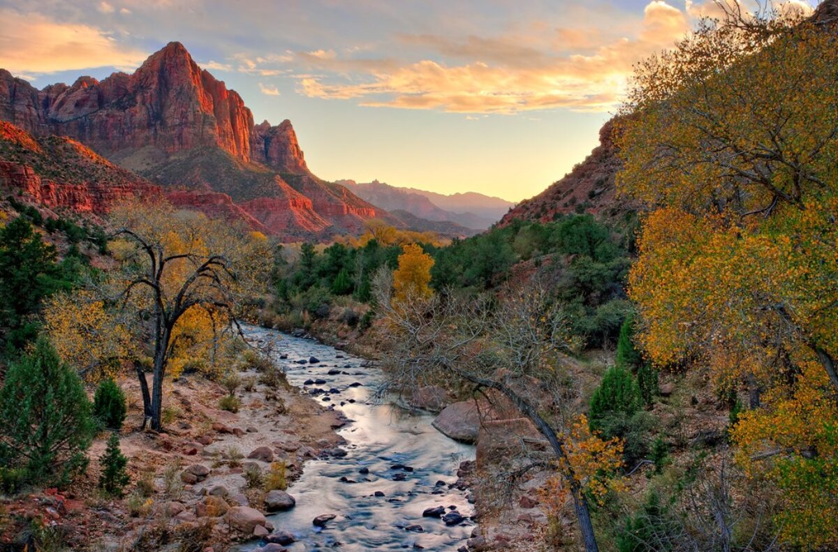
But the letters HDR stand for High Dynamic Range.  Nothing sinister about that.  It’s a situation frequently encountered when out photographing.  That’s when the dynamic range of the scene, the difference between the darkest and brightest spots in the scene, is greater than the dynamic range our camera’s sensor is capable of capturing.  When we encounter this situation we’re going to get clipping where the highlights or shadows or both lack detail, are blank.  This is not a desirable situation.  If there’s anything that’s shocking here it’s that the camera, that supposedly great recorder of reality, does not, cannot see what our eyes see.  So what can be done about that?

Well, if you’re shooting color film the answer is simple. Nothing.  Move on.  You’ll never be able to capture high dynamic range images on color film (without clipping) no matter how beautiful they are.  If you are shooting black and white you can do what Ansel Adams did – water bath development.  He exposed for the shadows and adjusted his development process and chemicals to get a proper development of his highlights.  Sounds to me like he’s doing what we digital photographers do with HDR – adjusting the process to capture the full dynamic range (Read “How Ansel Adams did HDR”).

If you’re a digital photographer you can use the HDR technique – capture two or more images with bracketed exposures that span the dynamic range and then blend them together using software like PhotoMatix Pro.  So where’s the problem?  I mean, doesn’t that sound like a good thing, taking photographs we weren’t able to do at all with color film or with great difficulty with black and white?

But somehow HDR has become a four letter word in some circles.  It’s become synonymous with that word that is so offensive to some – MANIPULATION.  HDR images are manipulated images.  Never mind that HDR can be used to create photographs that are a lot more like what our eyes see than what our cameras are even remotely capable of capturing.

Many of these same people that think that HDR is a four letter word are also prone to look down their noses and ask, “Did you PHOTOSHOP that picture.”  Yes, with Photoshop we can easily drop in moons that weren’t there.  And our photographs are cheap because of that.  But it was OK in the days of film when the masters that we so admire did it.  What’s the difference?  Is it that it was hard when you did it with film and therefore to be admired but it’s easy with Photoshop?  Don’t know.  Could be.

And with HDR a similar thing might be happening.  With the software tools that are available you don’t have to settle for recreating what our eyes saw, you can take your images over the top, give them that grunge look.  Or that painterly look.  It’s up to you and your vision.

Now, for the record (not that it’s important) I choose not to go for the grunge or painterly look in PhotoMatix Pro.  I prefer to control the dynamic range, remove highlight clipping and return an image to Lightroom that I can continue to work on.  And when it comes to moons in my  photographs I prefer to be there when the full moon comes up behind my  favorite bristlecone pine.  It’s a lot more fun that way.

But I have no argument with those that drop moons or cloudy skies or whatnot in their photographs.  And I have no argument with those that choose to express themselves with grunge HDR images.  I readily confess that some of them are extremely effective with the grunge look.  That’s just not my style, not my personality.

The only thing I think we all owe our viewers is to be honest about it.  When people come into my booth at an art festival and ask if I manipulate or Photoshop my photographs I  answer, “Of course.”  I often go on to say, “Let me put it this way.  I approach photography from the mindset of a painter.  I want to have all the creative freedom a painter would have.’”  And more than once, they have responded, “Oh, I get it.  You’re an artist.”

Smile

Love it when that happens.


What do you think of HDR?  What do you think of manipulation in Photoshop?  Leave a comment.  We’d love to hear your opinion.

If you found this post interesting or relevant please feel free to share it on Facebook, Twitter or the like.

Join me on an upcoming workshop.  Click here for more details.

To see more of my photographs click here.

WordPress Tags: Four,Letter,Word,Many,images,photography,MANIPULATION,exposure,judges,image,category,High,Dynamic,Range,situation,difference,sensor,highlights,shadows,Move,Ansel,Adams,development,Read,technique,PhotoMatix,PHOTOSHOP,Could,tools,grunge,vision,Lightroom,argument,viewers,booth,festival,mindset,painter,freedom,artist,Love,competitions,chemicals,exposures,digital,camera,black,software,were,moons

(1994)

Mastering Composition – Working the Shot

How can you create a strong composition? Here’s one method that really works.

There’s no doubt that composition is one of the key elements of a successful image.  You can have all the other factors of a great shot – fantastic light, optimum exposure and appropriate sharpness – but with a weak composition you have a weak photograph. 

I know photographers that work slowly enough to work out the strongest composition before they press the shutter.  I admire these people immensely.  But I don’t work that way, especially in an area I’m unfamiliar with.

A short while ago I was driving south through Utah on beautiful highway 89 traveling between Bryce Canyon and Zion National Parks after wrapping up a successful photography workshop.  I came upon a stand of cottonwood trees that were in full autumn splendor.  I had to pull over.

I grabbed my point and shoot (Canon G11) and started scouting for photographs.  I like to use the G11 for that, scouting for compositions that are worth the effort of setting up my big Canon.  I found two compositions that were promising.

The second proved to be the most interesting, at least in terms of how the final composition evolved.  Behind the cottonwoods was a meadow with a dilapidated shack.  It was so Utah!  I set up what I thought would be an interesting composition.

bryce_121019__SM33931

(Click on the images to enlarge them.)

I positioned my camera so that there would be a narrow opening to the meadow and the shack.  It is a tight composition that draws the viewers eye to the shack which is placed in a very strong position within the frame.  It has a feeling of depth with a strong foreground opening up to the shack in the background.

I was feeling good about this composition and then I noticed a glowing cottonwood just outside the frame to the right so I moved the camera a couple of feet to the right and created this image.

bryce_121019__SM33935

The golden cottonwoods on the left are balanced by the single, smaller cottonwood to the right.  This arrangement has the effect of placing more emphasis on the autumnal trees.  The eye makes three stops, first at the cottonwoods on the left, then to the right and finally works its way back to the shack in the back.

I was pretty  pleased with these two compositions and thought I had something to work with when I got home.  So I disassembled everything and put  it back in my camera bag, collapsed the tripod and started back toward the car.  I hadn’t gone 5 steps when I looked back up toward the shack and saw there was another blaze of cottonwoods right next to it.  So I swung my backpack back down to the ground and set up again for this shot.

bryce_121019__SM33939

Now there are three sources of golden light for the eye to explore – the cottonwoods to the left, the one a little further back on the right and the ones way in the back by the shack.  (Odd numbers of things are always good.)  The image is well balanced and every element in it contributes to the entire impression.

There’s a story here, a story of living in this beautiful valley during a time that is gone and will probably never return.  It must not have been an easy life but one of honest, hard work and the satisfaction of living in a place of such splendid beauty.  We would do it differently today with more conveniences and comforts.  And maybe, just maybe, miss out on the more intimate connection with Mother Earth that living in such a simple shack must have provided.


I’d be interested to hear which of the three compositions you like the most.  Please leave a comment saying which one you like and why.  It will make for a very interesting dialog.

If you enjoyed this post please feel free to Like it and share it with your friends.  You can use the links at the top.

Join me on an upcoming workshop.  Click here for more details.

To see more of my photographs click here.

WordPress Tags: Composition,Shot,image,exposure,area,Utah,highway,Bryce,Canyon,Zion,National,Parks,photography,workshop,trees,splendor,Canon,worth,effort,Behind,shack,Click,images,viewers,depth,foreground,background,arrangement,emphasis,tripod,steps,backpack,numbers,element,valley,life,satisfaction,conveniences,connection,Mother,Earth,factors,compositions,feet,cottonwood,cottonwoods,camera,three

(1275)

How Ansel Adams Did HDR

How did Ansel Adams and other black and white film photographers deal with high dynamic range?

High dynamic range (or HDR) is a condition frequently encountered by landscape photographers where the digital camera’s sensor cannot handle the dynamic range of the scene.  In other words, the scene has very bright highlights with areas of deep shadow.  The resulting image will have clipped highlights (highlights that are pure white with no detail), clipped shadows (shadows that are pure black with no detail or at best, muddy) or both.

In digital photography we have several options including HDR, the techniques whereby we take multiple shots at varying exposures.  The most underexposed image will capture the highlights and the most overexposed image will capture the shadows.  Then we blend them all together with software like PhotoMatix Pro.  The result is an image with bright highlights that still have detail and dark, crisp shadows, also with detail.

But what do film photographers do when they face this same situation?  After all, film may not be able to capture the dynamic range of the scene any better than digital can.  And with film there is not the option of taking multiple shots at different exposures and blending the negatives together.

Continue reading “How Ansel Adams Did HDR”

(7567)

Ansel Adams – The Making of 40 Photographs

A continuing series of posts inspired by Ansel Adams’ book “Examples – The Making of 40 Photographs.” In this post, the 1932 photograph “Alfred Stieglitz: An American Place.”

I’m continuing my journey through this marvelous book, “Examples – The Making of 40 Photographs” by Ansel Adams.  It’s a fascinating experience.  Much of the legacy of Ansel Adams is distorted these days because of all the hype about him in the press.  But to read the master’s own words is inspiring and refreshing.

Alfred Stieglitz, An American Place

Alfred Stieglitz

I could only find this tiny rendition of the photograph Adams discusses in his book.  So I apologize for the quality.  But the story is the important thing.

Adams’ main cameras were large view cameras.  I have two 8X10 prints of his hanging in our home, contact prints made directly from 8X10 negatives.  In fact, most photographers of the time (1932) photographed with large format cameras and their prints were contact prints.  Photographers that used enlargers were extremely rare.

This photograph of Stieglitz was taken with an amazing new device, a Zeiss Contax 35mm camera.  It was taken when Adams visited Stieglitz’s gallery in New York to show some of his photographs to the one most people considered the finest photographer in the country.  Stieglitz was impressed and arranged for Adams to have a one person show.

Adams commented on his experiences using a small camera which sounds very similar to today’s comments regarding digital SLRs.

“Small cameras make pictures far more immediate; and many negatives could be made in the time required to produce one with a sheet-film camera.  The technique of 35mm photography appears simple, yet it becomes very difficult and exacting at the highest levels.  One is beguiled by the quick finder-viewing and operation, and by the very questionable inclination to make may photographs with the hope that some will be good….  The best 35mm photographers I have known work with great efficiency, making every exposure with perceptive care….”

One can substitute ‘DSLR’ for ‘small camera’ and the statement rings just as true today.

Having photographed in the past with a 4X5 camera I know the slow, exacting deliberation it takes and often think that this is a desirable approach with my Canon 1Ds Mark III and even my Canon G11.  The latter especially is great for spontaneous photography.  Setting up the Mark III is a much more deliberate process but not like setting up a 4X5.  I like to encourage my workshop students to slow down, connect with the land and then try to capture what they are feeling.  You don’t get this from chasing after as many  captures as you can find.

I was standing next to a large format photographer on ‘The Bridge” in Zion National Park at sunset.  He was shooting 8X10 color film.  I asked him how much it cost to press the shutter.  He replied, “$35.”  The light didn’t happen that time and he did not press the shutter.   One of the beauties of digital photography is that it doesn’t cost us anything to press the shutter.  But if it did, we would slow down and our photography would benefit from it.

In researching for this post I came across a letter by Ansel Adams that I must share with you.  The letter was written to his good friend Cedric Wright.  Adams had just come through a period where he was emotionally torn between passion for his beautiful lab assistant and commitment to his wife Virginia and their two children.  He had a clarifying moment in Yosemite when he observed a glorious thundercloud over Half Dome, a moment in which he saw clearly the meaning of love, friendship and art.  Here is what he wrote.

“Dear Cedric,

“A strange thing happened to me today. I saw a big thundercloud move down over Half Dome, and it was so big and clear and brilliant that it made me see many things that were drifting around inside of me; things that relate to those who are loved and those who are real friends.

“For the first time I know what love is; what friends are; and what art should be.

“Love is a seeking for a way of life; the way that cannot be followed alone; the resonance of all spiritual and physical things….

“Friendship is another form of love — more passive perhaps, but full of the transmitting and acceptances of things like thunderclouds and grass and the clean granite of reality.

“Art is both love and friendship and understanding: the desire to give. It is not charity, which is the giving of things. It is more than kindness, which is the giving of self. It is both the taking and giving of beauty, the turning out to the light of the inner folds of the awareness of the spirit. It is a recreation on another plane of the realities of the world; the tragic and wonderful realities of earth and men, and of all the interrelations of these.

“Ansel”

Join me on an upcoming workshop.  Click here for more details.

To see more of my photographs click here.

WordPress Tags: Ansel,Adams,legacy,Stieglitz,American,Place,Photographers,Zeiss,Contax,gallery,SLRs,pictures,sheet film,technique,photography,exposure,DSLR,Canon 1Ds Mark III,photography workshop,Zion,National,Park,sunset,friend,passion,commitment,wife,Virginia,children,moment,Yosemite,Half,Dome,friendship,Here,Dear,friends,Love,life,resonance,grass,granite,self,world,earth,students,cameras,camera,photographer,digital,thundercloud

(2405)

Camera Gear–Camera Bag

How I ended up with a thinkTANK StreetWalker camera bag and how much I love it.

It was about this time last year that I was absorbed in deciding what camera gear to take with me to Germany.  We had a family vacation planned for a one week cruise on the River Rhein – from Basel, Switzerland to Amsterdam, Netherlands.

I knew I was going to take my Canon PowerShot G11, my don’t-leave-home-without-it camera.  The big question was would I take the big Canon with its retinue of lenses.  And would I take my laptop with Lightroom and Photoshop?  It came down to one simply stated problem – how could I safely get them over there and back?

Continue reading “Camera Gear–Camera Bag”

(906)