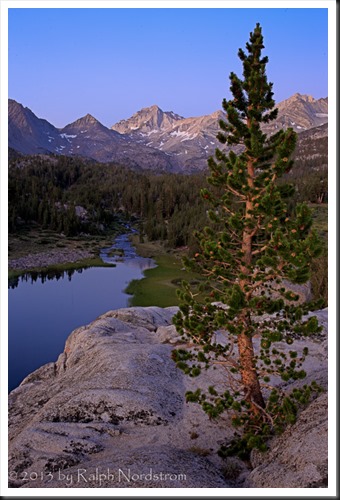
There are many rules of composition. I know people don’t like to use the term rules and for good reason. If you treat these rules as if they are hard and fast you can end up with compositions that are mechanical. So I prefer to call them ‘principles of composition.’ Now I’ve said before that composition is a problem solving endeavor. That is, you have been inspired by what lies before you, you have connected with it and you have an idea of what you want to say. And one of the key elements in communicating your message is the composition you choose. There is generally a point where this becomes very much of a problem solving effort, meaning it can get very analytical. And while the analysis may be important if not essential, it can cloud aesthetic considerations. Take for example this photograph of dawn in the Little Lakes Basin up Rock Creek in the Sierra Nevada Mountains of California.
I was drawn to this Lodgepole Pine growing from a cleft in the granite above the lake. I gave a lot of thought to this composition and compositional principles came very much into play. The way I saw it, the two key elements were the tree and the lake. I didn’t think of the peaks in the distance as being a key element although I knew they were important. And I was aware of the lake as a leading line the drew the eye to them. I placed the tree on the right 1/3 line so that it wouldn’t block the lake. And I enjoyed the wonderful alpenglow as I captured a few images through the final minutes of civil twilight. Then I wandered off looking for other photographs. But later, after the sun came up I was drawn back to this tree and saw it completely differently.
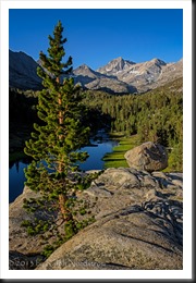
After exploring other compositions the Lodgepole Pine called to me again. I hadn’t found anything that inspired me as much as this tree. So I set up again and this time the composition was completely different.
The compositional principles employed in the two images are similar, especially with regards to the tree which sits on a 1/3 line in each. But the key elements changed. In the second image the tree is still dominant but the composition now calls more attention to the distant mountain peaks rather than the lake. Instead of the lake providing the leading line that draws the viewer’s eye to the mountains, now the granite in the foreground and the lake in the middle ground do that. Also, in the second image there’s a large boulder on the right that helps to channel the eye up to the peak.
But this is all analytical thinking. From an aesthetic point of view the second image is more balanced. It’s the placement of the tree and the boulder that do that. There are masses on both sides of the image that keep it steady. The first image feels unstable. I get the feeling that it want’s to topple over to the left, especially when seen side by side with the second.
Balance is more of thing you feel than something you figure out. Oh sure you can talk about the placement of elements, visual density, contrasting tonal qualities and colors, physical mass, symbolic counterparts, all of which can be used to describe a balanced image. But generally when you’re out there shooting the composition will just feel right when it’s in balance. You can figure out all that analytical stuff later if you want.
One thing that strikes me about the first image is that it may be balanced in different light. I love its soft light and the alpenglow on the pine. If I had taken a third shot using the first image’s composition but after there was direct sunlight on the lake, the added intensity on the water may have given it more weight and been enough to balance the image.
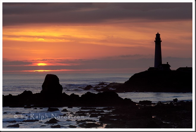
Here’s something you can do to strengthen balance in your photographs. Look at some of your photographs with an awareness of balance. Identify the key elements and see how they relate to each other. Are they in balance? How could they be rearranged to improve the balance. Realize that this is all very subjective so don’t try to be analytical about it. Just experience the image. Here’s an example of one of my photographs in which the balance could be improved.
It’s a very nice sunset moment. It’s the beautiful Pigeon Point lighthouse along the Central California Coast. I didn’t see it at the time but the setting sun is too close and to the outside of the rock on the left. It’s weakens the balance of the image. If I had just moved 10 or 15 feet to the right that would have placed the sun between the rock and the lighthouse and the composition would have been much stronger.
So the next time you’re out shooting be aware of balance and your images will become even stronger yet.
Read other recent articles on composition:
What is your experience with balance? Share your comments with us. We always enjoy hearing from you.
If you enjoyed this post please share it on Facebook, Twitter, etc. so that others can also enjoy it.
We cover composition in our workshops so come on out and join us. We’d love to see you.
You can also check out our photography. Click here.
(1689)
