There are about as many definitions of “fine art photography” as there are people who call themselves “fine art photographers.” For many of us, fine art photography is an expression of our view of the world. Much of what we see in the world is captured in the images we capture in the field. But that’s not the whole story. Why? Because the true expressive quality of our photographs comes to life in the post processing – the digital darkroom if you will.
Workflow
Working on an image (if you can truly call it ‘working’) is best done and leads to the best results if you have a structure, an order in which you do things. It’s good to have a starting point, a consistent way in which you you begin. I often think of the first adjustments you make to your photograph as like the opening book in chess. There are a set of standard moves that all chess masters begin with. There are more than one set of moves but the first five to ten moves are recognizable. It’s when you get into the game that the play becomes more free form.
I have a set of opening adjustments that I almost always perform, a post processing equivalent of the opening book. It’s not until I get further along that the decisions of what to do next become more free flowing.
In addition to the opening book my workflow has a general structure to it. It’s not a rigid structure. I don’t hold off a type of adjustment because it’s not time to make it. But in general I make the adjustments in the following order:
- Tonality
- Hue
- Saturation
I’ll dive into each of these in more detail below.
I’ve heard some advocate a totally free-form workflow. See want needs to be fixed and fix it. Then see what needs to be fixed next and fix it. And so on. While this workflow works, I prefer a little more structure than that although the structure is more along the lines of guidelines than rules.
I’m not going to get into the details of how to make the adjustments I describe in the following sections. That will come in subsequent posts. What I want to provide is an overview of my workflow. Of course you are free to try it out, see what works for you and adapt it in any way you choose.
Preliminary Steps
There are often some mechanical steps that are best performed first. These consist of removing dust spots, aligning horizontals and verticals and cropping.
Dust spots are annoying blotches in your images that result from pesky dust that gets on your sensor when you change lenses. They are apparent when you shoot at the higher f/stops and show up in the sky or other areas that don’t have a lot of detail. Lightroom’s spot removal tool is perfectly suited for the job.
The crop tool in Lightroom pulls double duty. Not only does it crop your image but it can be used to straighten horizontals and verticals. The horizontal alignment tool within the crop adjustment rotates the whole image.
I like to remove spots and adjust the horizontals and verticals first. Then I make a virtual copy of the image before cropping and proceeding with the rest of the workflow. The reason for the virtual copy is that quite frequently I need to start over. So if I’ve been working on a virtual copy I can just create another virtual copy from the original and begin again. But when I start over I don’t[ want to have to redo the spot removal and straightening.
Tonality
The lightness, darkness and contrast of the image is referred to by many terms – brightness and contrast, luminosity and tonality. I prefer ‘tonality’ so I’ll use that. It’s the term painters use. But luminosity as in HSL (Hue, Saturation and Luminosity) is for all practical purposed the same thing.
We can adjust the overall brightness or darkness of our image.
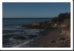 |
 |
We can also adjust the image’s contrast.
 |
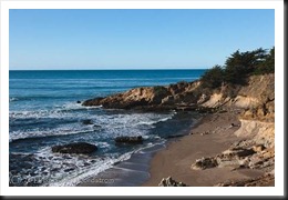 |
I start many images the same way. I set a white point using the Exposure adjustment. That’s a tiny area of the image that is pure white. Next, I set a black point using the Blacks adjustment. You guessed it. That’s a very tiny area of the image that is pure black. Next I adjust the mid tones until the overall brightness of the image is pleasing. I use the Brightness adjustment for this. And lastly I tweak the contrast using the Contrast adjustment. Many people would advocate using Lightroom’s Curves adjustment for contrast adjustments and I understand their point. I’m just not a big fan of the Lightroom Curves. I prefer the Curves in Photoshop.
There are usually more tonality adjustments to make but I generally start this way. Other tonality adjustments I use frequently are Recovery (to recover blown highlights), Fill Light (to open up detail in shadow areas) and the Luminance adjustment in HSL (to lighten or darken a specific color).
The adjustments I’ve described so far are global – they affect the entire image. Lightroom has some capabilities for making local adjustments with the Gradient Filter and Adjustment Brush. I use the Gradient Filter more than the Adjustment Brush. I prefer Photoshop for the kinds of local adjustments the Adjustment Brush is designed for.
With the tonality adjustments pretty much done it’s time to move on to the second step in the workflow – Hue.
Hue
Hue refers to the color of the image. There can be an overall color cast to images. For example, the images you take on an overcast day, during twilight or in the shade will have a decidedly blue cast.
 |
 |
Lightroom is unsurpassed in it’s ability to adjust Hue. In fact, I much prefer to adjust Hue in Lightroom rather than Photoshop.
Color casts are often cool or warm. Cool colors are the blues and greens. Warm colors are the yellows and magentas.
The primary hue adjustments in Lightroom are Temperature and Tint. Temperature adjusts the yellows and blues. Tint adjusts the greens and magentas.
I also like to adjust the hue of a single color. For example, I may find the sky is too cyan so I’ll use the Hue adjustment in HSL to make it more blue.
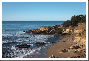
Lightroom comes with a White Balance dropper. In images like the one above where you have white waves you can use it to set the Temperature and Tint. This can be very effective in at least giving you a good starting point for your final Hue tinkering.
Saturation
The final adjustment is saturation. This is the intensity or purity of the color. The extremes of saturation are overly vivid colors or no color at all.
 |
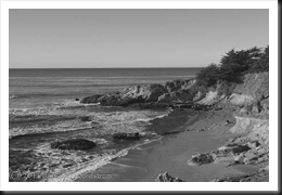 |
Lightroom has some nice adjustments for Saturation. I rarely use the Saturation adjustment as it affects all colors equally. The Vibrance adjustment tends to saturate the less saturated colors without oversaturating the more saturated ones. I like Vibrance.
But my preferred method of saturating is to saturate individual colors using the Saturation controls in the HSL adjustment. With it I can increase or decrease the saturation of one color at a time.
The reason for putting Saturation at the end of the workflow is because the Tonality and even the Hue adjustments can affect saturation. So it makes sense to do those adjustments first and see where you end up saturation-wise. Then you can go from there.
Summary
So there you have it – the overall approach I take to post processing. To recap:
Tonality adjustments – Set a white point and black point, adjust the mid tones and contrast and then tweak the shadows and colors.
Hue – correct any overall color casts or color casts of individual colors.
Saturation – Increase the intensity and purity of individual colors.
We go into workflow in more detail in our photography workshops so come on out and join us.
Join me on an upcoming workshop. Click here for more details.
To see more of my photographs click here.
(2836)
I have struggled off and on with Aperture for about 18 months. It has become off most of the time. I really know very little about work flow and have many, many pictures. I’m looking for a workflow that helps me sort out the “bad” pictures as a first activity. light room 4 have anything that will help me with this?
Rich, Lightroom has very powerful features for quickly sorting through your photographs and selecting the ones you want to devote some time to. You inspire me. Rather than going into the details here I’ll write an blog post that spells out the process. Stay tuned.
A good summary of your LR workflow, Ralph.
I was first introduced to it in 2011 at your Eastern Sierra workshop — a great class, btw!
I was a relative LR newbie at the time, but I was determined to use your techniques once I returned home to become as comfortable using LR as I am with PS. I think I have succeeded!
I was wondering if you’ve tried the LR4 beta? I know some of the sliders have changed and I was wondering how these changes may/will affect your LR workflow?
~Linda
Thanks for the kind remarks Linda. And I have not tried LR4 Beta and don’t plan to. Not enough time. I’ll just buy it when it comes out. But the general workflow won’t change. I’m sure of that. Tonality, hue and saturation in that order will remain the same. And setting a black point and possibly a white point is still an important first step, no matter what sliders do that. So, no, I don’t see a change.