Haze is an integral part of landscape photography. Distant mountains are not as clear as close up objects. They lack contrast, are often lighter and may even appear blue or even purple (purple mountain majesty). It’s interesting that in the history of Western art, painters didn’t incorporate atmosphere into their paintings with landscapes until the Renaissance.
Atmosphere lends depth to an image. We know from our experience with objects that they loose detail the farther they are from us. Where I live in Southern California, we have one of the Channel Islands 26 miles off the coast – Santa Catalina. On many days we can’t even see it – even on sunny days. There is so much haze in the atmosphere that it’s not even visible. On other days it’s a pale blob on the horizon. But there area a few special days every year where the air is perfectly clear and you’ll hear people say, “Catalina looks so close you feel like you can reach out and touch it.”
Haze isn’t necessarily all smog, not even in Southern California. Water vapor in the atmosphere produces haze. Blowing dust and smoke from wild fires (for which we make the national news every fall) also create atmospheric haze. You can tell what’s causing the haze from its color. If the haze is blue, it’s water vapor. If it’s brown or red then smog, blowing dust, or smoke is your best bet.
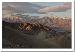
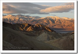
We all love those days when you can ‘reach out and touch’ distant islands or mountains. And that raises a question regarding post processing; namely, “Is it possible to remove the atmospheric haze and make distant objects look closer?” And the answer is “Yes it is.” So let’s take a look at how we can do that. We’ll start with a photograph taken at Zabriskie Point in Death Valley National Park in California.
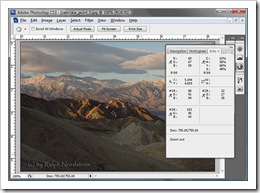
The foreground is the badlands of Zabriskie Point and the background is Telescope Peak and the Panamint Range. A quick look demonstrates the point I made above; namely, the foreground is clearer with greater contrast and the background is hazy with a cool tint. But let’s take a deeper look. The shadows in the background are bluish while those in the foreground aren’t. In fact, if we use the Color Sampler Tool in Photoshop and sample a few select locations we can clearly see from the RGB numbers what I’m talking about.
The first sample was taken of the big shadow in the background. The RGB numbers are 88, 91 and 94 respectively. The red at 88 is less then the green indicating a little cyan (the opposite of red) while the blue at 94 is greater than the green indicating a little blue. So the distant shadow is a pale shade of blue.
The second sample was taken in the foreground shadow. The RGB numbers are 32, 27 and 28. The green and blue numbers are practically the same but the red number is higher indicating the shadow is a little red. This makes sense in light of the third sample which is of the sunlit foreground. The RGB colors are 153, 96 and 43, making the color red plus yellow – or orange. So the foreground shadow is not as orange as it’s sunlit counterpart but it’s still red.
The lesson to come away with here is that there isn’t enough atmosphere to affect the foreground shadows but the background shadows are far enough way to be turned blue.
The other thing you will notice is that the contrast between highlights and shadows in the foreground is much greater than in the background. The background shadow is much lighter than the foreground one – 88, 91, 94 compared to 32, 27, 28. (Remember, in this scale 0, 0, 0 is black and 255, 255, 255 is white.) And although I didn’t measure the background highlight, we can see that the contrast in the foreground is quite pronounced – 32, 27, 28 to 153, 96, 43.
Adjust Luminosity
The first step in dealing with atmospheric haze is to adjust the luminosity of the background. We want to increase the contrast by darkening the shadows. For this we’ll create a curve layer. We darkened the shadows in the canyons without changing the highlights on the ridges. A layer mask is created to limits the effect of the adjustment to the distant range and sky. The result is an image where the atmosphere looks clearer but it’s still a bit confusing. The enhanced contrast suggests the atmosphere is clearer but the blue cast suggests it’s not. This is sunrise and the warm, golden light of sunrise would be nice.
Adjust Hue and Saturation
The next adjustment we want to make is to the hue and saturation of the background. For that we’ll create a Hue/Saturation layer. We want to neutralize the blue haze and warm the highlights. This also leverages the fact that warm colors seem to advance and cool colors retreat. So to bring the distant range even closer we’ll saturate the reds and desaturate the blues. Again, a layer mask is applied that restricts the changes to the background and sky.
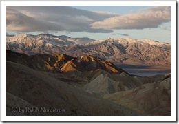
The result is pretty striking. Below are the original and adjusted images side by side.
There’s still work to do on the image but with the adjustments made so far a nice morning was turned into one of those rare mornings where you can reach out and touch the mountains.
To see more of my photographs click here.
Join me on an upcoming workshop.
(6039)
