A few weeks ago I published the first of a series of articles on histograms, “Mastering Exposure – Histograms Part 1.” I eventually want to talk about different types of histograms and how to work with them in the field and during the post processing. But before getting into that I want to take a deeper dive into the histogram itself.
In the first article I defined a histogram as a graph that shows the relative amounts of each shade of gray in the scene we are photographing from pure black to pure white. I need to modify that definition just a bit because we don’t see the world in shades of gray but rather in color. The definition should be, “A histogram is a graph that shows the relative amounts of each tonality in the scene we are photographing from pure black to pure white.” Tonality is lightness and darkness and is one of the three physical properties of light – tonality (or luminance), hue (or color) and saturation (or purity of color).
Dynamic Range of the Scene
To really understand histograms we need to understand dynamic range. Dynamic range is the difference between the darkest and brightest parts of a scene. The difference is measured in stops. In an outdoor scene on a bright sunny day the dynamic range might be seven, eight or more stops. On an overcast day the dynamic range might be only three or four stops (at least as long as we keep the sky out of the composition). Some situations have very narrow dynamic ranges like during twilight or in open shade. In some extreme situations dynamic ranges can be ten, twelve or even more stops. I’m thinking of photographing slot canyons such as Antelope Canyon.
Every scene we photograph has a dynamic range whether photographing in a studio or outdoors. In the studio we have control over the dynamic range because we controlled the light. But outdoors we have no control.
Dynamic Range of the Sensor
Our camera’s sensor also has a dynamic range. But with the sensor, the dynamic range is fixed. Digital cameras typically have dynamic ranges of six or seven stops. Some high end digital cameras have dynamic ranges of eight, nine, ten or more stops. But if you have a digital camera with a moderate dynamic range, the only way you can increase it is to upgrade to a more expensive model.
The histogram on your camera shows the dynamic range of the sensor. The left side of the histogram is the maximum darkness the sensor can capture and right side is the maximum brightness. Said another way, the left side is pure black and the right side is pure white.
It’s important to understand that the notion of “black” and “white” is from the sensor’s point of view, not the scene you’re photographing. The scene never really has a pure black in it because pure black would be the total absence of light and even the darkest shadow has some light in it. One might argue that a fluffy white cumulus cloud on a bright sunny day might be pure white but specular highlights off of chrome or water are even brighter and the sun itself is brighter still. So the idea of pure black and pure white is really related to the end result, the photograph, and the sensor (or frame of film) from which it is produced and not the scene.
Mapping the Two Dynamic Ranges
The graph of the histogram shows how the dynamic range of the scene you are photographing maps to the dynamic range of the sensor. Because the dynamic range of the scene can vary but that of your camera cannot, it’s unlikely that the two will always match up. If the scene you are shooting has a dynamic range that is less than or the same as your sensor’s then everything works out fine. But if the scene’s dynamic range is greater then that of the sensor, then the graph will completely fill the histogram and begin to climb both sides. This is when you start running into shadow clipping, highlight clipping or both.
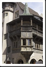
Here’s an example of just such a scene photographed on a very bright day. It was shot in the town of Colmar in the Alsace region of France.
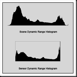
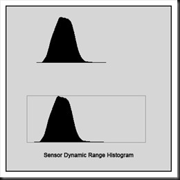
The dynamic range was a little beyond what the camera’s sensor could capture as you can see in the figure below. The top graph represents the actual dynamic range of the scene and the bottom, the dynamic range as captured by the camera.
The scene’s dynamic range exceeds that of the sensor. Therefore the scene’s dynamic range must be compressed to fit into the sensor’s smaller dynamic range. As a result the right end of the scene’s histogram is smashed up against the right wall. The results are dramatic; the graph climbs the wall very sharply. A similar thing is happening at the shadow end of the graph. And while the results weren’t quite as dramatic the graph is still shoved up against the left wall.
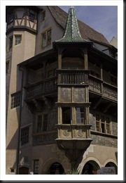
As shot, this image has both shadow and highlight clipping. If the camera is set up to save the image as a JPEG then you’re going to get clipping in the image and there’s not much that can be done with it. However, if the image is stored as a RAW file then there’s a chance the highlights and shadows can be recovered. Here’s an example of what can be done with a RAW file.
If the dynamic range of the scene is less than the sensor’s, the graph will fit well within the histogram. That is assuming the image is not over or under expose in which case the graph will be skewed to one side or the other.
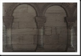
An example of this is a photograph I shot of the Munster Cathedral in Basel, Switzerland.
This is clearly a very low contrast scene and the histograms of the scene and the camera’s sensor are virtually identical.
The sensor has no problem capturing the full dynamic range.
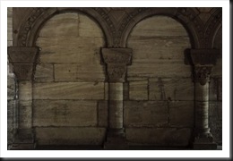
By the way, here’s an example of what can be done with an image like this.
Two Critical Pieces of Information
So the histogram provides us with two critical pieces of information. First it tells is how the dynamic range of the scene maps to the dynamic range of the sensor. The width of the graph shows the dynamic range of the scene. If the graph extends from one side to the other without touching the sides then the dynamic ranges of the scene and the sensor are very much the same . If the graph is touching both sides then the dynamic range of the scene exceeds that of the sensor.
Second it tells us whether our image is over, under or correctly exposed. The position of the graph shows the exposure. In the graph is shifted to the right the image is probably over exposed. And if it’s up against the right side but not touching the left, then the image is definitely overexposed and you have highlight clipping. If the graph is shifted to the left you have the opposite situation and your image is probably under exposed.
So the histogram is a very important tool that digital photographers can use to help us establish that all-important foundation for a great photograph, the correct exposure.
Join me on an upcoming workshop. Click here for more details.
To see more of my photographs click here.http://ralphnordstromphotography.com/workshops/
(2875)
Thanks for the fine explanation about dynamic range. I think that the use of neutral and graduated filter helps to reduce the dynmic range, so that it maps to the range of the camera. Or is this wrong?
Thanks for your fine Homepage and all the best for 2011***
You’re absolutely right about graduated neutral density filters. They are a powerful tool in reducing the dynamic range of the sceen so that it matches that of the sensor.
And thanks for your kind wishes. All the best to you too in 2011.