Composition is one of the four pillars of a strong landscape photograph (See Making a Photograph – The Four Pillars). There are many approaches to mastering composition and certainly countless excellent books on the topic. Many books discuss the elements of design and how they relate to composition – line, shape, form, texture, pattern and color. Others go into the various rules of composition – rule of thirds, golden rule, leading lines, near / far, layers, frames, etc.
All of these rules or principles are very analytical and, I think, are necessary and useful building blocks. Often creating a strong composition is very much of a problem-solving endeavor. But in the end I believe the goal of the composition is to support what the artist wants to communicate through the image. And this comes more from compositions that just feel right, not ones that are mechanically created from the rules. That’s not to say that one is not aware of these principles as the composition is being worked out. Rather these principles are like words in a sentence. They are carefully chosen so that the sentence as a whole communicates the author’s message. There are several techniques that lead us to this goal. And one of them is to ask yourself, ‘’”What am I photographing?”
“What am I photographing?” It sounds like a simple enough question. But often times in photography workshops when I ask this question I get some interesting answers. One answer is to point to a small element within the photograph and say something like, “I really like the waterfall.”
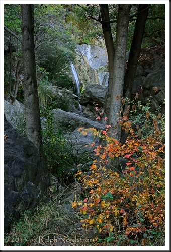
The photograph above is of Salmon Falls along the Big Sur Coast in California. But can the viewer tell this photograph is about the waterfall? That’s the important question, “What does the viewer think I photographed?” Our ultimate goal is for the viewer to get what it is we’re trying to say. And to do that we compose the image so that it guides the viewer’s eye to the primary element of the composition. In looking at the photograph above you might ask, “What waterfall?” Yes, and that’s the point. Technically, the composition is not a bad one. The Rule of Thirds has been followed. The waterfall is framed between two trees. There is a near / far aspect that draws you in and creates a sense of depth. And there’s a nice diagonal leading line coming out of the lower left hand corner that helps to draw the viewer’s eye into the frame.
But it’s not at all clear that this image is about the waterfall. The waterfall is a very insignificant element because of its small size relative to the whole image. And it doesn’t help that the waterfall has a blue hue which in one sense helps to make it recede giving the image depth, but it doesn’t call attention to itself at all. Also, the poison oak bush in the lower right is demanding attention with its vibrant warm colors that attract the viewer’s eye. But its placement in the lower right corner makes it easy for the viewer to stop there and then exit the frame.
So if my intent was to make a statement about the waterfall (which it was), this image does not work.
Now take this photograph of the same falls taken during a different workshop.
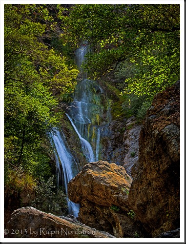
The waterfall is framed by the warm rocks on the bottom and the sunlit foliage above. Both of these elements have warm hues that advance from the frame giving a sense of depth, especially when contrasted with the cool hues of the waterfall. It doesn’t matter that the waterfall is not displayed in its entirety. In fact, just showing a portion of it communicates a sense of discovery and mystery. But there’s no question this photograph is about the waterfall. It’s not about the rocks, it’s not about the trees as interesting as they may be. It’s about the waterfall and that is communicated very clearly.
Isolate and Simplify
How is this achieved? There is a very important compositional principle at work here; namely, ‘isolate and simplify’. There is a single primary element or subject in this image – the waterfall. All the other elements, the rocks and foliage, play very important supporting roles because they make the whole composition work and convey the sense of discovery and mystery that I wanted to communicate. But because the waterfall fills a large portion of the image and because the supporting elements set it off, it’s clear to the viewer that this is the subject.
Back to ‘isolate and simplify.’ The waterfall is isolated because, unlike the first example, it occupies a significant portion of the frame (“fill the frame”). I didn’t attempt to include more of its surroundings because they wouldn’t have added anything and the significance of the waterfall would be lost amid the clutter. Rather, the goal was to isolate the waterfall from its surroundings. The rest of the elements that were included play supporting roles and work to strengthen the overall composition.
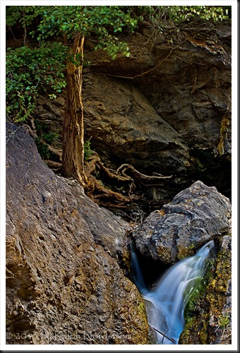
Sometimes images also have a secondary element which supports the primary element. An example of a strong primary element with an important if not essential secondary element can be seen in this photograph also taken at Salmon Creek.
The primary element is obviously the tree with its magnificent gnarled roots. Its texture, warn colors and fascinating roots make it stand out. The little cascade of water is an important secondary element because it balances the tree both spatially and with it’s contrasting color. It also provides a symbolic context for the tree in that it is the life-giving water that makes it possible for the tree to survive.
But you generally don’t want more than two strong elements and of those two one is the primary and the other is the secondary. All other elements support the composition. Another response I sometimes get on workshops when I ask, “What are you photographing?” is something like, “I really like this and this and this and this and….” My response to them is, “Choose two. You only get to include two.” When you have more than two strong elements the image looses focus and the viewer doesn’t know what to pay attention to. When you simplify the image to include at most two strong elements and all the others take on supporting roles the composition becomes stronger. Now the viewer is not confused and knows exactly what the photograph is about.
So when you’re in the field and feel inspired by what lays before you, ask yourself, “What am I photographing?” When you identify the primary element find a viewpoint that isolates your subject and simplifies your composition so that the viewer knows exactly what your subject is. This is a first step in making photographs that communicate the excitement and inspiration you feel.
You are invited to add a comment and share your experiences. We always enjoy hearing from you. And please feel free to share it on Facebook, Twitter and any other social sites or email it to your photographer friends.
We do photography workshops. Come on out and join us. Click here to check us out.
You can also check out our photography. Click here.
(1702)


Ralph, you have written and shown examples of the perfect way to photograph one’s subject. This is a very simplistic approach (but sometimes difficult to achieve), and one that should be remembered by all photographers. You have great talent for expressing it. Thank you.
Jerry, thank you for your kind words. I really appreciate your feedback. It is rewarding to hear that the suggestions I offer are useful to you. This series of articles are a result of rethinking how I approach teaching composition in my workshops and I’ll be creating a new presentation that follows along these lines. Give my best to Linda.