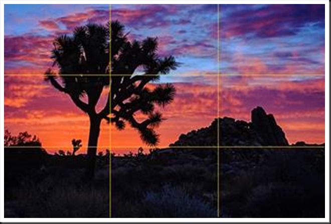
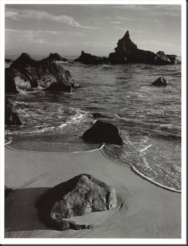
The Rule of Thirds is a compositional principle that is widely used. And for good reason because, well, it works. At least, it works in a lot of situations.
What is the Rule of Thirds? You superimpose a tic-tac-toe grid on your image, two vertical lines equally spaced and two horizontal lines equally spaced. Then you place the key elements of your image on or near those lines, or at one of their intersections. They don’t have to be exactly on the lines or intersections, just near them. This is art, not engineering, so it’s important that it feels right. But the Rule of Thirds gives us positions that are visually very strong and command the viewer’s attention. That’s why you want to use this principle for the key elements of your composition, the elements you want to draw the viewer’s eye to.
One should be cautious in overusing the Rule of Thirds. It should not be applied mechanically and certainly not universally. It does not apply to all compositions. After all, aren’t our ‘Rules’ of composition made to be broken? But on the other hand, sometimes a composition gets just a little bit stronger when you move the key element just a tiny bit to place it closer to or right on a 1/3rd line.
The fact is it works so well in so many situations that the camera manufacturers give us the ability to display the grid on our camera’s LCD screens and viewfinders. Also, software publishers like Adobe display the grid when we use the crop tool. This is true of Elements, Lightroom and Photoshop. And these aids can be very helpful in achieving strong compositions.
Why does the Rule of Thirds work so well? To answer that let’s talk about Visual Tension.
Continue reading “Mastering Composition – Rule of Thirds”
(2867)


