This is the third post in a continuing series on the oft misunderstood but oh so important histogram. In the first two posts we discussed the histogram in general. If you missed them, click on these links.
Mastering Exposure – Histograms Part 1
Mastering Exposure – Histograms Part 2
Recap
To recap, the histogram displays a graph of the tonal values in the scene you are about to photograph. It shows how the dynamic range of the scene matches and fits into the dynamic range of your camera’s sensor. There are two critical pieces of information a histogram tells you:
- If your exposure is correct
- If you have problems capturing the dynamic range of the scene
To recap, the exposure is displayed by the position of the histogram curve within the boundaries of the graph area. As you increase the exposure the histogram moves to the right. As you decrease the exposure it moves to the left. If the exposure is increased so that the histogram moves all the way up against the right side of the graph area you will have highlight clipping. Likewise, if it moves all the way to the left side you will have shadow clipping.
The dynamic range of the scene is displayed as the breadth of the histogram, The wider the histogram the greater the dynamic range of the scene. The narrower the histogram the lower the dynamic range. When the histogram is so wide that it extends from one end of the graph area to the other you are facing a situation where your camera’s sensor will have a difficult time capturing the full dynamic range of the scene. The worst case is you will have both highlight and shadow clipping.
Shape
Sometimes I hear people expressing concern about the shape of the histogram. They’ll ask me, ‘”Is this a good shape?” or “I don’t like the shape. What can I do to fix the shape?” Basically there’s nothing you can do about the shape because it is determined by the scene, the amount of light and dark areas.
But being aware of the shape can help prepare you for challenges you may encounter as you capture the image and later on in the post processing.
I find it useful to categorize the histogram shapes into four general types – Rocky Mountain, mole hill, Grand Canyon and HDR. The Rocky Mountain histogram is broad and may have many peaks. It can fill a large portion of the graph area. The mole hill histogram is narrow, often with a single peak but it may have a few. It has lots of room on either side and doesn’t even come close to filling the graph area. The Grand Canyon histogram has two major peaks, one in the shadow area and the other in the highlight and is separated by a huge canyon. The HDR histogram extends from one edge of the graph area to the other and very likely has highlight clipping, shadow clipping or both.
In this and the following posts I’ll discuss each of these shapes in detail and offer suggestions of how to expose for them and how to treat them in post processing.
Rocky Mountain Histogram
Let’s begin with the Rocky Mountain histogram. It basically fills most of the graph area. It may have many peaks.
You typically encounter the Rocky Mountain histogram in the middle of sun filled days. You have bright, sunny areas, deep shadows and a continuous range of tonalities in between.
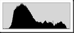
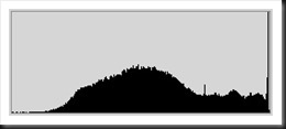
Here’s an example of a Rocky Mountain histogram.
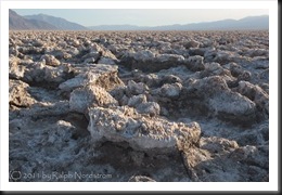
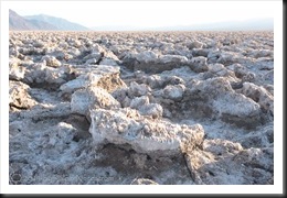
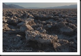
It is the histogram of this photograph taken at Devil’s Golf Course in Death Valley.
Devil’s Golf Course is an amazing area filled with jagged slabs of salt. Salt saturated ground water seeps up and evaporates, leaving behind salt crystals that accumulate into these fantastic shapes.
Understanding the Histogram
This image has bright areas, particularly the sky and the parts of the salt slabs that are in direct sunlight. These bright areas contribute to the right side of the histogram. The area also has a lot of shadow areas, especially in the bottom half of the image. The amount of shadow area is greater than the amount of bright area, contributing to the large peak on the left end of the histogram. There is also a continuous range of tonalities from the darkest area (far left side of the histogram) to the brightest (far right side) so there are no significant gaps or valleys.
The histogram fills nearly all of the graph area indicating that the dynamic range of the scene pretty closely matches that of the camera’s sensor. More importantly, the dynamic range of the scene does not exceed the camera sensor’s dynamic range. This we know because the histogram does not touch both sides of the graph area but ends just a little short. This is a good thing because we won’t have clipping problems with this image.
In the Field
The thing you want to think about in the field is to make sure this image is not over or under exposed. Over exposing will introduce highlight clipping and underexposing will give you shadow clipping. We can tell the image in the example is properly exposed because, as mentioned above, the histogram does not touch either end of the graph area.
Over exposure results in the entire histogram shifting to the right. Let’s take a look.
The image was over exposed by 1 1/3 stops and is washed out as we would expect. And the histogram now has shifted well to the right with a large spike climbing the right wall. This is where the clipping occurs which is largely in the sky but also in some hot spots on the salt. There’s a very real possibility that this clipping cannot be recovered in post processing, even with a RAW image. When over exposed like this there’s a high chance the image cannot be recovered.
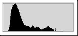
Under exposure results in just the opposite. The histogram will move to the left. Here’s what that looks like.
This image was under exposed by 1 1/3 stops. In this case we didn’t get any shadow clipping. The histogram moved to the left but did not move all the way to the left side of the graph area. This image is still very workable. This is actually closer to what we would like the final photograph to look like.
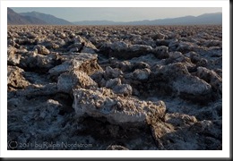
For comparison purposes here are the three exposures and their histograms.
Notice that while the histogram’s shape changed a bit as the exposure was varied it kept its basic shape of a large peak in the shadow area turning into smaller peaks as we move towards the highlights.
In the field I almost always shoot aperture priority, especially in situations like this. The reason is to control depth of field which is critical for this photograph. If the depth of field requirements are extreme I may need to shoot at f/16 or even f/22. Since the camera is on a tripod, the shutter speed is not important.
So it is important to check the histogram after the initial shot to make sure the image isn’t severely over or under exposed. If so, exposure compensation must be applied to correct the exposure. The basis for making this decision is the position of the histogram relative to each end of the graph area. In this case if the over exposed image had been our initial shot we would have applied a correction of –1 1/3 exposure compensation.
HDR
It’s worth mentioning at this point that the three images are what you would get if you were shooting HDR. Without going into all the detail just now, the first image is the middle exposure and captures the mid-tones. The second image is the over exposure that captures the shadows and the third image is the underexposure that captures the highlights.
Post Processing
The Rocky Mountain histogram poses no particular challenges when it comes to post processing. No special techniques are required.
We could work with either the middle exposure or under exposed image as neither of them have any clipping. I’ll choose to work with the first image, the middle exposure. I won’t go into the specific adjustments here but just outline the decisions I make.
We’ll want to darken the image to make make it richer. Darkening it will bring out more of the blue in the sky, add contrast and increase the color saturation. I like to take a somewhat systematic approach to post processing, adjusting the tonality or luminance first, then the hue or color and finally the saturation.
Proceeding with the tonality, I’ll first adjust the overall brightness and contrast. And the very first tonality adjustment is to set a black point; – some small area of the image that will be pure black. This establishes a tonal foundation for the entire image. The next thing I did was to darken the sky. And finally I adjusted the mid tones to product a pleasing amount of contrast. Here are the results.
The second thing I do is adjust hue or color. This image doesn’t need a lot in the way of hue adjustment. The change is very subtle. It’s a little cooler to help bring out the cyan in the sky and shadows.
The final adjustment is saturation. I focused on the red and yellow found on the salt (caused by the low angle sun) and the cyan in the sky and shadows.
Here’s a before and after comparison.
As you can see, the post processing is where the magic happens. But you must start with a good capture.
In subsequent posts I’ll discuss the mole hill, Grand Canyon and HDR histograms. These are a bit more challenging and require some special techniques. Stay tuned….
Join me on an upcoming workshop. Click here for more details.
To see more of my photographs click here.
(2333)
