It all started with kneeling in the mud.
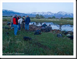
I was with David Muench, Jerry Dodrill and twelve other eager photographers on a Mountain Light Gallery workshop in May. We lined up along the bank of the pond just outside Bishop, California and aimed our cameras at magnificent Mt Tom, the dominant peak in the Eastern Sierra crest in this area.
I’d like to take you through the process of making a photograph from the images I captured that morning.
In the Field
David and Jerry suggested we get our cameras as low to the ground as possible so we could get the best reflection of Mt Tom. That’s where the mud came into the picture (so to speak – actually it was all over my jeans).
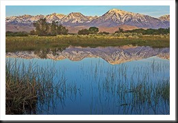
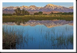
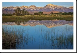
The weather cooperated and the breeze that often comes right before sunrise didn’t materialize so the perfect reflection was not disturbed. I set up my camera on a wonderful composition with an opening through the reeds that beautifully framed the reflection of the peak and took three shots over a 45 minute period.
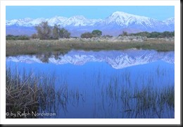
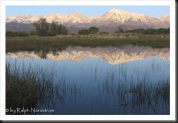
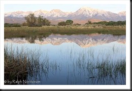
The first was at 5:35 and captured the soft light of dawn. (These are the untouched RAW images.)
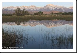
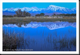
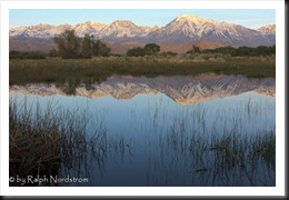
The second was 6:15. There were some thin clouds to the east that softened the first rays of the sun.
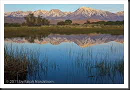
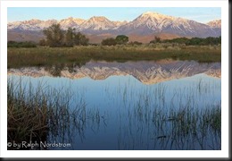
The last was captured at 6:20 after the sun got above the clouds and shed some serious morning light on the mountains.
I didn’t use a graduated neutral density filter in the field. The dynamic range was not that great, probably because of a thin band of clouds on the east horizon. I got my camera as close to the ground as my tripod would allow. My tripod has a center post so that’s the lowest I can get. Many photographers choose tripods without center posts so they can get lower. I prefer a center post because it facilitates taking panoramas. And as you can see, if I had gotten any lower the composition wouldn’t have been as good. Mt Tom would have been in the reeds.
There’s nothing of interest going on in the sky so I framed the image with just enough sky to give Mt Tom a little breathing room on top. What’s really happening in the image is the mountains, their reflection in the pond and the reeds in the foreground. The opening in the reeds worked out well in that it leads the eye into the image. And it was just really wonderful that the water was so still and the reflections so perfect.
The so called “rule of thirds” played an important role in the composition. The far bank of the pond is at the upper 1/3rd line. That’s also the symmetry plane for the reflection. And Mt Tom is on the right 1/3rd line. Sometimes with reflection images like this you have the symmetry plane in the center of the frame. And that works very well much of the time. But I was fortunate to have a really interesting foreground so it made sense to position the plan higher.
Selection
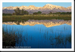
That night I gave them all a quick treatment in Lightroom in my hotel room and published them on Flickr. Here’s what I got.
I thought my favorite was going to be the last one, or possibly the first. They are the most dramatic, each in its own way. But as time went by I really began to like the middle one. It is muted, quite and tranquil. And while the colors are soft and cool there is still enough contrast and warmth to be interesting. So that’s the one I decided to go with.
Lightroom
All my work on my photographs begins in Lightroom. Lightroom is set up to undo some of the default settings when the images are imported so that the starting point for the image is as close as possible to what the sensor picked up. The defaults it undoes is the +5 Blacks (which it sets to 0) and the Medium Contrast Point Curve (which it sets to Linear). It also applies some capture sharpening on import. I use the Lightroom Sharpening – Narrow Edges (Scenic) preset, That’s my starting point. Not very exciting.
I picked up a new workflow from Jerry Dodrill that I was eager to try out. The opening game if you will is to make three adjustments – set a white point with Exposure, a black point with Blacks and adjust mid-tone luminosity with Brightness, usually by darkening the image. The white point is some very tiny area of the photograph that is pure white. Likewise, the black point is some tiny area that is pure black. If you were to stop here the image would look horrible – washed out.
Adjusting the mid-tones with Brightness fixes that. Brightness was decreased from +50 to –5 – quite a lot.
Next I turned to Fill Light. Fill Light brightens the darker tonalities of your image without affecting the brighter mid-tones or highlights. I use it a lot. And as long as you’re careful and don’t overdo it the results can be very pleasing. I pushed Fill Light up to 28. Notice how the foreground opens up.
Some times when you add Fill Light you loose your black point. That’s what happened here so I increased Blacks some more, from 3 to 11. This brings some snap back into the image.
Scroll back up and compare this to the original capture. You can see that already we’ve made some nice progress.
Now it’s time to add a little Vibrance and Clarity, about 50 of each. Vibrance does wonderful things with the color saturation and sometimes 50 is too much. But it worked in this case. Clarity makes the image sparkle by increasing contrast in the mid-tones. It enhances edge detail which has the effect of providing some very subtle sharpening. You can see this really pumps up the image.
So far all the adjustments in Lightroom have been global adjustments; that is, they affect the entire image. Now I want to turn to the mountains and enhance them so they stand out more. In general, Lightroom doesn’t do as good a job as Photoshop when it comes to local adjustments. You just don’t have as much control. But I do like the Graduated Filter in Lightroom. It works in same situations where a graduated ND filter works but is a lot more flexible. Like a grad ND filter you have control over what portion of the image is covered by the filter and what portion is not. But unlike a grad ND filter you can adjust the size of the area that transitions from filtered to unfiltered. And there’s more than just ND filtration available. You can adjust contrast, saturation, clarity and more.
The Graduated Filter ended up with the top of the image receiving the full effect of the filter and the transition was on the reflection of the mountains. From the nice assortment of adjustments that are available I added 27 Contrast and 100 Clarity.
One thing I neglected to mention is to add a little corner vignetting. That’s in the Effects section and is called Post-Crop Vignetting. I applied –10 amount which produces a very subtle affect.
Photoshop
You can see that we’ve made quite a bit of progress just in Lightroom. In fact, there are things that Lightroom excels at and other things in which Photoshop is the best. So I like to use each tool to its own unique advantage.
But from here on out the rest of the work gets done in Photoshop.
The first thing I do in Photoshop on virtually every image is to apply a contrast mask. It’s a technique that I’ll share with you in a subsequent post. I like it because it gives the image a velvety look. It actually undoes a lot of the contrast that was added to the image in Lightroom but does a beautiful job of smoothing out any harshness in the mid-tones. To add the contrast back in I apply a Curves adjustment. The end result is an image that has quite a different feel to it (compare it to the one above and notice especially how the mountains have come live).
But there’s even more that can be done with the mountains Some local adjustments can add more contrast to the mountains (using a Curves layer) and adjust the hue of the sky (using a Hue / Saturation layer – the sky was too cyan). Layer masks are used to limit the affect of the adjustments to just the areas I want to treat.
At this point I’m ready to make a print. When I made an 8X10 proof everything looked fine. But when I went up to a 16X20 print the far bank was murky. So I added another Curves adjustment layer to add some contrast and give it some life. And with one more application of corner vignetting, this time with a Pixel Genius plugin, the image is done.
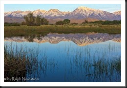
For comparison’s sake, here’s what we started with.
Final Thoughts
I like this image a lot. It seems I’ve been going for more quite, tranquil moods lately. For me there’s a very comforting blend of the coolness of the water and the warmth of the snowy mountains in the filtered light of the early morning sun. The colors, especially the warm ones are more pastel. They’re definitely not the brilliant first light oranges and yellow we see so often with sunrise photographs and that works for me. I feel at peace and an inner warmth when I look at it.
I hope you’ve enjoyed this journey and perhaps got a few ideas. Photography is more than taking pictures; it’s making pictures and as such can be a wonderful means of expression. The language we use is all the tools and techniques at our disposal – our Creative Vocabulary. You’ve seen an example of that here. Photography is art and art is interpretation and communication. It’s one way we can share what’s in our hearts.
If you have a friend who might enjoy this post, please feel free to share it with them. There’s a Share link at the top.
We do photography workshops. Come on out and join us. Click here to check us out.
You can also check out our photography. Click here.
(1759)




I enjoy your blog a lot, particularly the ‘making of a photograph’ articles. Your workflow is similar to mine. I’m working very hard with Lightroom to get localized adjustments and eliminate the need to go into Photoshop at all. The work continues…
Hi Robert. Always good to hear from you.
I use local adjustments in Lightroom sparingly although I find the gradient filter is really nifty, better than a grad ND (when it works). But I still prefer to finish the photographs in Photoshop. In my actual workflow I prefer to set the black point in Photoshop. And I use a contrast mask on nearly every image that gives it a velvetly look. Local adjustments are way more precise in PS and of course Curves are way superior.
I find that LR does some things way better than PS and vise versa. So I try to use each for what it does best.
By the way, I just set the date for the Joshua Tree Gathering this morning. It’s March 16-18. Lizz requested a date more in the middle of the month.
Ralph,
Thanks for this wonderful post. I really enjoyed seeing how you think through the process. As you know I now am a lightroom user and really enjoying it. I appreciate how you adjust the image to reflect your feelings. I have really tried lately to slow down my shooting to reflect how I am feeling in the field. There then seems to be learning curve on how to communicate that feeling in the post processing. Thanks again for your thoughts. Keep them coming.
Larry Lindell
Larry, it’s always good hearing from you. And I know you are taking your time more in the field. It shows in your work.
Here’s a little exercise you might like to try to get in touch with and create a mood for an image. It comes from the idea that I belive composition is the emotional foundaton of the image. So an interesting thing to do is to look at an image and feel its mood. And then look at the elements of the composition and see how they work to create and strengthen the mood. With the analytical side of my brain I made a cross reference on a spreadsheet with compositional techniques as the column headers and moods as the row headers. Then I just filled it in with X’s where a compositional technique supported a mood. It’s a very interesting exercise. If you give it a try, let me know how it works out.
So keep up the good work.
Ralph- I appreciate your vision, and sharing notes from David’s workshop that I was unable to attend. I’m a frequent visitor to the area and wanted to know the location of this pond- if you would share. Thanks!
Thanks for the comment Barb. I know of several ponds in the Bishop area. The one in the post is off of Brockman Lane. It’s north and west of Bishop. Follow 395 N out of town. Brockman Ln is one of the last streets before you completely leave Bishop. It’s on the right.
There are a couple more ponds that I know of on Airport Road. Head east on Line and turn right on Airport Rd. There are two ponds on the right. The first is maybe a a mile or two. The second may be twice that distance. Actually the second is at the intersection of Airport Rd and Warm Springs Rd.
There are more seasonal ponds that are filled during duck hunting season and then drained. So if you find them you’ll be in the company of men wearing camo with shotguns makine weird sounds with crazy noise makers.
Good luck.
Ralph:
The Making of a Photograph brought me for a moment back in an other world.
Maria Broome