If Color Space can be described as a box of Crayons as we suggested in Color Management Made Simple – Color Space, what else do we need to know about Color Management? Well, Color Management is essentially about getting the right colors – and here’s the most important word – consistently.
Let’s spend a few moments talking about the ‘right color.’ (I’m inclined to add, ‘whatever that is.’) The story begins when you press the shutter. Let’s suppose you are photographing the beautiful redwoods of Northern California.
The scene is full of rich browns and oranges and vibrant greens. We can say that these are the right colors, these are the colors you want. You set up your camera and snap a picture and your sensor captures these colors, pretty much just as they are (the sensor is playing with pretty much the full big box of 120 Crayons). The camera’s processor does its thing and the image is saved in a file to your memory card. Eventually we’re going to view the photograph on our computer’s monitor and we just might be a bit disappointed.
This is the point where we should mention white balance. Not only do the things we photograph come in different colors, so does the light. And that affects the colors of the things we photograph. For example, a leaf looks different when illuminated by the blood-red rays of a setting sun then it does by that same sun at high noon. That’s usually fine but sometimes it’s not. The purpose of white balance, then, is to compensate for the color of the light you’re photographing in. There are white balance settings like Daylight, Cloudy, Shade, Tungsten light, Florescent light, Custom and Auto. When the white balance is set to match the color of the light it makes everything look like it was photographed on a clear day at high noon; in other words, Daylight.
When I first started photographing with a digital camera the advice I received from those a lot more experienced than I was to set white balance on Auto and forget it. And I did that for many years. But now I set white balance on Daylight about 99% of the time. When I’m photographing during golden hour I don’t want the camera to make that gloriously warm light look like high noon.
So what effect does white balance have on the photograph we just took. If you are saving your photo files in RAW format, absolutely nothing. White balance setting does not alter the RAW file at all. The only thing that happens is your white balance setting is stored in the EXIF data along with f/stop, shutter speed and all the other metadata that gets saved. This is great because it gives you complete flexibility in changing the white balance when you get your raw file into Lightroom. But if you save your image files as JPEGs then the image will be altered to apply the color correction. I could talk about white balance for an entire blog post but for this post it’s time to move on.
So, you composed your shot, set the exposure and focus, snapped the shutter and the file is saved to your memory card. If you saved the image as a RAW file you will have all of the colors that were in the scene. Virtually nothing will be lost. You have the entire Crayola big box, all 120 of them.
If you feel you need to save your images as JPEGs you’re going to lose some of the colors. But to minimize the loss be sure to save them in the AdobeRGB color space, not the default sRGB. That way you’ll at least get the 96 count Crayon box instead of the 64.
Now that we’ve returned home (or back to our hotel room), we’re ready to upload the files to our computer. I use Lightroom. And, if you’re like me, you can hardly wait to see them. They looked pretty good on the camera’s LCD when you checked them in the field. But when you see them on your computer’s monitor, well, it can be a bit disappointing.
You know how you walk into Target and you saunter by the home entertainment department where they have this entire wall wallpapered with TV sets all on the same channel? You can’t help but noticing that the colors are different from one TV set to the next. Shouldn’t they all be the same? Shouldn’t red always be red, not orangish red or brownish red or bluish red? Shouldn’t they just be reddish red?
They are all receiving exactly the same signal, the signal that says, “Display red.” But they all don’t interpret the signal exactly the same way. They’re a lot like a bunch of cats, independent and each doing their own thing.
Well, our computer displays are no different. They receive a signal that says, “Display red,” but they all do it a little differently. It’s one thing if you’re watching “NCIS” and the color of Gibbs’ shirt is a little off. But it’s quite another matter if you’re preparing a photograph and the color of the red rose is off. Not good.
Fortunately our monitors can be taught. To explain, I’m going to get a little technical here so hang on. (On Mythbusters they’d flash a sign on the screen that said, “Science Warning.”) So here goes. Our digital cameras are really computers. And computers store everything as numbers, and I mean everything. A color is stored as three numbers. The first number is for the amount of red, the second for the amount of green and the third for blue. Let’s say the numbers can range from 0 to 100 (the high number actually gets a lot higher like into the millions but 100 can represent 100% and it makes the conversation easier to follow). If the color is black the three numbers are (0,0,0) and if the color is white the three numbers are (100,100,100). If the color was pure red the numbers would be (100,0,0) meaning that the color only has red with no green or blue at all. A darker red would be (50,0,0), still only red but not as much and no green or blue. Are you with me so far? What would pure green be? It would be (0,100,0) just like pure blue would be (0,0,100).
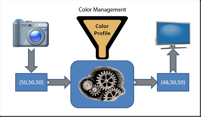
Ok, so here’s where color management comes into the picture. Let’s say that we took a picture of a gray card and the camera captured it pretty faithfully. The numbers the camera saves in the image file for the gray are (50,50,50) But let’s say that our computer display tends to make everything a little redder. So if we said to the monitor, “Display (50,50,50),” we wouldn’t get a pure gray but a slightly reddish gray. So if we want to accurately display the colors our camera captured we have to cheat a little and change the numbers we send to the display so that it displays the same gray. Since it makes things redder, we need to trick it by telling it to display less read, something like (48,50,50). We need to change the numbers to make the color slightly cyan (the opposite of red) so that when the monitor makes it more red, the end result will be the same gray as the one we photographed.
Color Management, then, is about changing the numbers that produce a certain color on one device to another set of numbers that will render the exact same color on a different device. This is because all devices have their own built in color biases.
But how do we know how to change the numbers for our display? Well, actually, we don’t. To do that we need to calibrate our monitor.
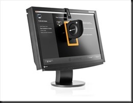
This is a picture of a Colormunki in action. The device hanging on the front of the monitor measures the amount and color of the light displayed on the monitor. A calibration program flashes different shades of red, green, blue and gray on the monitor and the Colormunki tells the program what it senses which compares it to what it actually displayed. Then it determines the difference and from that it knows what adjustments need to be made so that the monitor display the intended color. It’s a kind of mapping; if it gets one color (three numbers), it changes them to three different numbers but the color is the same.
This mapping is called a color profile which is saved in an ICM file on Windows machines. You don’t have to worry about where to put this ICM file or tell Windows to use it. The calibration software does all that. And Windows uses this ICM file to adjust the numbers for everything it displays on the screen not just your photographs. And the result you get is true, accurate colors, the same colors you saw in that redwood grove.
Let’s recap. In the field your digital camera will do an excellent job of capturing virtually all the colors that are there, as long as you save your images as RAW files. For white balance I recommend Daylight although it doesn’t have any affect on the image data. Then, to get those same colors on your computer’s monitor you first need to calibrate it. Using a calibration tool like the Colormunki is the preferred way because it’s the most accurate. But there are programs that allow you to do this manually. Whatever method you choose, a color profile is created in an ICM file that gets saved on your hard drive and Windows uses it to adjust the colors on everything it displays on your monitor. (The MAC has a similar system although I’m not familiar with the details.) Here’s a picture that illustrate the example of the gray card above.
And here’s a pretty good post from PC Magazine on calibrating your monitor using software.
Two companies that market monitor calibration hardware and software are
- Xrite – http://www.xrite.com/
- Datacolor – http://spyder.datacolor.com/
The key message from this blog post is CALIBRATE YOUR MONITOR. You may not think it’s important but you’ll be frustrated with the colors you get when you go to print your pictures. You’ll probably blame your printer when it’s actually your un-calibrated monitor’s fault (and yours for not calibrating it).
In the next post I’ll talk about taking your picture from computer to print. So don’t go very far.
I always enjoy it when you comment on my posts. So go ahead, make my day; contribute to the conversation and share your experience and expertise. And if you know someone who would find this article useful, please feel free to share it with them, share it on Facebook or reference it on your blog or website.
Join me on an upcoming workshop. Click here for more details.
To see more of my photographs click here.
(1689)


Hi Ralph,
Thanks for doing this color management series. It’s an area I’ve been wanting to learn more about, and you have a gift for making this complex subject (and others) very accessible.
Yet another easy-to-understand post on the intricacies of colour management. You make what can be a difficult subject clear and easy to understand.
I have just switched to an iMac, after years of using a calibrated PC laptop, the only computer we had. After calibrating the laptop for the first time, and seeing just how much better the resulting prints were, I was sold on the idea of calibrating the monitor. The iMac, as yet uncallibrated, as that will need a new device, produces the most horrible colour when printed from. So I will need to bite the $$$ bullet once again…