For some time now I’ve been using and teaching a process of working on photographs in Lightroom. It consists of basically four steps: manual adjustments, tonality adjustments, hue adjustments and finally saturation adjustments. Quite some time ago I had the brilliant idea of converting the image to black and white before doing the tonality adjustments. The technique I used was the B & W tab in Lightroom’s HSL group. Once the tonality adjustments were done, the image would be converted back to color and the process continue.
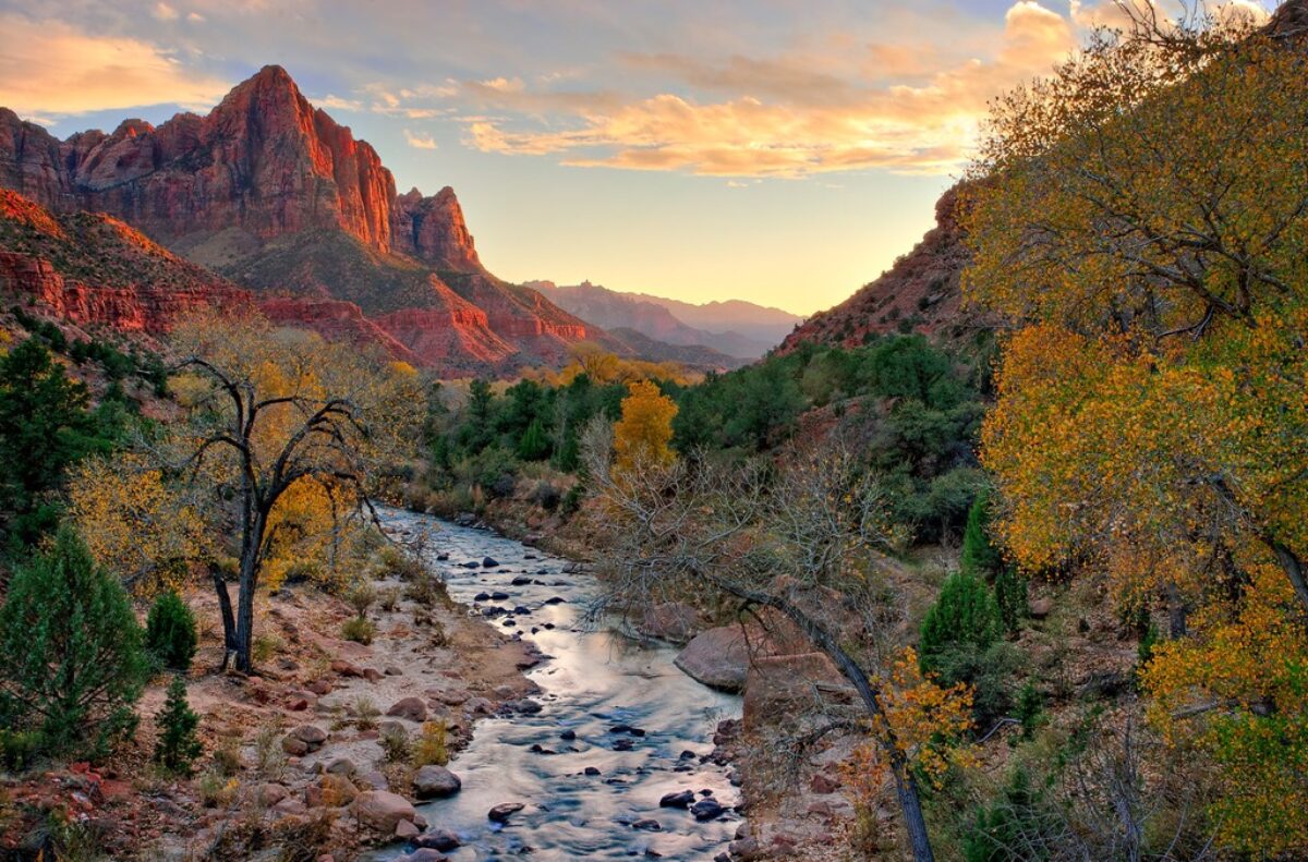
It didn’t work out because when I converted the image back to color, the colors were so oversaturated and unnatural that the image looked horrible. It was just easier to do the tonality adjustments on the color image. So I quickly gave up on that technique. But the other day I was reading an article in Popular Photography magazine that rekindled this idea. It took a different approach. It turned the image to black and white by setting the Saturation adjustment to -100. Now the author did this in the middle of the process but I thought that if I applied this to my process and did that at the start it just might work. So I was eager to give it a try. Let’s try it with this image of the Watchman in Zion National Park.
 This is the original raw file. I haven’t done anything to it yet. It doesn’t need any mechanical adjustments. These consist of removing spots, straightening the image, maybe some noise reduction and the final crop. But since none of these are required we can move on to the tonality adjustments.
Now, with this new process the first step is to desaturate the image so that there is no color. In the Basic group, slide the Saturation adjustment all the way to the left.
 |
 |
Now I’m going to go about my normal tonality adjustments, But this time I’m going to work on the black and white image Instead of color . My goal will be to make it look decent in black and white.
In this step I’m making adjustments to black points, highlights, mid tones and contrast. I’m only using the adjustments in the Basic group. I’ll be using other tonality adjustments once I return the image back to color but that comes later. You can see below that I’ve adjusted Contrast, Shadows, Whites and Blacks to achieve this result.
 |
 |
It’s time to start thinking about how I want to interpret this scene. For me the focal point is the Watchman and I want to make sure that everything contributes to leading the viewer’s eye to it. I’m noticing that the rocks in the foreground are quite bright. And being so bright they’re calling to the viewer, “Look at me! Look at me!” That’s not going to work so I want to darken them. To do that I’ll use Lightroom’s Graduated filter.
Selecting the Graduated filter (found above the Basic group), start near the top of the rock field by clicking the left mouse button and dragging it upwards. While dragging I hold the Shift key so that the graduated part of the filter remains horizontal. Next release the left mouse button and adjust the Exposure slider to darken the foreground. Here are the results.
 |
 |
Now that I have the black and white image looking pretty good I’m ready to add the color back in. Admittedly, it wouldn’t make a very good black and white photograph at this point. There would be still more work to do. But it’s good enough to continue.
So back to the Saturation slider. I just slide it back to the right until I get the amount of color and saturation that looks good. I don’t have to return it to zero but I want to make sure I don’t under- or overdo it. In this case a little bit of extra saturation looks good. I ended up with a +5.
 Next I want to work on the sky. If I remember correctly there were some clouds in the sky. But this sky is so washed out that you can’t see them. So the first thing I want to do is darken the sky; in other words, decrease its tonality. I’m still doing tonality adjustments but I’m not going to use the adjustments in the Basic group this time. Instead I’m going to turn to one of my favorite adjustments in the HSL tool. In this tool the L stands for Luminance, another word for tonality. With the HSL tool I can adjust the luminosity or tonality of individual colors. And I can use the Targeted Adjustment Tool or the TAT, to make the adjustments. This tool is quite magical in that it selects the colors that it’s hovering over. Expand HSL, click Luminance, click the TAT and move the cursor over the sky. Press the left mouse button and slide it down.
 |
 |
As you can see, there are some interesting clouds in the blue sky. And restoring the blue by darkening it does two things. First, this is closer to what I actually experienced and what excited me when I was there. And second, it makes for a more interesting and complete photograph. Now you’ll notice that there is some fringing around the Watchman, a very small halo effect. That’s pretty distracting, especially when the image is blown up. And at this point there is no way of dealing with it in Lightroom but I can take care of it in Photoshop. So I’m not going to worry about it now. I’ll deal with that later.
Back to interpretation. Cottonwoods play a very important role in Zion Canyon. And I want this photograph to express their role. As the image is now, they don’t really stand out very much. They’re pretty subdued. But I want to draw attention to them so I’m going to brighten them up a little bit. As with the sky, I turn to the Luminance adjustment again but this time instead of darkening the blue, I will make the green lighter. I don’t want to brighten them too much though because I still want the Watchman to be the primary element. But I definitely want the cottonwoods to be important in this image. And here’s the result.
 Were almost there. I want to make one more adjustment, this time to the Watchman itself. One of the difficulties of shooting in the Southwest, especially in this kind of light, is highlight clipping in the red channel. What that means in practical terms is detail is lost in the highlights on the red cliffs. So I used the TAT in the HSL tool to darken the highlights on the cliffs just a little and added just a wee bit of saturation. I magnified the image so I could see exactly what the effect would be.
There’s one slight distracting cloud on the left border. Typically we want to avoid bright elements on the border because they too are distracting. So I’m going to use the Spot Removal Tool to remove or at least soften the cloud. Now you may question whether or not something should be removed from the image, just like you might question whether or not something that wasn’t there can be added. This is a personal decision that each of us must make for ourselves. For me, I am okay with removing distracting elements but I draw the line when it comes to adding things that were not there. That’s my choice. Others may choose to add elements to photographs and that’s their choice. The thing that I think is more important is not whether it’s right or wrong to add or remove elements but whether we are honest about it. In the end it’s the artists intent and creative vision that’s important and that we do not try to deceive our viewers.
So I’m going to use the Spot Removal Tool to get rid of that little cloud.
 The final tonality adjustment I want to make is to add a touch of Clarity. I set up some presets in Lightroom to give me +25, +50 and +75 Clarity. That way I can quickly try different amounts to see which works the best. It’s easy to overdo it with so I like to be careful with it. In this case +25 is just about right. It adds just a little bit of sparkle and life to the image.
 After the tonality adjustments the next adjustment I consider is hue. Now hue is the same as color. In general, the overall color of this image is just fine. I’m a little bit concerned, however, about the sky. It’s just a little bit too cyan. So I’m going to return to the HSL tool and this time use the Hue adjustment to make it a little bluer. I want to be careful because the sky at this time of day is a beautiful baby blue so I don’t want to overdo it. But I don’t want it to be to cyan either.
 |
 |
That’s all the hue adjustments that are needed. And when you look at the saturation, there’s nothing that really needs to be done. The reason for adjusting saturation last is because tonality and hue adjustments have an effect on saturation and so quite often there’s really not a whole lot more that needs to be done. Normally I might try a little Vibrance at this point but Vibrance seems to work mostly on blues and the blues are already so saturated that I don’t want to do anything else to them. So we’ll skip the Vibrance.
There is one last adjustment that I want to make and I finish up virtually all of my photographs with his final adjustment. And that is to add some vignetting around the corners. Vignetting if done well is very subtle but has a very profound effect on the overall impact of the image. The goal of the image is to focus and hold the viewer’s attention on the primary and secondary elements. Normally these elements will be near the center of the frame. And a very effective way of drawing the viewer’s eye into the frame is to darken the edges just a little bit. And that’s what vignetting does so well.
Vignetting is found in the Effects group. I keep it simple and only adjust the Amount slider. Negative numbers produce darkening and positive numbers produce brightening. As with Clarity, I’ve created my own presets for -5, -10 and -15 vignetting. For this image -10 works really well.
 |
 |
And that’s the last thing I do in Lightroom. From this point on the rest of the work is done in Photoshop (which I’ll save for another day). So how did it turn out? Well, judge for yourself. Here’s the before and after.
 |
 |
This overall process is not a whole lot different from what I practiced or taught in the past. I think what’s really interesting about this process is to desaturate the image before doing the tonality adjustments. There are a couple of things that I think are very important. First, we get tonalities that are effective with or without color. Secondly, we can focus on light and dark without the distraction of hue and saturation.
Over the years I’ve searched for a way to separate tonality adjustments from the color adjustments. As I mentioned at the top of this article I tried converting the image to black and white using the HSL B & W adjustment and then convert it back to color but that didn’t work. I tried using the Lab color space in Photoshop and while that held some promise it’s not something I could do in Lightroom and it really takes some getting used to. And this technique of desaturating the color before doing tonality adjustments and then adding the color back is very promising.
So after reading that article in Popular Photography, I was eager to give it a try. And after seeing how well it worked, I was eager to share it with you. Give it a try. See if it works for you and if it does you may have just expanded your Creative Vocabulary.
.
(4960)