Mastering Composition – Rule of Thirds

Use the Rule of Thirds to create visual tension in your images and stimulate the viewer’s interest.

The Rule of Thirds is a compositional principle that is widely used. And for good reason because, well, it works.  At least, it works in a lot of situations.

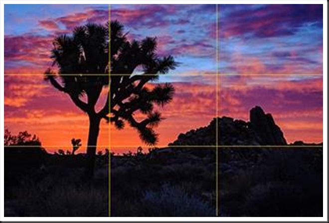
What is the Rule of Thirds? You superimpose a tic-tac-toe grid on your image, two vertical lines equally spaced and two horizontal lines equally spaced. Then you place the key elements of your image on or near those lines, or at one of their intersections.  They don’t have to be exactly on the lines or intersections, just near them.  This is art, not engineering, so it’s important that it feels right.  But the Rule of Thirds gives us positions that are visually very strong and command the viewer’s attention.  That’s why you want to use this principle for the key elements of your composition, the elements you want to draw the viewer’s eye to.

clip_image002

One should be cautious in overusing the Rule of Thirds. It should not be applied mechanically and certainly not universally.  It does not apply to all compositions.  After all, aren’t our ‘Rules’ of composition made to be broken?  But on the other hand, sometimes a composition gets just a little bit stronger when you move the key element just a tiny bit to place it closer to or right on a 1/3rd line.

The fact is it works so well in so many situations that the camera manufacturers give us the ability to display the grid on our camera’s LCD screens and viewfinders. Also, software publishers like Adobe display the grid when we use the crop tool. This is true of Elements, Lightroom and Photoshop. And these aids can be very helpful in achieving strong compositions.

Why does the Rule of Thirds work so well? To answer that let’s talk about Visual Tension.

Continue reading “Mastering Composition – Rule of Thirds”

(2806)

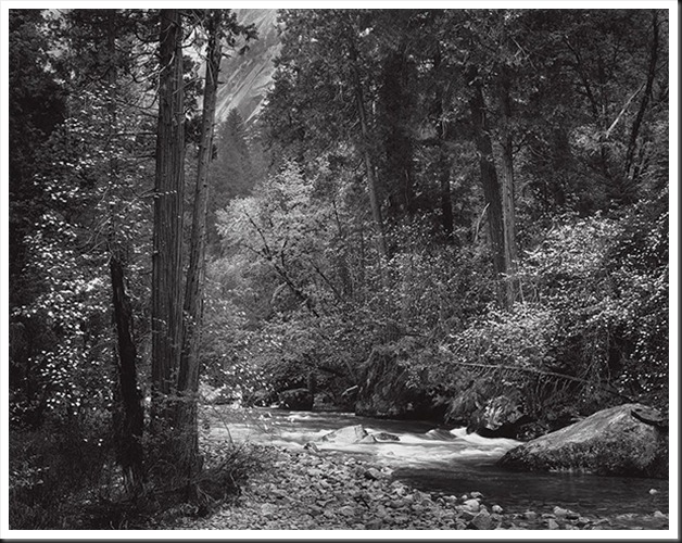
Ansel Adams – The Making of 40 Photographs: Tenaya Creek, Dogwood, Rain

Ansel Adams’ “Tenaya Creek, Dogwood, Rain” photograph inspires a discussion of the importance of the “intensity of feeling” that is the beginning of a great photograh.

As I continue reading Ansel Adam’s fascinating book, ”Examples The Making of 40 Photographs” I continue to come across insights that I wish to share with you.

Ansel Adams - Tenaya Creek, Spring Rain, 1948-600

“Tenaya Creek Dogwood Rain” was taken one overcast spring day in 1948 as Adams was out looking for dogwoods to photograph.  He notice something along Tenaya Creek up by Mirror Lake and went exploring.  It was starting to rain and he almost returned to his car and the warmth of his accommodation when this scene caught his eye.  He went back to his car to retrieve his photographic gear including his 8X10 view camera.

I’m really taken by this photograph.  The light is perfect.  The white dogwood bracts glow against the green foliage.  It has a feeling of both intimacy and grandeur.  I would love to have a print.  It would be so easy to get lost in it.

The comments that Adams made that caught my attention (besides this beautiful photograph) deal with the inspiration the artist feels when interacting with a subject.  They are perfect and I must share them with you.

“The photographer learns to seek the essential qualities of his environment, no matter where he may be.  By this I mean he should be tuned to respond to every situation.  It is not enough to like or dislike; he must make an effort to understand what he is experiencing….  My life is full of memories of experiences that are of greater importance than recollections of mere things that have happened.  Unless I had reacted to the mood of this place with some intensity of feeling, I would have found it a difficult and shallow undertaking to attempt a photograph.”

In my own experience “intensity of feeling” comes with practice, experience, patience, slowing down, quieting the brain, opening up, understanding, respect, harmony, and reverence.  There is a very technical, analytical side to photography that can easily drown out the creative, inspirational side.  It is necessary to balance the two to create successful images.  Technical excellence without soul is sterile and empty.  Great photographs begin with inspiration, awe and wonder which is then captured and communicated through an abundance of technical skill.  We don’t find inspiration every time we go out but as our eye becomes more and more aware we find inspiration in more and more places.


We invite you to join the conversation.  Where do you find inspiration?  How has that changed over time?  We’d be interested in hearing your experiences.

Do you know someone who might also enjoy this article?  Please feel free to share it on Facebook, Twitter or other social network sites.

Join me on an upcoming workshop.  Click here for more details.

To see more of my photographs click here.

Oh, by the way, I couldn’t resist.  I purchased the photograph from the Ansel Adams Gallery.  It will arrive in a few days.  I’m so excited.

(4587)

Mastering Composition – Working the Shot

How can you create a strong composition? Here’s one method that really works.

There’s no doubt that composition is one of the key elements of a successful image.  You can have all the other factors of a great shot – fantastic light, optimum exposure and appropriate sharpness – but with a weak composition you have a weak photograph. 

I know photographers that work slowly enough to work out the strongest composition before they press the shutter.  I admire these people immensely.  But I don’t work that way, especially in an area I’m unfamiliar with.

A short while ago I was driving south through Utah on beautiful highway 89 traveling between Bryce Canyon and Zion National Parks after wrapping up a successful photography workshop.  I came upon a stand of cottonwood trees that were in full autumn splendor.  I had to pull over.

I grabbed my point and shoot (Canon G11) and started scouting for photographs.  I like to use the G11 for that, scouting for compositions that are worth the effort of setting up my big Canon.  I found two compositions that were promising.

The second proved to be the most interesting, at least in terms of how the final composition evolved.  Behind the cottonwoods was a meadow with a dilapidated shack.  It was so Utah!  I set up what I thought would be an interesting composition.
bryce_121019__SM33931

(Click on the images to enlarge them.)

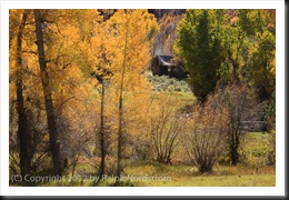
I positioned my camera so that there would be a narrow opening to the meadow and the shack.  It is a tight composition that draws the viewers eye to the shack which is placed in a very strong position within the frame.  It has a feeling of depth with a strong foreground opening up to the shack in the background.

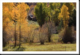
I was feeling good about this composition and then I noticed a glowing cottonwood just outside the frame to the right so I moved the camera a couple of feet to the right and created this image.
bryce_121019__SM33935

The golden cottonwoods on the left are balanced by the single, smaller cottonwood to the right.  This arrangement has the effect of placing more emphasis on the autumnal trees.  The eye makes three stops, first at the cottonwoods on the left, then to the right and finally works its way back to the shack in the back.

I was pretty  pleased with these two compositions and thought I had something to work with when I got home.  So I disassembled everything and put  it back in my camera bag, collapsed the tripod and started back toward the car.  I hadn’t gone 5 steps when I looked back up toward the shack and saw there was another blaze of cottonwoods right next to it.  So I swung my backpack back down to the ground and set up again for this shot.
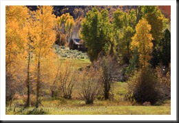
bryce_121019__SM33939

Now there are three sources of golden light for the eye to explore – the cottonwoods to the left, the one a little further back on the right and the ones way in the back by the shack.  (Odd numbers of things are always good.)  The image is well balanced and every element in it contributes to the entire impression.

There’s a story here, a story of living in this beautiful valley during a time that is gone and will probably never return.  It must not have been an easy life but one of honest, hard work and the satisfaction of living in a place of such splendid beauty.  We would do it differently today with more conveniences and comforts.  And maybe, just maybe, miss out on the more intimate connection with Mother Earth that living in such a simple shack must have provided.


I’d be interested to hear which of the three compositions you like the most.  Please leave a comment saying which one you like and why.  It will make for a very interesting dialog.

If you enjoyed this post please feel free to Like it and share it with your friends.  You can use the links at the top.

Join me on an upcoming workshop.  Click here for more details.

To see more of my photographs click here.

WordPress Tags: Composition,Shot,image,exposure,area,Utah,highway,Bryce,Canyon,Zion,National,Parks,photography,workshop,trees,splendor,Canon,worth,effort,Behind,shack,Click,images,viewers,depth,foreground,background,arrangement,emphasis,tripod,steps,backpack,numbers,element,valley,life,satisfaction,conveniences,connection,Mother,Earth,factors,compositions,feet,cottonwood,cottonwoods,camera,three

(1288)