In part one and two of this series I described how I selected the file to work on and explored the potential of the image in Lightroom. The treatment I ended up with would be exported into Photoshop and we go from there.
After trying several approaches particularly with regard to the color of the light I selected one that was very much like the unadjusted file. The only change was opening up the shadows in the valley floor a bit.
 Now the fun begins. While Lightroom 2.x supports local adjustments I prefer to do the local adjustments in Photoshop. I just feel that I have more control in Photoshop.
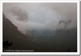
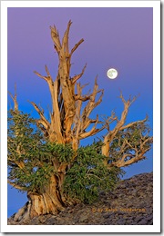
The first thing to deal with is the silhouette of the pint tree in the lower left hand corner. I used the clone stamp tool to get rid of that. I have no qualms about removing things that distract from the image. But I draw the line at adding things. Someone asked me if I added the moon in Bristlecone Moonrise. No, I was there and that was the moon. What’s the point of faking it. The experience in the field would simply not be the same. It’s so exciting to take an image like this and think you’ve got it. But there’s always the nagging doubt in the back of your head wondering if you overlooked something and messed it up. You never know until you get back at your computer to see what you really have.
But back to Yosemite. So the pine tree silhouette had to go. Also, I checked the image for dust spots and only found one or two. The spot healing brush took care of them.
The next step was to do some local adjustments with Viveza. It’s a cool tool from Nik Software that allows you to select an area and control brightness, contrast, saturation and more. The clouds in the upper right needed contrast enhanced a little. Next a couple of Curves with layer masks helped open up the valley floor even more. I tried some vignetting on the bottom and really liked the way it funneled the eye into the center of the image where everything was happening. I didn’t think I’d need any vignetting for the top corners but tried it anyway and liked that too.
I made some global adjustments too. Selective Color helped warm the reds with some yellow, lighten the yellows and darken the blues. Color Balance also shifted the overall color just a couple points to the yellow.
Sorry I don’t have images of each of the steps along the way but that pretty much finished up the first evening. The image was starting to get interesting and it was time to sleep on it and come back another day to take a fresh look at it.
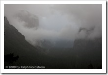 Original Capture |
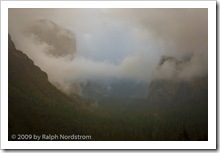 After Photoshop Session 1 |
Here are the two side-by-side. It’s starting to take shape. There’s a little hint of warmth in the clouds and they stand out more from the background. The valley floor is better defined and the trees stand out a bit more. There’s actually a subtle feeling of warm light down there. El Cap and Bridle Vail Falls also are more prominent and their warmer tones contrast more with the overall picture’s coolness. You can click on the images to enlarge them.
Even before I fell asleep that night I was thinking of what needed to be done next. As you work on an image you become satiated to the colors, tonalities and contrast and you can’t tell if they are good or not. You also get emotionally involved. So it’s good to stop, get away from it and return another day. Sometimes when you return you are pleased and other times you say to yourself, “What was I thinking?” When I get the latter reaction it usually means starting over from the beginning. We’ll come back to this technique when you get far enough along to start making proofs.
So come back for #4 in this series to see if I said, “What was I thinking?” or if I picked up from where I left off.
To see more of my photographs click here.
Join me on an upcoming workshop.
Become a fan on Facebook and follow along.
(1045)
