There are a lot of instructional books on how to use Lightroom, Photoshop, Photoshop Elements and the like. They provide a comprehensive and in-depth review of the various adjustments and filters available in these powerful tools. And as such they serve as excellent references. I own many of these fine books.
Now, a lot of workflows are built around the concept of seeing what needs to be fixed next and fixing it. I advocate a more structured approach; namely, fix the tonality first, then the hue and finally the saturation. See my recent post on Workflow. But I often hear the statement, “I look at my photograph and just don’t know what to do.” Many people often don’t know where to begin.
So I want to take a different approach. I want to look at an image and identify what it needs and then talk about the various techniques for achieving it. In other words, I want to start with the question, “What makes a compelling photograph?” and go from there. It doesn’t help to know all of the tools and tricks available in Lightroom and Photoshop if you don’t know when to use them.
We’ll start with this image. It is photographed in the Mesquite Flats Dunes of Death Valley. The dunes provide an inspiring variety of compositions and ligh. (You can click on this and all other images in this post to enlarge it.)
Let’s start by examining the images tonality and see what improvements can be made.
Checking the Photograph
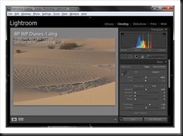
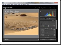
The first thing to check is the exposure. To do that we look at the histogram. Here’s how it looks in Lightroom.
The image is not bad. The exposure is actually very good. There is no highlight or shadow clipping problems; that is, the histogram does not extend to the right or left sides. In fact, it is pretty well centered which, in this case, is a good thing.
But the image is lacking in drama. It has no snap. There’s nothing to make it stand out. The problem is it lacks contrast.
Contrast
Contrast adds interest because it adds drama. Bold dark areas balanced with brilliant light areas are exciting. They catch our eye.
Contrast also adds clarity. You know what it’s like to be outside on a clear day after a cleansing rain or when it’s windy. Distant mountains become very clear. In fact, one often hears, “It was so clear I felt like I could reach out and touch them.” This is because the haze and dust in the atmosphere is gone. Normally the atmosphere will scatter the light from distant objects, making them appear fuzzy and giving them a blue cast (“Purple mountain majesty”). But when we have these exceptionally clear days it’s always thrilling. The fuzzy appearance of the distant mountains results from the contrast being reduced and this can be ‘corrected’ by restoring at least some of the contrast.
But contrast applies to more than just images of mountains and other distant objects. It’s a fundamental quality of all photographs and in many cases, greater contrast is preferable to lesser contrast, the notable exception being fog.
Now, the histogram also tells us that this image lacks contrast. The same observation about the exposure (that the histogram does not extend to either side) also tells us that the dynamic range is at least somewhat limited. In other words, the image lacks the necessary contrast to make it interesting.
Dynamic Range of the Medium
But what this also tells us is that the image is not taking advantage of the full dynamic range of the medium. If you’ve read Ansel Adams, you know that his goal in creating black and white images was to take advantage of the full dynamic range of the paper he was printing on. The full dynamic range is the blackest black and the whitest white the paper can display. The whitest white is the natural white of the paper. And the blackest black is the darkest tone that can be created by the maximum density of the silver in the emulsion. In our digital world, the whitest white is still the white of the paper but the blackest black is the darkest tone that can be created from the black inks we use.
So one characteristic of a compelling print is that it makes use of the full dynamic range of the medium. And one way to determine if it’s doing that or not is the histogram (yep, the histogram).
Looking at the histogram for our image we can see that we need to stretch it out, thereby increasing the dynamic range AND the overall contrast. One way to do that is to set a black point and a white point. Let’s break it down.
Setting a Black Point
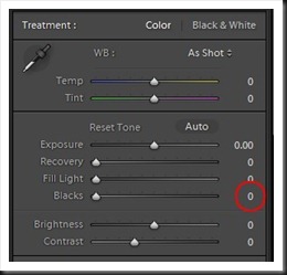
Setting a black point creates a tonal foundation for the image. In Lightroom the Blacks adjustment is used to set the black point.
Now, I must point out that my starting point in Lightroom is with Blacks set to zero. Adobe defaults Blacks to 5, no doubt because that makes the images look better. But I prefer to override that when I import my images and set all Blacks to 0. See Lightroom Tutorial – Camera Specific Presets
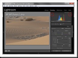
The Blacks adjustment affects just the left end of the histogram. So by increasing Blacks the left end of the histogram will move toward the left side. Now, before I start I want to turn on the two clipping warnings. To do that I click the triangles in the upper corners of the histogram.
Now I slide the Blacks adjustment to the right until I get a small amount of black clipping. Note the emphasis on the word “small,” A tiny amount of black clipping is good for an image but too much is a bad thing. Let’s take a look.
Notice that the black clipping warning triangle is now ‘lit up.’ The histogram is just barely touching the left side but it is enough to create a very small amount of black clipping. You can see some blue areas in the shadows near the bottom of the image. This is where the shadow clipping occurs.
Let’s compare the before and after images.
 Before Before |
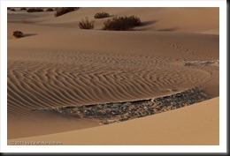 With Black Point With Black Point |
Already there is a noticeable improvement. The ripples in the sand stand out more because if the increased contrast. And the image has a richer feel to it. Oftentimes adding a black point will also saturate the colors, especially in Lightroom. So the yellows of the sand are more pronounced.
Setting a White Point
We can kick this image up another notch though. We can increase the brightness of the image by using the Lightroom Exposure adjustment. This will have the effect of moving the right side of the histogram toward the right with minimal affect on the blacks. If we increase Exposure to the point where the histogram touches the right side we will have created a white point.
It’s not always desirable to create an actual white point in color images (unlike black and white images which almost always benefit from a white point). But increasing Exposure will add contrast and give the image more pop.
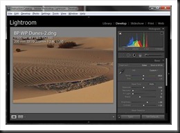
Increasing Exposure produces these results.
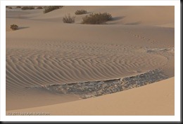
I’ve increased Exposure to +1.3. This is similar to increasing the exposure in your camera by 1.3 f/stops (not that you can adjust the exposure in your camera by 1/10 stop increments – usually we choose 1/3 or possibly 1/2 stop increments). Here are the three images – the original, the black point and the combined black point/white point images.
 |
 |
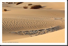 |
It’s clear that the image has grown from one that is flat and uninteresting to one that has a lot more promise. The image we started with just doesn’t have any life. The final image is vibrant and much more interesting. The texture and contours of the sand are much more pronounced now and the color is more vivid. I wouldn’t say it was done yet. We may have more adjustments to make to tonality, hue and saturation. But the point here is not to produce a final image but to spell out in some detail how setting black and white points is a great first step in your workflow.
A few words of caution are in order. Not every image benefits from a true white point. In fact, if you check the histogram for the final image above, it does NOT have a white point; the histogram does not touch the right side. Rather, the Exposure was increased so that there is a pleasing brightness and an interesting amount of contrast.
The same can be said for black points although most color images benefit from black points. But this is not something you want to do blindly. In both cases you may find that if you go all the way to a black or white the result is too strong. In this happens, back off. Set levels of Blacks and Exposure that strengthen your images but do not overpower and thus ruin them.
Other Ways to Set Black and White Points
We’ve described how to set black and white points in Lightroom. But Photoshop offers more ways to do this and while the controls are different, the principle is the same. I won’t get into the details here but will just outline how it’s done.
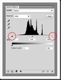
The first Photoshop adjustment that people often learn is Levels.
There are two sliders in the Levels adjustment that allow you to adjust the black and white points. They are circled above. Slide the black triangle to the right to adjust the black point. Hold down the Alt key while you slide and the image will turn white. When you start to create black points those area of the image will turn black.
The same technique works for the white slider. Holding down the Alt key will turn the image black. As you slide the white slider to the left the areas where highlight clipping occurs will turn white.
Levels is available in both Photoshop and Photoshop Elements.
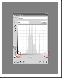
The Curves adjustment can also be used to set black and white points.
As with the Levels adjustment there are black and white sliders (circled above). Again, holding down the Alt key and sliding the respective sliders will have the same effect as with Levels.
When used in this way (simply using the black and white sliders to set black and white points) there is really no difference between the two controls. However, Curves offers a great deal more flexibility than Levels and for most experienced Photoshop users it is their go-to adjustment. We’ll get into some of the differences at some point but let’s just leave it here for now.
Conclusion
So what’s the answer to those who say they have no idea where to start with an image? The answer is to explore what adjusting the overall brightness and added contrast can do. And this can be done by setting a black point and possibly a white point. As long as your photograph is well exposed, this is a good place to start. (Of course, if it’s under or over exposed then you need to approach the image in a totally different manner.)
The adjustments you will use in Lightroom are Blacks and Exposure. In Photoshop you can use Levels or Curves.
Both approaches lead to improved contrast which adds drama and impact to the image.
If you find this post useful and know others who might enjoy it, please feel free to share it with them. You can use the Share button at the top of the post.
We do photography workshops. Come on out and join us. Click here to check us out.
You can also check out our photography. Click here.
(12131)

Thanks so much for these helpful tips. Coming from Elements to Lightroom I was unsure what to do with the black and white points, and was tempted to always adjust them so the histogram reaches both sides of the grid. I believe I was even taught to do this in a photoshop class, but it’s very good to know that this is not always desirable. Thanks!
Thanks again for the additional comments. I know a lot more than I did a year ago as a result of the generosity of folks like yourself, and hope to know much more a year from now. I’m an amateur photog on weekends, and an Engineer by day. I suffer a bit of OCD as it relates to processes. I’m always looking for standardization when it comes to process parameters, that extends to the histogram and all of the sliders that can impact it. I’ll keep plugging away.
Hi Brian. Thanks for your reply. I can appreciate your OCD comment. I’m an IT guy and a certain amount of that is necessary for a successful career where details matter. By the way, I prefer to call it OCA, the A standing for Advantage. You and I being technical have an advantage with complex software like Lightroom and Photoshop. And I find the workflow works best if there is a general framework by which one approached an image. I start with tonality adjustments, then hue and last saturation. But I also find that this is not a rigid nor a precise sequence. Because at some point the image itself cries out for an adjustment that is out of sequence. One of the things we technical people need to look out for is to become over-analytical. We need to back off of the analysis and let our right brains be heard. There’s plenty of problem solving in the making of a photograph from setting exposure and focus to deciding on whether to use Levels or Curves. But in the end a compelling photograph is one that comes from the right brain and where the left brain plays a supporting (albeit critical) role.
Keep up the good work. Maybe you can join me on a workshop sometime. We could continue the conversation in greater depth. (We can continue it here too of course.)
Thanks much for the instruction, much appreciated. I do have a question regarding workflow sequence. I know there are different schools of thought regarding creating a White Point, versus just using Exposure Adjustment. However in the above example you set a Black Point followed by Exposure. In the Workflow tutorial you do the reverse. Is there a difference? Also is there some redundancy with regards to using the Contrast Adjustment which would seems linear in it’s effect, verses curves?
Thanks for your Comment Brian. You raise an excellent point. But first, let me point out that the Black and White Point article was written in 2012 with an older version of Lightroom. With Lightroom 5 where we are today the controls are much different. So perhaps it’s time to do an update on black and white points. You also point out that in different blogs I use different approaches. I often think of workflow as an opening book in chess – there are any number of opening moves. And I must confess that I often start with different adjustments. For example, if I’ve ‘exposed to the right’ I’ll generally start with an Exposure adjustment to bring the intentionally overexposed image back to its ‘proper’ exposure before doing anything else. However, most of the time I begin with setting a black point and not often to I set a true white point, at least on color images.
As for the difference between the Contrast and the Curves adjustments I tend to use Contrast in Lightroom which goes against what most people recommend. I’m not too fond of Curves in Lightroom (I much prefer Curves in Photoshop) although there are times when Curves is just what the image needs. When using the Contrast adjustment it’s important to understand that the histogram is stretched out from the midtone. In other words, tonalities lighter than the midtone are stretched to the right and tonalities darker than the midtone are stretched to the left. If you need to enhance contrast around a tonality other than the midtone than you need to use Curves. But the Curves adjustment in Lightroom doesn’t have near the power and control of the Curves adjustment in Photoshop. So I generally defer my tweaking with Curves to Photoshop.
In practice, I also defer creating the final black point to Photoshop where I use Curves and Charles Cramer’s ‘sudden black’ technique or, I should say, a modification of it.
I think the bottom line is that workflow is not a mechanical step-by-step process. One may usually start by setting a black point but there are exceptions. And one’s workflow will change over time as one gains experience with Lightroom and Photoshop.
I hope this helps to shed some light on some of your concerns.
Ralph
Needed to draft you one bit of remark to be able to give many thanks again for all the nice pointers you have featured in this case. This is simply tremendously open-handed of people like you to grant openly what most of us would’ve marketed as an e book to end up making some profit for themselves, especially considering that you could have done it if you ever decided. Those advice likewise served as a fantastic way to fully grasp that most people have a similar eagerness like my personal own to understand whole lot more when considering this problem. I think there are numerous more fun times ahead for individuals that view your blog.
Thanks Bennett. I appreciate the kind remarks and positive feedback.