Color Management is the science of getting the colors you want in your photographs – consistently. And in my workshops I hear all too often that people are disappointed because the colors they get in their prints are not what they saw on their monitors. They often go to a lot of work preparing an image and when they print it it’s as if all that work was a waste of time.
Color Management is indeed a science and can be very complicated and technical. But getting the same colors on the print that you see on your monitor is essential if you are to have control over the creative process. For that, color management is the key and in these series of articles I’m trying to break it down to make it more understandable and accessible for all of us.
In the previous two articles I presented the concept of a color space and what happens behind the scenes when you move the image from the camera to your computer. See Color Management Made Simple – Color Space and Color Management Made Simple – From Camera to Computer. In this article I’ll be covering the all important aspect of getting your prints to look like what you see on your monitor; that is, from Computer to Print.
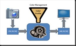
In the Camera to Computer article we discussed a couple of key factors that are also at play when we take our images to the print. Each medium has its own unique color characteristics. Colors are rendered differently on paper than they are on your monitor. We saw in that article that colors are stored in our digital cameras as a set of three numbers that specify the amount of red, green and blue in a particular color. And we said that those three colors had to be altered to compensate for the color biases of a particular medium. The example we gave was of a photograph of a gray card displayed on a monitor that had a slight red bias. A color profile of the monitor was used to make the translation from the camera numbers (50,50,50) to the monitor numbers (48,50,50) in order to make the colors accurately rendered on the monitor. And we illustrated it this way.
Pretty much the same process is at work when we go from the monitor to the print. And more. So let’s get started.
I want to share with you a bit more of what’s going on in your computer. And I’ll use the graphic below to show you what I mean. The heart of color management is the CMM or Color Matching Module. This is a program that does these number translations we’ve been talking about, translating a set of RGB numbers that render a particular color on one device to a different set of numbers that render the same colors on a different device. There are different CMMs. Some of them come with your computer’s operating system such as ColorSync for the Mac and Windows Color System for Windows. Adobe has written their own that can be used when you print from Lightroom or Photoshop or Elements.
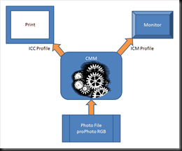
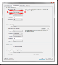
Now then, let’s begin at the bottom of the graphic where we have our photograph file (TIFF, PSD, JPEG). One of the functions of Lightroom, Adobe Camera Raw or Aperture is to convert the image in our RAW file to one of these formats. The RAW file has no defined color space. It’s what the camera’s sensor captured. But these other formats require a color space. And these programs, called RAW image conversion programs, will apply the color space you choose to the converted file. In the example above the RAW file was converted to the proPhoto RGB color space. In Lightroom you can specify the color space in the Preferences dialog (Edit | Preferences) on the External Editing tab.
This is important because it lets the CMM know the color space you worked in. And proPhoto RGB is the preferred color space because it’s the largest (the 96 Crayon box). But remember, the color space is not stored with your RAW file but only with the TIFF, PSD, etc.
How the CMM actually works to display the image on the monitor is pretty clever. It uses the photo’s imbedded color space information (proPhoto RGB in this case) as the starting point. It then converts all the colors from the image file into an internal universal color space, a space that is virtually unlimited. This represents the true colors of the image. Then from this color space it converts the image’s colors to the monitor’s color space using the ICM profile file that was created when you calibrated your monitor. Pretty complicated, isn’t it. Aren’t you glad you didn’t have to figure that out. But the simple fact is that the monitor faithfully displays the colors of your image.
At some point we’re ready to print our photograph and the CMM does the exact same thing when preparing an image for the printer. Again, it starts with the color space of the image (proPhoto RGB), converts it to the internal universal color space and then, using a different type of profile file for printers, the ICC profile, translates the RGB numbers so the colors are rendered accurately on the print.
Let’s talk a little bit about ICC profiles and why they are so important. I’m assuming you are printing your photographs on a high quality dot matrix printer (I use an Epson 4800). But the same applies if you are sending your photos to a lab. There are two components to a photographic print – the paper and the ink. First the paper. They come in different colors and surfaces. We generally think of photographic papers as being white. But not all whites are created equal. Some papers contain varying amounts of whiteners that can make them really white. And other ‘natural’ papers will have a warm tone. And then there are the different surfaces – glossy, metallic, luster, matte, canvas and more. The color of the paper and its surface will affect the final color of your print so an ICC profile needs to take that into account.
Then there’s the ink. First off, you only want to buy the ink created by the printer’s manufacturer. There’s a surprising amount of sophisticated engineering that goes into developing an ink. And the colors are consistent, stable and resist fading. And that’s very important. Also you need to use the inks for your model of printer. The number and types of inks has become more sophisticated over the years but your printer will only work with the inks that were created specifically for it. All this is leading up to this statement: you need a different ICC profile for every combination of paper and ink. Yep, that’s right – every paper and ink combination. There’s got to be thousands of them. And that’s also true.
Where do you get these ICC profiles? From the paper manufacturer’s website is one source. It’s definitely in their interest to provide the ICC profiles for all major printers and the inks specific to those printers. You can also pay a company to create custom ICC profiles for you by printing a color pattern they provide on the paper of your choosing and sending it in. They will measure each color patch the same way you did when you profiled your monitor and produce an ICC profile from the readings. And, if you want to do it yourself, Colormunki has the ability to do the same right in your own studio.
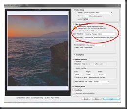
There are three things you need to remember when you print. One, tell your print program which ICC profile you’re using. It will communicate that to the CMM so it knows how to translate the colors in your print file. Two, you need to tell the print program (Photoshop) to do the color management. And three, you need to tell your printer NOT to do any color management. Printers like to be helpful or at least think they’re being helpful by ‘enhancing’ your photographs when you print them. But believe me, you do a much better job of enhancing them than they every could. Here’s a picture of the Photoshop print dialog that points out where you make the first two choices. The third setting is in your printer’s Properties dialog and will be different for every printer.
So let’s recap all three articles. First, there are different color spaces which are like bigger or smaller boxes of Crayons. The world we see with our eyes is the largest color space of all. Our digital cameras see most of that. It’s like the big 120 count box of Crayons. The color spaces we use when we work on our photographs are more limited with proPhoto RGB being the largest commonly used color space (96 Crayons) and sRGB being the most limited (48 Crayons).
Every medium or device we display our images on has it’s own unique color profile which is to say it distorts the colors in its own unique way. To get consistent results we need to be able to correct the distortions of each medium or device and we do that with a powerful program call the CMM (Color Matching Module) and profile files. That way, when we print out photographs the colors we expected to see are what actually get printed.
But wouldn’t you know it. It’s not quite that simple. There are still more thorny issues to come that we’ll take up in the next article. Here’s a hint – gamut errors and rendering intent. So stay tuned.
Share your thoughts and experiences and leave a comment; we love to hear from you. And it enriches everyone’s experience. And please feel free to share this with friends, on Facebook, Twitter, Google+, etc., or even on your own blog or website.
Join me on an upcoming workshop. Click here for more details.
To see more of my photographs click here.
(3288)

