The Qualities of a Powerful Landscape Photograph

When working on a photograph and wondering where to start, it’s helpful to know what is possible.

I think we all understand that serious landscape photography does not document nature but interprets it.  A well-made landscape photograph captures the photographer’s response to what was experienced and is able to convey this response to the viewer.

The Professional Photographers Association has 12 criteria by which they judge their competitions.  Granted, the PPA membership consists of very few fine art landscape photographers but still, the criteria of a great photograph are pretty much the same.

Here are the twelve criteria (the order is my own):

1.    Impact

2.    Composition

3.    Center of Interest

4.    Lighting

5.    Color Balance

6.    Technical Excellence

7.    Story Telling

8.    Creativity

9.    Style

10.  Presentation

11.  Subject Matter

12.  Technique

I mention these because there’s a lot that goes in to making a great photograph and these criteria provide a framework in knowing what to look for.  But rather that exploring these criteria in words, let’s look at a few photographs.  And let’s do it by looking at two examples of the same image – what it looked like when it came out of the camera and what it became when transformed in the digital darkroom.

Image 1

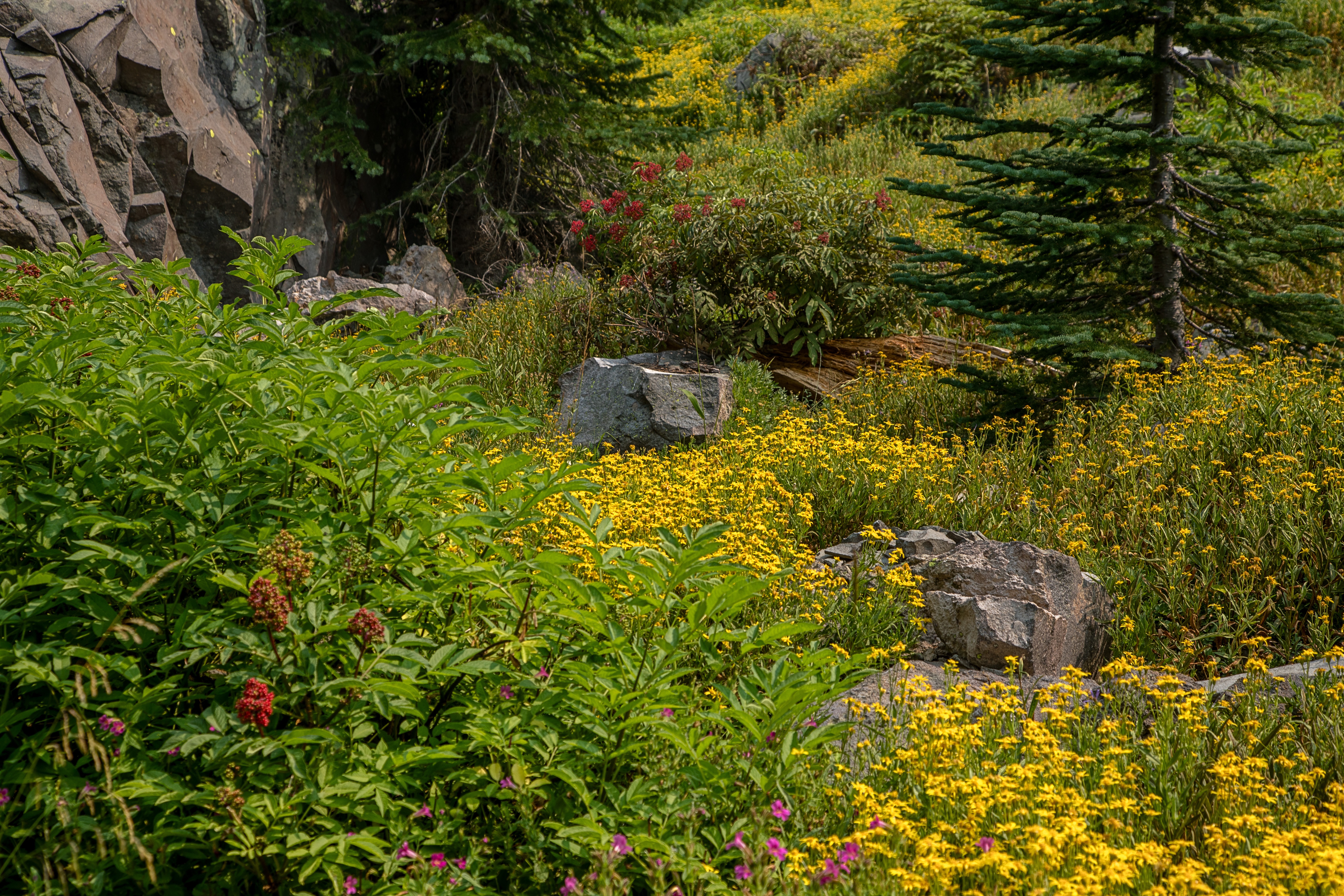
The first image is a scene in the mountains of Southern California.  I was wondering by myself along a remote trail.  The sun was sinking lower and lower in the sky and I was thrilled climbing the trails and walking among the trees and rocks.  I came upon this scene and it just felt right.  I had to capture it.

San jacinto 180720 SM37804

The mid-afternoon light is actually quite nice.  It’s not spectacular but it’s very pleasant and doesn’t pose any exposure challenges. The shadows make for interesting patterns on the forest floor.  And I tried for a composition that captured the energy and harmony I was feeling while at the same time portraying the stately strength of the trees.  And the center of interest is the rocks that form a sort of path that leads up to the trees on the right.  The trail leads out of the frame on the right, inviting the viewer to explore what lies beyond.

It’s a very nice picture but now it’s time to make it even nicer.  An effective way to add impact is to increase the contrast.  (This will be a recurring theme.) The shadows can be darkened along with the midtones.  Care is taken, however, to not lose detail in the shadows.  You also have to be careful with the clouds.  They have more detail that the RAW image doesn’t show, detail that can be coaxed out.

Continue reading “The Qualities of a Powerful Landscape Photograph”

(264)

JPEG or RAW

Which file format is better – JPEG or RAW. Well, it depends….

Our digital cameras give us a choice of two file formats in which our images are stored – JPEG and RAW.  In fact, some digital cameras only store images in JPEG format.  What’s the difference and is one preferred over the other?  Let’s take a look at each.

But before we begin, I was curious what JPEG stands for, so I looked it up.  It’s pretty weird – Joint Photographic Experts Group.  Strange indeed.  But. be that as it may, JPEG is widely used.  Practically every image you see on the web is JPEG although you occasionally see other formats.  If you use a lab to print your photographs, there’s a good chance they will ask you to send them JPEG files.

Continue reading “JPEG or RAW”

(114)

Everyone Can Take a Picture but Few Can Make a Photograph

Making a photograph involves much more than ‘point and shoot.’

“Anything that excites me for any reason, I will photograph; not searching for unusual subject matter, but making the commonplace unusual.”

~ Edward Weston

There are millions of pictures taken every day, every hour even.  They are fun and spontaneous.  They record moments in peoples’ lives.  They are shared on social media and sent in emails. And when viewed later, they bring back memories.

It’s easy to take a picture.  The dominant camera is the smart phone.  Just hold it up and tap the red button.  It takes no time at all and the reward is instantaneous.  It requires no particular skills or training.  It’s easy; anyone can do it.

These pictures will fill the internet’s networks and some may even end up on peoples’ walls or in scrapbooks.  But mostly when shared face to face, it’s from the smart phone’s camera roll.

Making a photograph is not at all like taking a picture.  It’s not easy.  It requires training, experience, special skills and patience.  The rewards are not instantaneous and not everyone can do it.

Continue reading “Everyone Can Take a Picture but Few Can Make a Photograph”

(112)

Photographing the California Central Coast – Day 1

Tag a long on a scouting expedition of the California Central Coast.

It wasn’t long ago that I spend three days along the California Central Coast, scouting good shooting locations for the upcoming Central Coast and Napa Valley workshop.   I’m very familiar with the Big Sur coast but this was my first real exposure to the Central Coast north of San Francisco.  And I am excited with what I found.

My base of operations was the Schoolhouse Canyon Campground, a privately owned campground just east of Guerneville on the Russian River.  Clean, quite – I couldn’t have been more pleased.  But on with the photography….

The plan was to start to the north and work south over the next three day’s.  I was joined by a friend the first day which started out overcast and foggy along the coast.  That’s not a huge surprise as this area is still susceptible to the marine layer in September.  But, in this line of business, you work with what you got.  The first destination was Salt Point.  It’s hard to find because there are no marked turn-offs, just a sign saying you’re entering and another sign a few miles up the road saying you’re leaving.  So we overshot it.  And I’m glad we did because we came upon a creepy house that was falling apart.

Creeph House

My friend suggested framing the house with moss hanging from the tree.  That was the perfect touch to give it the macabre feeling we were feeling,  And the overcast sky provided the perfect light.

Continue reading “Photographing the California Central Coast – Day 1”

(114)

Why Do I Need an HDR App when Lightroom Has It?

Lightroom is good for basic HDR but for full creative control, HDR applications have an important role to play.

I was recently in the redwoods of Northern California.  One of the groves I love is the Lady Bird Johnson Grove in Prairie Creek State Park.  In it is a Western hemlock growing next to a massive redwood.  The hemlock’s roots spread out across the ground, making an interesting and photo-worthy pattern.  I’ve photographed it a number of times in the past but never liked what I got.

This year was different.  I finally saw a composition that excited me.  The sky was overcast and a bright mist hung in the forest.  I knew I was going to have a dynamic range problem so I shot HDR – 5 shots bracketed 1 1/3 stops.

I knew I was going to have a dynamic range problem so I shot HDR….

I was eager to see what it looked like so when I got back to my hotel room I ran it through the Lightroom HDR.  One thing about the Lightroom HDR feature is that it is convenient, quick and creates a DNG file.  But its drawback is that you don’t have a lot of control.  Besides alignment and de-ghosting, you have the Auto function, the same Auto found in the Basic group in Lightroom.  That’s it.

I ran my five files through Lightroom HDR, but the results were disappointing.  The foreground was rendered well but the forest in the background was blown out.   I tried my best to recover what I could, but it was too far gone.  Another year gone by and I still don’t have this photograph.

Redwoods 180522 SM37414 HDR

It wasn’t until sometime later that I was browsing my redwood images and came across this shot.  I decided to have another go at it but this time using my tried and true Photomatix Pro 6.0.  I’ve been using Photomatix Pro since version 1 and it has always produced for me.  Photomatix Pro is extremely versatile, giving the photographer a wide range of expressions from natural to surreal.  And with over 40 presets, it’s easy to find one that is very close to what you’re looking for.  I always prefer the more natural look.

An image that I thought was lost came back to life with Photomatix Pro.

I imported the five files, selected one of the more natural presents and what a difference.  An image that I thought was lost came back to life with Photomatix Pro.  Not only was the foreground beautifully rendered but so was the background.  A few small tweaks and the photograph was ready for the rest of the workflow.

Redwoods 180522 SM37414 5 6 7 8 Enhancer

I finished my normal workflow by completing the Lightroom adjustments once Photomatix Pro had imported the TIFF file back into the Lightroom catalog.  That was followed by the fine tuning I always do in Photoshop.

I thought you might like to see the HDR outputs from Lightroom and Photomatix Pro along with the finished photograph side-by-side.

Redwoods hdr comparison

Lightroom HDR still has a role to play for me.  When I’ve just uploaded my files from a shoot and am browsing through them to select the ones I want to work on, I find the Lightroom HDR very handy to get a sense of if I’ve captured the dynamic range or not.  But if I later decide I want to print the image and add it to my portfolio I’ll redo the HDR blending in Photomatix Pro where I have so much more control.  Lightroom HDR doesn’t come close to providing the artistic control that I need.  Photomatix Pro continues to fill that gap and remains an essential tool in my HDR workflow.

You can see for yourself and give Photomatix Pro a spin by downloading a trial version from their website.

(45)

The 2018 Gems of Oregon Workshop

Join me as we relive the experiences, challenges and excitement of the 2018 Gems of Oregon photography workshop.

The Gems of Oregon workshop was different this year.  I was feeling apprehensive as the date approached.  With eight major wild fires burning in the area, the conditions were going to be challenging to say the least.  Smoke-filled air not only makes photography difficult but poses a health risk.  I was paying particularly close attention to air quality warnings in the areas we would be traveling through and photographing in.  Some areas looked fine but others posed a problem, especially for the workshop’s final days.

We met Wednesday afternoon as planned in Crescent City on the Northern California coast.  The air was clear and fresh.  With a very productive orientation and instructional session, we were off to a good start.  Thursday we were to journey up the spectacular southern Oregon coast and we were ready.  The weather forecast was favorable and there were no air quality warnings.

It was still overcast when we made our first stop at Harris Beach in Blanding, OR.  The overcast made black and white photography especially fitting.

Harris Beach, Brookings, OR

Figure 1: The thing that stopped me for this photograph was the stream running into the ocean.  I would have prefered the stream to be more prominent but that put the rest of the image out of balance.  So this is what I ended up with.

Continue reading “The 2018 Gems of Oregon Workshop”

(145)

Making a Photograph – Fort Point

Not long ago I was in San Francisco for some photography. I was interested in photographing Fort Point because it would be a good opportunity to emphasize design elements and abstractions. Fort Point is part of the National Park system and situated at the mouth of the San Francisco Bay. Its intent was to protect the bay from attack. Construction was completed in 1861. It never fired a shot.

If you’re interested in learning more about the fort, here are a couple of interesting links.

https://en.wikipedia.org/wiki/Fort_Point,_San_Francisco

https://www.nps.gov/fopo/learn/historyculture/index.htm

These “Making a Photograph” articles generally take a single, successful photograph and walk through the process of its creation from the moment of inspiration in the field to the finished product. What that doesn’t show is the scores of rejects that ended up in my memory card, what I was trying to do with them and how and why it didn’t work. I think there’s as much to be learned from the rejects as there is from the keepers.

So in this post I want to ‘air my dirty laundry’ so to speak and share with you not only the keepers but the rejects. I also want to take you through the process of looking deeper into the rejects in an effort to learn from my mistakes.

So come along with me as I share my flubs and successes at Fort Point. Continue reading “Making a Photograph – Fort Point”

(163)

Making a Photograph – Witch’s Hat

It’s no surprise that Bandon Beach in Oregon is a powerful attraction for photographers. It has one of the largest concentrations of sea stacks on the entire Oregon coast. This makes it a prime sunset destination. Read the story behind the making of a sunset photograph on one special afternoon.

clip_image002

The Pacific coast at Bandon, Oregon is graced with a generous collection of sea stacks of various shapes and sizes. It has the potential for dramatic sunsets and is on many photographers’ bucket lists. Some go so far as to crown it the best stretch of shore on the entire Oregon coast.

The day began about 80 miles to the south and we made our way north, stopping along the way in the Samuel H. Bordman Scenic Corridor and other locations that demanded our attention. It was overcast as we moved up the coast. But that didn’t dampen our enthusiasm for the many wonderful places to shoot. As the day continued, the clouds gave away to hazy sun. But by the time we got to Bandon Beach, the marine layer with its bank of clouds was again encroaching on to the shore.

Still, our motto is, ‘You work with what you got.’ So we gathered our gear and descended the long stairway leading from the overlook to the beach below.

Continue reading “Making a Photograph – Witch’s Hat”

(289)

Images with Impact – Contrast in Nature

Explore how haze affects the contrast in distant objects, how humans respond and how that knowledge can be used in your photographs.

Last year I started a series of articles under the general theme of Images with Impact. In it we are discussing things you can do with your images in Lightroom and Photoshop to enhance their impact. When I got to the topic of contrast I came to an abrupt halt. The more I thought about contrast, the more I wanted to begin that discussion with some real examples from nature. But to do that, I needed some photographs that illustrated what I wanted to share with you. And in Southern California, the types of photographs I wanted are only possible in winter. But it’s winter now. And I’ve been able to capture the photographs that I want, so now we’re picking up the series again.

What distinguishes a photograph created by the serious student of photography from one taken by a casual photographer? Many things to be sure. But one thing that stands out is a sense of clarity, a clear quality. The casual photographers’ photographs are just what the camera captures and are often like looking through a bit of haze and I don’t mean that they are out of focus. It’s the light. The effect may be subtle but it is very real. A more accomplished photographers’ photographs have a special quality to them, a quality that engages us, that draws us in and holds our attention. You might describe it as a crisp quality.  (You can click on the photographs to enlarge them.)

CRW_9603

(My daughter some years ago as we hiked out of a late spring backpacking trip in the local mountains.)

The serious student of photography skillfully applies contrast in the digital darkroom to achieve this look. But before getting in to how this is done, let’s step back and take a look at how we respond to contrast not only in photographs but also in nature.

In the following discussion I will use examples from nature to illustrate the affect contrast has on us. The idea is to understand how it works so that we can more effectively apply this knowledge to our photographs.

Continue reading “Images with Impact – Contrast in Nature”

(492)

Sleeklens Lightroom Workflow Review

Use Lightroom presets and brushes from Sleeklens to enhance your creativity and improve your images.

Sleeklens is a company with a concept that is not new in the Adobe Lightroom world – providing presets to help us in processing our photographs. I’ve always shied away from using presets, just like I rarely if ever use the Auto tone adjustment built into Lightroom. I’ve always felt that I prefer making all the decisions myself rather than letting the computer make them in the case of Lightroom Auto tone or a designer make them in the case of presets.

But I recently received an evaluation copy of one of the Sleeklens presets workflows and have been using them on several photographs I’m working on. Sleeklens has a variety of presets for different purposes. The collection I received is titled ‘Through the Woods Workflow.’

Content

Through the Woods Workflow consists of forty-seven presets and twenty-nine brushes.

Presets

The Presets are global adjustments, affecting the entire image. Once installed they are in their own folder in the Presets area of the Development module screen. The presets are applied just like any other preset – namely, clicking on them.

The presets are organized into seven groups – All in One, Base, Exposure, Color Correction, Tone/Tint, Polish and Vignette. The All in One presets can affect the Basic, Tone Curve, HSL and Split Toning adjustment groups. Base mostly affects the Basic adjustments and occasionally the Tone Curve. One Base preset affects HSL and Split Toning. Exposure sets either Basic or Tone Curve. Color Correction adjustments are applied to HSL. Tone/Tint plays with Vibrance and Split Toning. Polish mostly adjusts Basic. And Vignette sets Post-Crop Vignetting in Effects. One thing that is missing is settings that utilize the new Dehaze adjustment in Effects.

Brushes

The brushes are used with the Adjustment Brush, Graduated Filter or Radial Filter. There are five groups – Basics, Color, Effects, Haze and Light. The brushes are applied by selecting the effect and painting with the Adjustment Brush or creating the Graduated or Radial Filter. Continue reading “Sleeklens Lightroom Workflow Review”

(1159)