File Naming Strategies

Having an effective file naming convention may not be the most exciting thing but it can sure make your life a lot easier.

OK, so this isn’t a very sexy topic but having a strategy for naming your image files can save you a lot of grief down the road.  Let me run through what I’ve worked out over the years (and believe me, it’s taken several years to perfect this).

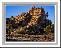
So it starts in Lightroom which gives you the option of renaming your files when you import them.  I’m following Scott Kelby’s recommendation here.  Let’s start with a file name as it is created in the camera.  It’s going to look something like this – _SM35116.CR2.  By the way, here’s the photograph that that goes with.

hidden_valley_130119

Hidden Valley (2013)

Continue reading “File Naming Strategies”

(2792)

A Conversation about Fine Art

Listen in on a conversation about the nature of fine art photography.

What’s on your mind?

I’ve been thinking about ‘fine art.’

You’ve got to be kidding. I mean there are PhDs that study this sort of thing, masters of the arts that won’t touch the topic. What makes you think you can think about ‘fine art?’

I don’t know. I just wonder about it. I’m trying to be an artist and I wonder what it all means, if I’m truly an artist or if I’m getting any closer.

Ok, you’re a photographer, aren’t you? So you must be thinking about fine art photography. You must be nuts! Nobody agrees on what fine art photography is.

Yea, fine art photography, that’s it. What do you think? Do you have any ideas of what it really is? I mean I’ve heard people say that if you want your photography to be art all you have to do is to call it art and it is so. ‘My photographs are fine art.’ Lord knows you hear that enough. But that seems a bit too simplistic, a bit too easy. It seems like it should be more than that.  I mean, can you snap a picture, run down to Costco to get a large print and call it art?


Continue reading “A Conversation about Fine Art”

(1128)

Ink Jet Papers – Red River

One thing I haven’t done at all really is play around with different ink jet papers.  My thinking is simple – there is so much to master in all the tools I use – Photoshop, Lightroom, etc. – and so many techniques to learn that adding one more variable is something I just wasn’t interested in doing.

I made the decision right at the start to go with matte papers.  The paper I chose was Epson Enhanced Matte, now renamed to Premium Presentation Paper – Matte.  The decision was based on my desire to produce photographs that look more like paintings.  A glossy or even luster surface shouts “photograph!”  But people don’t expect to see photographs on matte surfaces.  At shows, people frequently ask if my works are paintings.

So Epson Enhanced Matte paper has worked out very well for me and I still stand by my original decision.  It’s my paper of choice.  But I had no idea what I was getting into.

Continue reading “Ink Jet Papers – Red River”

(557)