How to get good photographs from photographing hand-held in dark conditions.
I was at a fabulous winery in Napa Valley, California. (If you’re a wine lover like I am, you don’t need me to tell you that Napa Valley is in California so my apologies.) The winery was Castello de Amorosa – the Castle of Love. It is a replica of a medieval Italian castle.
Now let me clarify a misperception about the castle. A rumor is going around that the castle was dismantled in Italy and reassembled in Napa Valley. Not true. Some pieces of the castle were brought over from Italy but the bulk of it is local stones. Nevertheless, it’s a beautiful and authentic replica of the real thing. It has a great room, chapel, a torture chamber, and honest to goodness wine cellars lined with hundreds of barrels of aging wine, which, by the way, is quite good. (Don’t look for this wine in markets or gourmet restaurants however. The only place it is sold is at the winery. But if you would like to tour it, give me a call and I’ll meet you there.)
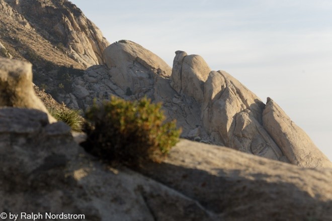
I was with a group, participants in the workshop I was leading, and we got a private tour. We all had our cameras at the ready and were photographing just about everything, even the torture chamber (especially the torture chamber?). The wine cellars were very dark, however, and the aisles extended for hundreds of feet. There were dim light bulbs sparsely scattered the length of the aisles. Some of the barrels had labels on them. Celebrities frequently bought an entire barrel of aging wine, so these barrels were set aside for them.
I was eager to photograph the wine cellars but there was an exposure problem to solve. I don’t have a tripod, I’m shooting hand-held, so I can’t rely on a lengthy shutter speeds for a good exposures. So, each side of the exposure triangle posed a challenge and required a solution. Let’s start with shutter speed.
What shutter speed should I use for handheld shooting? Well, that depends on the focal length of the lens. After all, the rule of thumb for sharp handheld images is 1/focal length. OK, I knew that. The lens I was using was my go-to 24mm to 105mm lens. I didn’t want to have to change my shutter speed every time I zoomed to a different focal length, so I chose a speed of 1/120 sec that covers all the zooms up to and including the longest. Now that’s really fast for a dark environment. But hold on. The lens has image stabilization which is good for 1 to 2 stops. In other words, I can increase the exposure time by 1 to 2 stops and still get a sharp image. So, being the cautious guy I am, I chose 1/60 sec.
But wait, I normally shoot Aperture Priority where the camera chooses the shutter speed. Gotta switch to Manual. OK, that’s done, and I set the shutter speed to 1/60 sec.
The next decision to make is the aperture. If I shoot wide open, which for this lens is f/4.5, I don’t get the depth of field I need for shooting down the long dim aisles. Now the depth of field will vary with the focal length so if I’m shooting at 24mm then I can use a fairly wide-open aperture but if I’m shooting at 105mm I need to stop way down, say f/11. Once again, I didn’t want to have to change the aperture for every shot, so I went with f/11.
But a relatively fast shutter speed and a smaller aperture severely reduces the amount of light that passes through the lens and falls on the sensor. That leads to the final decision. What ISO should I use? And not having eyes that work like light meters, I don’t have a clue. Furthermore, something has to change from one lighting condition to another. And since I’m setting and forgetting shutter speed and aperture, that adjustment falls on ISO. Let the camera set the ISO. Fortunately, my camera has Auto ISO, so I switched from ISO 100 to Auto. And I’m all set.
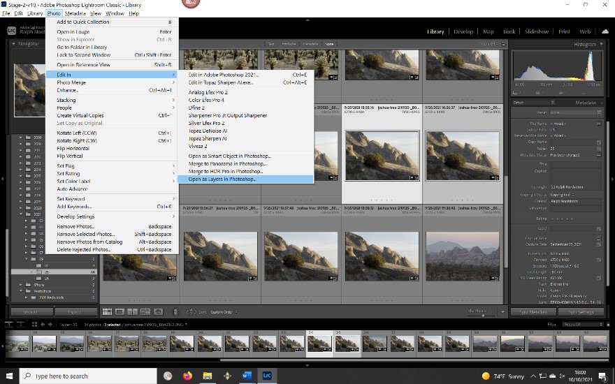
Since the cellar is much darker than a sunny day at noon, the camera selected the higher ISOs and in the really dark places, maxed out the ISO. As a result, many of the photographs have lots and lots of noise. At the time I took these photographs, Lightroom’s noise reduction was state of the art, but state of the art then was not very good. But that has all changed as a result of the AI tsunami and how everyone is going bonkers over it. Lightroom now employs AI in their noise reduction function and it’s like magic. The only thing is it can take a long time to do its magic, sometimes as much as 10 minutes and even more. Oh well, it’s a small price to pay for a dramatically improved image.
So, here’s the camera’s setup.
- Manual camera mode
- Shutter speed = 1/max focal length but compensated for taking the lens’ or camera body’s image stabilization (vibration reduction for you Nikon folks) into account
- F/stop that gives the desired depth of field for your longest focal length, such as, f/11.
- Auto ISO
In the digital darkroom, Lightroom now has the power to deal effectively with the noise that the highest ISOs will invariably generate. You may want to use third party noise reduction tools such as Topaz DeNoise AI which is faster than Lightroom and works as well with light to moderate noise. But it’s more expensive than Lightroom, given that you’re already paying $10/month to use it.
OK, so that’s it as far as the photography aspect of Castello de Amoroso goes. We ended up in the tasting room of course and I bought a rather expensive bottle of cabernet – 3 figures. It was so good I couldn’t resist. When I got home, we prepared a very special meal and opened the bottle. Both wife and daughter said it was the best wine they had ever tasted. I must confess, it was awfully good!
(206)