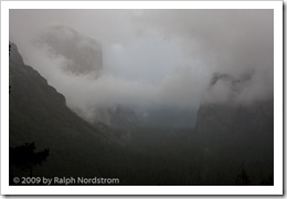
Veil of Gold (2016)

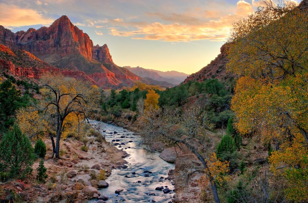
A Joshua Tree National Park sunrise that exceeded all expectations.

veil-of-gold-joshua-tree-161120

It was pitch black when we arrived. Not a single star was visible in the heavens. It was overcast and the prospects of a spectacular sunset or even a good one were not very high. It all depended on whether the clouds extended beyond the horizon, all the way to the Colorado River, 110 miles to the east. One can always hope. Dawn photographers are always filled with hope.

Then there was a gentle tap on my cheek. I must be imagining things. And then a phantom spot materialized on my glasses. “Hey guys, it’s starting to rain. Cover up your gear,” I called. But there was no way a little rain was going to deter us. So we started wandering around in the gathering light, looking for compositions still keeping a watchful eye on the eastern horizon.

Soon it was clear that the sun was about to peep over the distant mountains and there was a thin strip of open sky that would make the sun visible for a brief minute or two. “Get ready; here it comes!” And come it did! A gossamer veil of gold filled the stormy sky, exceeding our wildest expectations. What a thrill it was to be a part of this once-in-a-lifetime spectacle.

(131)

In a Redwood Grove

A walk through a redwood grove.

redwoods_guiding_light_130427


Even high up on the mountainside the parking lot is shrouded in the utter quite of the fog. I am alone. I set out, relishing the solitude. The crowns of the towering giants fade away into the mist. The fog condenses on the leaves and drops to the forest floor with barely perceptible random taps.

I continue along the trail, breathing in the moist air, breathing in the quite, breathing in the majesty that surrounds me. It is enough. And yet, there’s more.

The clouds begin to part, granting beams of sunlight passage into the cool, shadowed grove. My heart fills with joy, my eyes with wonder. And I have the presence of mind to bring it home to share.

(112)

Mastering Composition – Rule of Thirds

Use the Rule of Thirds to create visual tension in your images and stimulate the viewer’s interest.

The Rule of Thirds is a compositional principle that is widely used. And for good reason because, well, it works.  At least, it works in a lot of situations.

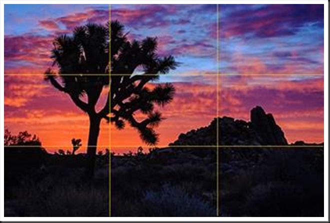
What is the Rule of Thirds? You superimpose a tic-tac-toe grid on your image, two vertical lines equally spaced and two horizontal lines equally spaced. Then you place the key elements of your image on or near those lines, or at one of their intersections.  They don’t have to be exactly on the lines or intersections, just near them.  This is art, not engineering, so it’s important that it feels right.  But the Rule of Thirds gives us positions that are visually very strong and command the viewer’s attention.  That’s why you want to use this principle for the key elements of your composition, the elements you want to draw the viewer’s eye to.

clip_image002

One should be cautious in overusing the Rule of Thirds. It should not be applied mechanically and certainly not universally.  It does not apply to all compositions.  After all, aren’t our ‘Rules’ of composition made to be broken?  But on the other hand, sometimes a composition gets just a little bit stronger when you move the key element just a tiny bit to place it closer to or right on a 1/3rd line.

The fact is it works so well in so many situations that the camera manufacturers give us the ability to display the grid on our camera’s LCD screens and viewfinders. Also, software publishers like Adobe display the grid when we use the crop tool. This is true of Elements, Lightroom and Photoshop. And these aids can be very helpful in achieving strong compositions.

Why does the Rule of Thirds work so well? To answer that let’s talk about Visual Tension.

Continue reading “Mastering Composition – Rule of Thirds”

(2804)

Ansel Adams – The Making of 40 Photographs

A continuing series of posts inspired by Ansel Adams’ book “Examples – The Making of 40 Photographs.” In this post, the 1932 photograph “Alfred Stieglitz: An American Place.”

I’m continuing my journey through this marvelous book, “Examples – The Making of 40 Photographs” by Ansel Adams.  It’s a fascinating experience.  Much of the legacy of Ansel Adams is distorted these days because of all the hype about him in the press.  But to read the master’s own words is inspiring and refreshing.

Alfred Stieglitz, An American Place
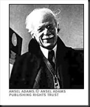
Alfred Stieglitz

I could only find this tiny rendition of the photograph Adams discusses in his book.  So I apologize for the quality.  But the story is the important thing.

Adams’ main cameras were large view cameras.  I have two 8X10 prints of his hanging in our home, contact prints made directly from 8X10 negatives.  In fact, most photographers of the time (1932) photographed with large format cameras and their prints were contact prints.  Photographers that used enlargers were extremely rare.

This photograph of Stieglitz was taken with an amazing new device, a Zeiss Contax 35mm camera.  It was taken when Adams visited Stieglitz’s gallery in New York to show some of his photographs to the one most people considered the finest photographer in the country.  Stieglitz was impressed and arranged for Adams to have a one person show.

Adams commented on his experiences using a small camera which sounds very similar to today’s comments regarding digital SLRs.

“Small cameras make pictures far more immediate; and many negatives could be made in the time required to produce one with a sheet-film camera.  The technique of 35mm photography appears simple, yet it becomes very difficult and exacting at the highest levels.  One is beguiled by the quick finder-viewing and operation, and by the very questionable inclination to make may photographs with the hope that some will be good….  The best 35mm photographers I have known work with great efficiency, making every exposure with perceptive care….”

One can substitute ‘DSLR’ for ‘small camera’ and the statement rings just as true today.

Having photographed in the past with a 4X5 camera I know the slow, exacting deliberation it takes and often think that this is a desirable approach with my Canon 1Ds Mark III and even my Canon G11.  The latter especially is great for spontaneous photography.  Setting up the Mark III is a much more deliberate process but not like setting up a 4X5.  I like to encourage my workshop students to slow down, connect with the land and then try to capture what they are feeling.  You don’t get this from chasing after as many  captures as you can find.

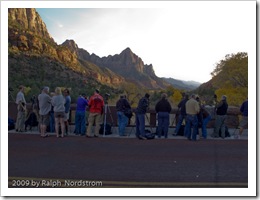
I was standing next to a large format photographer on ‘The Bridge” in Zion National Park at sunset.  He was shooting 8X10 color film.  I asked him how much it cost to press the shutter.  He replied, “$35.”  The light didn’t happen that time and he did not press the shutter.   One of the beauties of digital photography is that it doesn’t cost us anything to press the shutter.  But if it did, we would slow down and our photography would benefit from it.

In researching for this post I came across a letter by Ansel Adams that I must share with you.  The letter was written to his good friend Cedric Wright.  Adams had just come through a period where he was emotionally torn between passion for his beautiful lab assistant and commitment to his wife Virginia and their two children.  He had a clarifying moment in Yosemite when he observed a glorious thundercloud over Half Dome, a moment in which he saw clearly the meaning of love, friendship and art.  Here is what he wrote.

“Dear Cedric,

“A strange thing happened to me today. I saw a big thundercloud move down over Half Dome, and it was so big and clear and brilliant that it made me see many things that were drifting around inside of me; things that relate to those who are loved and those who are real friends.

“For the first time I know what love is; what friends are; and what art should be.

“Love is a seeking for a way of life; the way that cannot be followed alone; the resonance of all spiritual and physical things….

“Friendship is another form of love — more passive perhaps, but full of the transmitting and acceptances of things like thunderclouds and grass and the clean granite of reality.

“Art is both love and friendship and understanding: the desire to give. It is not charity, which is the giving of things. It is more than kindness, which is the giving of self. It is both the taking and giving of beauty, the turning out to the light of the inner folds of the awareness of the spirit. It is a recreation on another plane of the realities of the world; the tragic and wonderful realities of earth and men, and of all the interrelations of these.

“Ansel”

Join me on an upcoming workshop.  Click here for more details.

To see more of my photographs click here.

WordPress Tags: Ansel,Adams,legacy,Stieglitz,American,Place,Photographers,Zeiss,Contax,gallery,SLRs,pictures,sheet film,technique,photography,exposure,DSLR,Canon 1Ds Mark III,photography workshop,Zion,National,Park,sunset,friend,passion,commitment,wife,Virginia,children,moment,Yosemite,Half,Dome,friendship,Here,Dear,friends,Love,life,resonance,grass,granite,self,world,earth,students,cameras,camera,photographer,digital,thundercloud

(2410)

Making a Photograph – Vision

Develop your vision and express yourself through your photographs.

“This photograph speaks to me.”

The photographs that have a strong impact on us speak to us.  The photographer has created an image that moves us.  Did he or she have something in mind when making the photograph?  Probably so.  Strong images just don’t happen by accident.

As one grows as a photographer one’s vision becomes clearer.  One begins to discover who they are and what they have to say.  And as one’s technical and aesthetic skills develop, skills used in both the field and the darkroom, one’s ability to express their vision becomes stronger.

The artist’s vision is an important element of their art.  The clearer an artist is on what his or her vision is the more expressive their art becomes.

If you’re not clear on what your vision is, live with your photographs.  Become aware of what you associate with them, what stories they are telling you, how they make you feel.  And as your vision emerges nurture it, strengthen it, let it speak through you and your art.  And then your photographs will also speak to others.

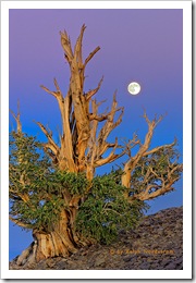
death_valley_sunrise_2012

We do photography workshops.  Come on out and join us.  Click here to check us out.

You can also check out our photography.  Click here.

Technorati Tags: ,,,,,,,
WordPress Tags: technical,aesthetic,Photograph,Vision,impact,photographer,skills,artist

(3286)

Mastering Exposure–Histograms Part 3

This is the third post in a series on the histogram. This post discusses the Rocky Mountain histogram, what it is, when you can get it, how to photograph and how to do the post processing.

This is the third post in a continuing series on the oft misunderstood but oh so important histogram.  In the first two posts we discussed the histogram in general.  If you missed them, click on these links.

Mastering Exposure – Histograms Part 1

Mastering Exposure – Histograms Part 2

Recap

To recap, the histogram displays a graph of the tonal values in the scene you are about to photograph.  It shows how the dynamic range of the scene matches and fits into the dynamic range of your camera’s sensor.  There are two critical pieces of information a histogram tells you:

  1. If your exposure is correct
  2. If you have problems capturing the dynamic range of the scene

To recap, the exposure is displayed by the position of the histogram curve within the boundaries of the graph area.  As you increase the exposure the histogram moves to the right.  As you decrease the exposure it moves to the left.  If the exposure is increased so that the histogram moves all the way up against the right side of the graph area you will have highlight clipping. Likewise, if it moves all the way to the left side you will have shadow clipping.

The dynamic range of the scene is displayed as the breadth of the histogram,  The wider the histogram the greater the dynamic range of the scene.  The narrower the histogram the lower the dynamic range.  When the histogram is so wide that it extends from one end of the graph area to the other you are facing a situation where your camera’s sensor will have a difficult time capturing the full dynamic range of the scene.  The worst case is you will have both highlight and shadow clipping.

Continue reading “Mastering Exposure–Histograms Part 3”

(2316)

zabriskie_point_7_2009_600

I thought I knew where I wanted this image to go but it had a mind of its own – beyond realism, beyond believability even, into pure emotion.

(413)

court_of_the_patriarchs_2009

I’m printing note cards for the Joshua Tree Art Festival this weekend and this was one of them. I really like this image so I thought I’d share it with you. Enjoy.

(488)

Lightroom Tutorial – Expose to the Right

For a followup post read

http://ralphnordstromphotography.com/wordpress/articles/how-to-articles/expose-revisited/

The light meters in our digital cameras don’t always give us the best exposure.  That’s not to say that they give us the wrong exposure.  But the ‘correct’ exposure doesn’t necessarily produce the best image file as far as post processing is concerned, especially if we’re shooting RAW.

If you expose an image at the exposure selected by your light meter and check the histogram, chances are it’s skewed a little to the left, toward the shadows.  This is especially apparent in low contrast scenes.  The image might look great on the camera’s LCD and in Lightroom.  But a slightly overexposed image will capture more information and is therefore better to work with later – given of course that it’s not so overexposed that you have highlight clipping.  An ideal histogram is one that is just to the right of center.  This technique is called ‘Expose to the Right,’ and is practiced by many of digital photographers.

Continue reading “Lightroom Tutorial – Expose to the Right”

(7852)