The Making of a Photograph–Watchman Tower

An example of how to process a difficult capture.

I was working on a photograph last night that turned out rather well. It was taken during a recent photography workshop in Zion National Park in Utah. I took the group to the famous bridge to photograph the Virgin River and the Watchman Tower at sunset. It’s a must photograph. It seems every photographer in Zion with a tripod is there. But we also returned for sunrise and had the bridge to ourselves.

There is a time of day when exposure becomes very tricky. This is during twilight when the sun is a little below the horizon so the earth is dark but the sky is very bright. You end up with what I call the “Grand Canyon” histogram – there’s a huge spike at the shadow end and a similar spike at the highlight end with a large gap in between. This is a challenging situation that, if you master, can provide some spectacular images. In this blog I’d like to walk you through the process.

Continue reading “The Making of a Photograph–Watchman Tower”

(1803)
Lightroom Tutorial–Color Calibration

Sometimes I create a post just to document and remember a learning process I’ve just gone through.  This is such a time.

I just spent an hour or so recalibrating my laptop monitor.  I calibrated it recently and it didn’t seem to come out right so I decided to recalibrate it again this morning.

Calibrating your monitor is a critical first step in the whole color management process (an area of study that hundreds of pages have been written on and that I won’t go into here – maybe later).

There are two settings you need to set in the calibration software – gamma and color temperature.  I made some guesses as to what these were and guessed wrong.  That’s why things like colors and tonalities didn’t look right.  A little digging into Lightroom help provided the answer (when all else fails, read the documentation – yea, I know).  So here it is.  Hopefully it will save you some time in the future.

Gamma: 2.2
Color Temperature: 6500K

Good luck.

Join me on an upcoming workshop.  Click here for more details.

To see more of my photographs click here.

(995)

Lightroom Tutorial – Camera Specific Presets

I’m a landscape photographer who likes to do it all himself.  I don’t want my camera making decisions for me.  That’s one reason why I shoot RAW.   And I don’t want Lightroom doing it either.  Lightroom has default presets that it applies to your photographs when you import them.

To make things interesting, I shoot with two cameras (three if you count my iPhone).  My main camera is a Canon 1Ds Mark III and my don’t-leave-home-without-it camera is a Canon G11.  These cameras have widely different characteristics to say the least.  Lightroom applies the same default preset to files from both cameras when they are imported.

Wouldn’t it be nice if you could set up separate presets for each camera and set them up the way you like them.  Well, that’s exactly what you can do.  In fact, you can go a step farther than just undoing the Lightroom defaults.  If there’s something you always do to every file you can create presets specific to each of your cameras and apply all the adjustments you want.

Continue reading “Lightroom Tutorial – Camera Specific Presets”

(4104)

Color Saturation in Lightroom

On three techniques for saturating color in Lightroom.

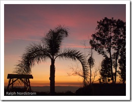
Last night we had a beautiful sunset.  The sky was baby blue, the clouds were pink and the horizon was golden.  I couldn’t resist.  So I grabbed my Canon PowerShot G11 and walked over to the neighbor’s front yard where the view is just a bit better.  I composed what I thought was an interesting image and snapped a few.

This morning I uploaded them and got to wondering about color saturation in Adobe Photoshop Lightroom.  I have a technique I’ve used for years to enhance colors but there are a couple of other techniques I thought I’d like to understand better.  The three Lightroom controls are:

  • Saturation
  • Vibrance
  • HSL (the control I use the most)

So, for starters, here’s the original unadjusted image.

sunset_original As you can see, the colors are really quite nice.  But my recollection of the sunset was that they were a little more saturated, more intense.

Continue reading “Color Saturation in Lightroom”

(4206)