Lightroom is a great tool. It’s quick and easy to use – once you get the hang of it. But sometimes mastering the workflow, the steps you go through to take a raw file to a ‘final’ image, can be a bit daunting.
Let me say up front that Lightroom is an important part of my workflow but it’s not the only part. Every photograph I work on starts in Lightroom but is completed in Photoshop. Nevertheless, Lightroom gets a photograph to about 80% of the final product. I know many people who use Lightroom exclusively and Photoshop only in rare circumstances if at all.
So back to the workflow. Can it really be made easy? Yes it can. There are four major steps (not counting import – see Lightroom Tutorial – Importing Photographs):
- Mechanical adjustments like dust spot removal and cropping
- Tonality adjustments
- Hue adjustments
- Saturation adjustments
Let’s skip the first step and start with the second. The example will be in Lightroom 4.
Tonality Adjustments
Just so we’re on the same page, tonality is the lightness and darkness of the image, also referred to as luminosity. It has nothing to do with color. This is the best place to start the workflow.
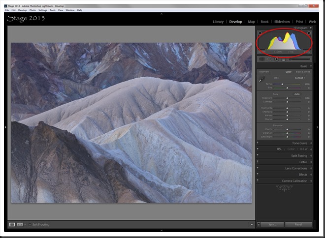
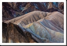
Let’s take an image I captured at Zabriskie Point in Death Valley National Park during our workshop in February, 2013.
This is a vignette of the wonderful eroded mud stone at Zabriskie Point. The photograph was captured in the beautiful pre-dawn light. It’s one of my favorite types of light because of its soft quality. As you can see from the histogram in the Lightroom screen shot above it has a limited dynamic range and looks quite flat and uninteresting.
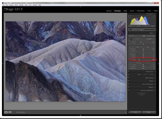
I generally start by creating a black point and a white point ( Making a Photograph – Black and White Points ). Let’s start with the black point. Use the Blacks adjustment in the Basic group. Move the slider to the left (negative numbers) until you start to see a tiny amount of shadow clipping. You can watch the triangle in the upper left corner of the histogram and when it turns white you have clipping. Back off just a little. (You can click on these images to see them more clearly.)
Notice how the image already looks better. By creating a black point we’ve expanded the dynamic range (added contrast) on the shadow end of the histogram.
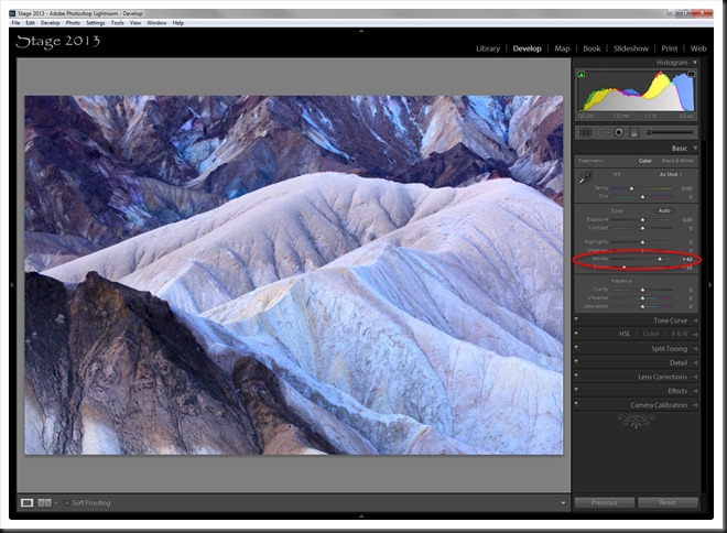
But we want to take advantage of the full dynamic range. So the next step is to set a white point which will stretch the histogram toward the right. And for that we use the Whites adjustment, also in the Basic group. Move the slider to the right (positive values) until you start to see white clipping (watch the triangle in the upper right hand corner of the histogram) and back off a little.
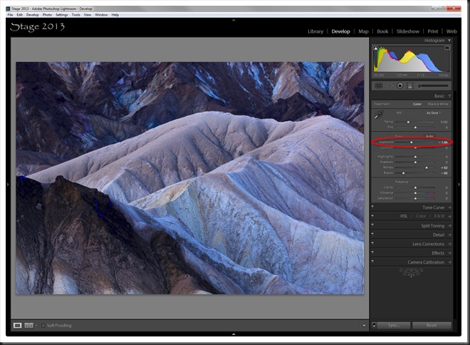
Often the image looks washed out at this point. In fact, color images do not benefit near as much from white points as do black and white images. We’re going to fix the washed out look but not with the Whites adjustment. We’ll adjust mid-tones with the Exposure adjustment. Move the slider to the left. I watch the bright parts of the image to judge how much of an Exposure adjustment to apply. I like to get the bright parts of the image looking just about right.
Yes, that’s nice. But the shadows are a bit blocked up, a bit muddy. So I turn to the Shadows adjustment to open them up. Shadow detail is very important.
The tonalities now look pretty good so it’s time to turn to Hue adjustments.
Hue Adjustments
Hue is color. Hue adjustments are intended to remove color casts and have nothing to do with the purity or intensity of the color. That’s saturation.
Because this photograph was taken before sunrise the source of light is the blue sky. So the light is very cool; that is, blue. While there are other ways to adjust hue in Lightroom, we will use Temperature and Tint for this example. These are also found in the Basic group. Temperature adjusts the hue from blue to yellow. Decreasing Temperature moves the hue towards blue while increasing moves it towards yellow. Tint adjusts hue from green to magenta. Moving Tint to the left adds green and to the right adds magenta.
The hue you choose for your photograph will have a powerful impact on the emotion it communicates. I’m going to warm this up a bit but not too much.
This warms up the mud stone to it’s familiar tan color while still preserving some of the subtle blues. If I increased the Temperature even more this subtlety would be lost.
The best way to use these two adjustments is to slide them from left to right, back and forth, going to the point where the image definitely looks bad (yucky is the technical term). Go back and forth from one yuck extreme to the other and slowly zero in on the hue you want. You can do that with both adjustments – Temperature and Tint.
Saturation Adjustments
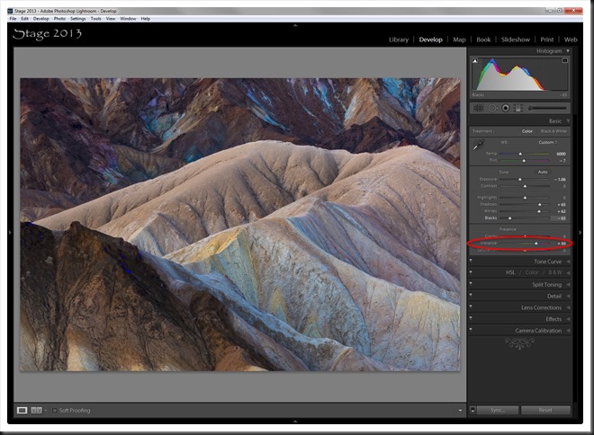
Lightroom also offers numerous ways to adjust saturation. But one very powerful adjustment is Vibrance (see Color Saturation in Lightroom). It’s powerful because of its subtlety. It can produce very believable results. So with the addition of some Vibrance we get the following.
You can see that this brings out the blues, greens and yellows very nicely.
Bonus Adjustments
The image is looking very nice now but there are a couple more adjustments I like to do at this point.
Clarity is an adjustment that can really make the image pop. A little Clarity brings it to life.
You can see that the contrast is affected. Clarity does in fact adjust contrast but in a very sophisticated way. First, it does Local Contrast Enhancements rather than global contrast enhancements, looking for and adjusting contrast in smaller, localized areas. And second, it only performs the local contrast enhancement on mid-tones. The shadows and highlights are not affected. Before Lightroom introduced Clarity in version 1.1 the only way to get a similar effect was with Photoshop Unsharp Mask with a small Amount and large Radius. I used that technique a lot before Lightroom came along with Clarity. You want to use Clarity judiciously though. Too much of a good thing can result in harsh looking images. And a little known secret about Clarity is you can do some very nice smoothing with negative adjustments (ah, a topic for a future blog post).
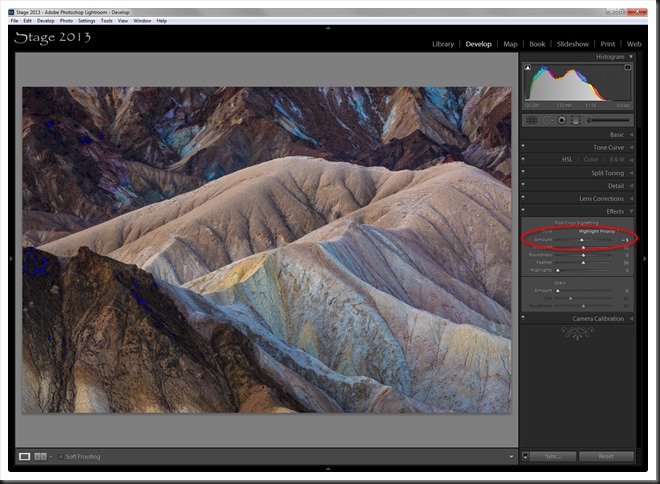
The other bonus adjustment is Post-Crop Vignetting. This used to be a pretty useless adjustment when it was simple Vignetting. But in Lightroom 3 Adobe added “Post-Crop” to Vignetting so that it would work correctly on cropped images.
Post-Crop Vignetting is found in the Effects group along with Grain. A little negative value will slightly darken the corners.
Vignetting is an important technique for focusing the viewer’s attention on the subject in the center of the image. Our eyes are naturally drawn to the brighter elements in the image and away from the dark. So darkening the corners helps keep the viewer’s eye away from the edges and thereby escaping from the frame.
Summary
Let’s summarize the steps and adjustments we’ve demonstrated.
1, Mechanical adjustments (we skipped that part)
2. Tonality Adjustments
A. Set black point with Blacks
B. Set white point with Whites
C. Adjust mid-tones with Exposure
D. Open up shadows with Shadows
3. Hue Adjustments
A. Temperature (blue/yellow) and Tint (green/magenta)
4. Saturation Adjustments
A. Vibrance for subtle saturation
5. Bonus Adjustments
A. Clarity for local contrast enhancement
B. Post-Crop Vignetting to imprison the eye within the frame
Let’s take a look at the before and after.
One of the nice things about this simple workflow is how quickly it can be. I use it to quickly evaluate an image to see if it’s worth spending more time on, if there’s a reasonable possible it will end up in the final selection. These steps can be run through in a matter of minutes.
So, if you’re workflow is still a bit helter skelter give this a try. It’s good to put a little structure around your workflow, even though post processing is a key part of the creative process. And the outline above is by no means intended to be the complete picture. There is usually lot more that needs to be done to create a successful image. But this outline is a great place to start.
Join the conversation and leave a comment. We would like to hear from you, your experiences and reaction.
If you enjoyed this post why not share it with a friend or on Facebook. We have links for that at the top for that purpose. And we would appreciate the exposure.
We do photography workshops. Come on out and join us. Click here to check us out.
You can also check out our photography. Click here.
(7142)



I’m one of those who relies on LR just about all the time for processing an image Ralph. My images come out pretty good but your technique is a little different from what I do. I am going to try your steps next time. But now I am wondering what I’m missing by not finishing my processing in PS. Have you or will you cover that in another tutorial?
Thanks for this tutorial Ralph…I found it very informative.
Chuck
Chuck,
A blog post on PS, especially comparing the respective strengths of LR and PS, is a great idea. I’ll work on that. Thanks for the tip.
Ralph
Hey there! Would you mind if I share your blog with
my twitter group? There’s a lot of folks that I think would really
appreciate your content. Please let me know. Many thanks
Here is my web page – google adwords analyzer download
Not at all. I would be honored.
Ralph, thanks so much for sharing the step-by-step process of making a picture come alive. I don’t have Lightroom, but many of the adjustments that you demonstrate can be done in Adobe Camera Raw and also with Nik Color Efex Pro. Your article provides a great foundation for the sequence and destination of the adjustments, and more importantly, the rationale for them. Thanks so much.
Thanks you Charlie. I’m happy that these ideas are working out well for you. And I should have mentioned it int he article but ‘Yes indeed,’ these would work with Adobe Camera Raw. It shares the same engine as Lightroom.
Wishing you good shooting in beautiful light.