Making a Photograph – A New Approach to Tonality Adjustments

Watch as a photograph of an icon of Zion National Park is made.

For some time now I’ve been using and teaching a process of working on photographs in Lightroom. It consists of basically four steps: manual adjustments, tonality adjustments, hue adjustments and finally saturation adjustments. Quite some time ago I had the brilliant idea of converting the image to black and white before doing the tonality adjustments. The technique I used was the B & W tab in Lightroom’s HSL group.  Once the tonality adjustments were done, the image would be converted back to color and the process continue.

It didn’t work out because when I converted the image back to color, the colors were so oversaturated and unnatural that the image looked horrible. It was just easier to do the tonality adjustments on the color image. So I quickly gave up on that technique. But the other day I was reading an article in Popular Photography magazine that rekindled this idea. It took a different approach. It turned the image to black and white by setting the Saturation adjustment to -100. Now the author did this in the middle of the process but I thought that if I applied this to my process and did that at the start it just might work. So I was eager to give it a try. Let’s try it with this image of the Watchman in Zion National Park.
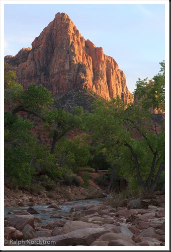
utah_141010__SM32783 This is the original raw file. I haven’t done anything to it yet. It doesn’t need any mechanical adjustments. These consist of removing spots, straightening the image, maybe some noise reduction and the final crop. But since none of these are required we can move on to the tonality adjustments.


Continue reading “Making a Photograph – A New Approach to Tonality Adjustments”

(4930)

Creating Images with Impact – Black Point

Add Impact to your Images by setting a black point. Here’s the how and why.

In this series of blog posts were talking about how to create Images with Impact. You know what I’m talking about. These are those images that really grab our attention, that capture our imaginations. There’s something special about them and it doesn’t have to be a mystery how they are created. There are a few simple techniques that you can use in Lightroom and Photoshop to add impact to your images. Now if you don’t use Photoshop, you can still do everything were talking about in Lightroom.

In the first article we talked about utilizing the full dynamic range of your medium. This is something Ansel Adams taught in his books and classes that was an essential element of his stunning landscape photographs. As he developed his technique which became known as the Zone System, the primary goal was to use the full dynamic range of his medium which, in his case, was the black and white print.

So we talked about that technique first because it is the most appropriate place to start. I do want to add that in color photography or color prints not every print benefits from a white point but virtually all prints benefit from a black point – which is what we want to talk about in this article.

IMG_0012-2

What exactly is a black point? It is small portions of the print that are pure black. If you’re printing on paper than these are small portions that are the blackest black that the combination of paper and ink can achieve. As a side note, different combinations of paper and ink achieve different levels of blackness. But regardless of the combination you use, the blackest black that can be achieved is your black point.

You want to keep the black point areas very, very small because they have no detail. And generally speaking we like to see detail in our shadows, another guideline that I picked up from studying Ansel Adams. But you don’t want to eliminate black points, that is, in most cases. There are a few exceptions to this rule that I will talk about later.

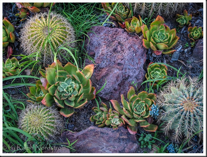
Let’s take a look at the before and after images of our photograph. I shot this at the Huntington Library in South Pasadena a few weeks ago. It’s in their incredible cactus garden – endlessly fascinating.

Continue reading “Creating Images with Impact – Black Point”

(8353)

Mastering Exposure – Expose to the Right

Expose to the Right – put it to the test by creating and comparing actual images.

Over the years there has been a lot of interest in the concept of ‘Expose to the right.’  This is something that is commonly done in digital photography where you intentionally overexpose an image.  The idea is that in digital images there is more information to work with in the brighter tonalities than there is in the darker.  And this will give you more to work with in the darkroom (Lightroom and Photoshop) which will result in a better image.

I’ve written several posts on this topic and if the concept is new to you please read these.  I’m not going to go into the theory here; that is spelled out in these posts.

Lightroom Tutorial – Expose to the Right

Expose to the right – Revisited

Now, I understand the theory.  I’m a computer guy; I had better understand it.  But I’ve always wondered if the promise of a better image actually worked out in real life.  So I did a test during our recent workshop to Big Sur.

Continue reading “Mastering Exposure – Expose to the Right”

(2299)

Lightroom Tutorial – Workflow Made Easy

Simplify your Lightroom workflow with these easy steps.

Lightroom is a great tool. It’s quick and easy to use – once you get the hang of it. But sometimes mastering the workflow, the steps you go through to take a raw file to a ‘final’ image, can be a bit daunting.

Let me say up front that Lightroom is an important part of my workflow but it’s not the only part.  Every photograph I work on starts in Lightroom but is completed in Photoshop.  Nevertheless, Lightroom gets a photograph to about 80% of the final product.  I know many people who use Lightroom exclusively and Photoshop only in rare circumstances if at all.

So back to the workflow.  Can it really be made easy?  Yes it can.  There are four major steps (not counting import – see Lightroom Tutorial – Importing Photographs):

  1. Mechanical adjustments like dust spot removal and cropping
  2. Tonality adjustments
  3. Hue adjustments
  4. Saturation adjustments

Let’s skip the first step and start with the second.  The example will be in Lightroom 4.

Continue reading “Lightroom Tutorial – Workflow Made Easy”

(7135)