Creating Images with Impact – Black Point

Add Impact to your Images by setting a black point. Here’s the how and why.

In this series of blog posts were talking about how to create Images with Impact. You know what I’m talking about. These are those images that really grab our attention, that capture our imaginations. There’s something special about them and it doesn’t have to be a mystery how they are created. There are a few simple techniques that you can use in Lightroom and Photoshop to add impact to your images. Now if you don’t use Photoshop, you can still do everything were talking about in Lightroom.

In the first article we talked about utilizing the full dynamic range of your medium. This is something Ansel Adams taught in his books and classes that was an essential element of his stunning landscape photographs. As he developed his technique which became known as the Zone System, the primary goal was to use the full dynamic range of his medium which, in his case, was the black and white print.

So we talked about that technique first because it is the most appropriate place to start. I do want to add that in color photography or color prints not every print benefits from a white point but virtually all prints benefit from a black point – which is what we want to talk about in this article.

IMG_0012-2

What exactly is a black point? It is small portions of the print that are pure black. If you’re printing on paper than these are small portions that are the blackest black that the combination of paper and ink can achieve. As a side note, different combinations of paper and ink achieve different levels of blackness. But regardless of the combination you use, the blackest black that can be achieved is your black point.

You want to keep the black point areas very, very small because they have no detail. And generally speaking we like to see detail in our shadows, another guideline that I picked up from studying Ansel Adams. But you don’t want to eliminate black points, that is, in most cases. There are a few exceptions to this rule that I will talk about later.

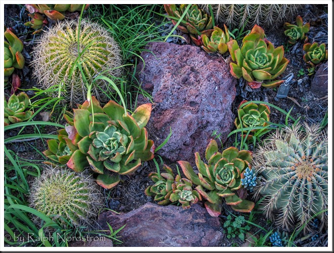
Let’s take a look at the before and after images of our photograph. I shot this at the Huntington Library in South Pasadena a few weeks ago. It’s in their incredible cactus garden – endlessly fascinating.

Continue reading “Creating Images with Impact – Black Point”

(8327)
Creating Images with Impact – Dynamic Range of the Medium

The pros create dramatic photographs, images with impact. You can add impact to your images too using these simple Lightroom techniques.

We’ve all seen those photographs that stop us in our tracks, that inspire us, that speak to us. Some photographs seem to have a special power, a special presence. Often times we hear ourselves saying, “Wow.” They have qualities that make them stand apart from other photographs. These are images with impact.

The masters of landscape photography seem to have the ability to capture a special quality of light in their photographs. It doesn’t matter whether they use film or shoot digital, their images stand out.

There are certain things about these images that do more than just appeal to us – we are drawn into to them. They capture our imaginations, stir our interests and perhaps show us moments in nature we could only hope to experience. We want to linger with them, explore them, take them in, get lost in them.

Without a doubt these photographs have compositions that are very strong, are bathed in fantastic light and have technical qualities of exposure and sharpness that are perfect. These are all decisions that the artist makes in the field, decisions that are critical to a strong image.

In the days of film, a good portion of the magic was done in the darkroom. That’s where their genius really became apparent. And it hasn’t changed today. We don’t actually have dark rooms to work in, closed rooms with the strange array of mysterious orders and the soft, dim yellow lighting. Today we have powerful software running on even more powerful computers. But really, how is that different from what the film Masters did in the darkroom? I don’t believe it is. I can’t think of anything that’s been done with “Photoshopped” photographs that hasn’t already been done in the darkroom. It’s probably a lot easier to do it in Photoshop but in the end, both the chemical darkroom and the electronic darkroom serve the same end, that being creating those “Wow” images.

In this series of posts I want to spend more time considering some techniques you can apply in the darkroom that will add impact to your images.

Use the Full Dynamic Range of Your Medium

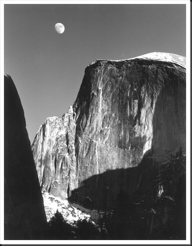
The first darkroom technique I would like to discuss is the importance of using the full dynamic range of your medium. This is not something new. When Ansel Adams developed the zone system it was precisely for this purpose – to use the full dynamic range of the black and white negative and ultimately the black and white print. But what exactly does it mean to use the full dynamic range of the medium. Let me illustrate with an Ansel Adams image I have loved for many years, one I’m privileged to be able to live with in my home – “Moon and Half Dome.”

Adams-moon-and-half-dome-1960

In this exquisite photograph if you are able to examine an original closely you will notice that the shadow on the left may look like it is totally black but actually there is subtle detail. However, there are some very small areas that are pure black. Also, the moon and the bright parts of Half Dome may look like they are pure white but a closer look will reveal detail in these areas also. This photograph takes full advantage of the full dynamic range of the paper, from the blackest black to the whitest white.

Continue reading “Creating Images with Impact – Dynamic Range of the Medium”

(4731)

Mastering Light – Sunrise and Sunset

Getting the most out of sunrises and sunsets.

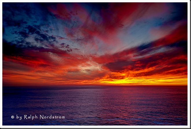
We all love a beautiful sunset, especially when the clouds glow with color. The same happens with sunrise although there may not be as many of us up to enjoy it. There’s something special about sunsets and sunrises that bring joy and wonder to our hearts.

sunset_marin_headlands_2010

My personal favorite is sunrise. I like to arrive while it’s still dark and set up my camera in the cold, crisp morning air. I like standing under the fading stars waiting for the sun to come. I like the stillness of the earth at that time of day. For me, it’s magical.

To get the most out of sunrises and sunsets, it’s helpful to know what’s going on in the sky. (I’ll talk just about sunrises now but much of the same things apply to sunsets.) A lot depends on the clouds. If the sky is completely overcast then you’re not likely to have much of a sunrise or sunset. If the sky is clear then you’ll have a totally different experience. But if the sky is strewn with scattered clouds you may be in for a wonderful experience.  And yet it’s hard to predict.

Continue reading “Mastering Light – Sunrise and Sunset”

(4248)

How to Photograph the Coastal Redwoods

The Coastal Redwoods of Northern California have a beauty that is inspiring. But capturing them in a photograph is much harder than it may seem. Come with me to explore ways to capture their grandeur.

California is blessed with two species of redwoods, the Giant Sequoia (Sequoia giganteum) of the Sierra Nevada Mountains and the Coastal Redwoods (Sequoia semperverins) along the California coast from the Oregon border to 150 miles south of San Francisco.  These awe-inspiring trees are both a joy and a challenge to photograph.  I recently spent a week in Crescent City in Northern California photographing the Coastal Redwoods and leading a photography workshop there.  I’d like to pass along some of the techniques we employed to capture photographs that do these majestic trees justice in breathtaking but often very difficult light.

Continue reading “How to Photograph the Coastal Redwoods”

(7395)

Mastering Exposure – Expose to the Right

Expose to the Right – put it to the test by creating and comparing actual images.

Over the years there has been a lot of interest in the concept of ‘Expose to the right.’  This is something that is commonly done in digital photography where you intentionally overexpose an image.  The idea is that in digital images there is more information to work with in the brighter tonalities than there is in the darker.  And this will give you more to work with in the darkroom (Lightroom and Photoshop) which will result in a better image.

I’ve written several posts on this topic and if the concept is new to you please read these.  I’m not going to go into the theory here; that is spelled out in these posts.

Lightroom Tutorial – Expose to the Right

Expose to the right – Revisited

Now, I understand the theory.  I’m a computer guy; I had better understand it.  But I’ve always wondered if the promise of a better image actually worked out in real life.  So I did a test during our recent workshop to Big Sur.

Continue reading “Mastering Exposure – Expose to the Right”

(2292)

Color Management Made Simple – From Computer to Print

Color Management can be a difficult topic. But we’re breaking it down for you. This is the third in a series of articles on the topic – from the Computer to the Print. For a full understanding, read all three.

Color Management is the science of getting the colors you want in your photographs – consistently.  And in my workshops I hear all too often that people are disappointed because the colors they get in their prints are not what they saw on their monitors.  They often go to a lot of work preparing an image and when they print it it’s as if all that work was a waste of time.

Color Management is indeed a science and can be very complicated and technical.  But getting the same colors on the print that you see on your monitor is essential if you are to have control over the creative process.  For that, color management is the key and in these series of articles I’m trying to break it down to make it more understandable and accessible for all of us.

plaskette_rock_setting_sun_110808

In the previous two articles I presented the concept of a color space and what happens behind the scenes when you move the image from the camera to your computer.  See Color Management Made Simple – Color Space and Color Management Made Simple – From Camera to Computer.  In this article I’ll be covering the all important aspect of getting your prints to look like what you see on your monitor; that is, from Computer to Print.

Continue reading “Color Management Made Simple – From Computer to Print”

(3283)

Color Management Made Simple – From Camera to Computer

Read the second installment in a series of articles on Color Management – taking the image from the camera to your computer.

If Color Space can be described as a box of Crayons as we suggested in  Color Management Made Simple – Color Space,  what else do we need to know about Color Management?  Well, Color Management is essentially about getting the right colors – and here’s the most important word – consistently.

Let’s spend a few moments talking about the ‘right color.’  (I’m inclined to add, ‘whatever that is.’)  The story begins when you press the shutter.  Let’s suppose you are photographing the beautiful redwoods of Northern California.

redwoods_130528__SM36093_4_5_6_7-Edit

The scene is full of rich browns and oranges and vibrant greens.  We can say that these are the right colors, these are the colors you want.  You set up your camera and snap a picture and your sensor captures these colors, pretty much just as they are (the sensor is playing with pretty much the full big box of 120 Crayons). The camera’s processor does its thing and the image is saved in a file to your memory card.  Eventually we’re going to view the photograph on our computer’s monitor and we just might be a bit disappointed.

Continue reading “Color Management Made Simple – From Camera to Computer”

(1674)

Color Management Made Simple – Color Space

Color Management is very important if you want to get prints that look as good as the images on your display. And understanding color space is fundamental to understanding color management.

Color Management is a very complex topic.  And it’s possible to get bogged down in a lot of technical details.  But it’s extremely important, especially if you want to print your photographs.  And it can be broken down into a few simple concepts.

On my workshops I often get asked questions about color management and the topic is huge and a bit technical to get into the details.  So I thought I’d give an overview of the topic in a few blog posts.  Who knows, maybe I’ll create a presentation that can be used during  a workshop.

Color Space

Let’s start with color space which is the whole reason we need color management.

A color space is all the colors that can be rendered using a given technology.  Think if it this way.  You all enjoyed coloring with crayons when you were young. And I don’t know  about you but I was always envious of my friends that had the big giant boxes of crayons with 120 different colors.  They had every color under the sun.

crayons_120cnt

We can think of the 120 crayon box as being the color space of the real world with every color under the sun.

Continue reading “Color Management Made Simple – Color Space”

(3667)

File Naming Strategies

Having an effective file naming convention may not be the most exciting thing but it can sure make your life a lot easier.

OK, so this isn’t a very sexy topic but having a strategy for naming your image files can save you a lot of grief down the road.  Let me run through what I’ve worked out over the years (and believe me, it’s taken several years to perfect this).

So it starts in Lightroom which gives you the option of renaming your files when you import them.  I’m following Scott Kelby’s recommendation here.  Let’s start with a file name as it is created in the camera.  It’s going to look something like this – _SM35116.CR2.  By the way, here’s the photograph that that goes with.

hidden_valley_130119

Hidden Valley (2013)

Continue reading “File Naming Strategies”

(2758)

Lightroom Tutorial – Workflow Made Easy

Simplify your Lightroom workflow with these easy steps.

Lightroom is a great tool. It’s quick and easy to use – once you get the hang of it. But sometimes mastering the workflow, the steps you go through to take a raw file to a ‘final’ image, can be a bit daunting.

Let me say up front that Lightroom is an important part of my workflow but it’s not the only part.  Every photograph I work on starts in Lightroom but is completed in Photoshop.  Nevertheless, Lightroom gets a photograph to about 80% of the final product.  I know many people who use Lightroom exclusively and Photoshop only in rare circumstances if at all.

So back to the workflow.  Can it really be made easy?  Yes it can.  There are four major steps (not counting import – see Lightroom Tutorial – Importing Photographs):

  1. Mechanical adjustments like dust spot removal and cropping
  2. Tonality adjustments
  3. Hue adjustments
  4. Saturation adjustments

Let’s skip the first step and start with the second.  The example will be in Lightroom 4.

Continue reading “Lightroom Tutorial – Workflow Made Easy”

(7129)